Housing Archive:

Where Did All the Mortgages Go?
In: Housing
29 Apr 2014Not sure I agree with the written analysis in this article from the Urban Institute, but it contains some interesting medium term charts on the housing market.


Housing Recovery
17 Dec 2013Home equity vs mortgage debt is about to flip back to the good side.

Of course, this is on a net basis, so a lot of people are still underwater – 6.3 million according to one estimate (13% of mortgages).

This map is missing a proper label for the legend (sigh) but it is apparently “concentration of underwater mortgages”.
Zillow has a similar interactive analysis that let’s you zoom in, if you want to see how your region is doing:

Payback Time for Subprime
6 Nov 2013Settlement and fines for mortgage abuses are starting to add up to real money. Of course, as Matt Taibbi points out, this is still just a drop in the proverbial bucket compared to the related profits and scale of activities that took place.
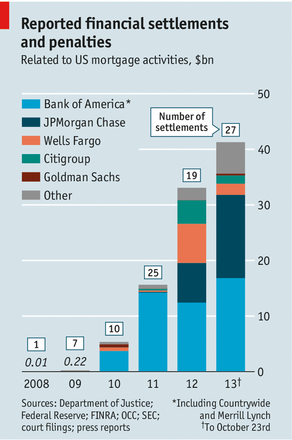
(disclaimer: clever post title pilfered from the Economist)
The Rent is Too Damn High
In: Housing Interactive Maps
7 Feb 2013Heat maps of apartment rental prices in DC:

and Boston:

and many many other cities using a tool created by Jeff Kaufman.
(via welovedc)
Update: Economic Indicators Dashboard
25 Jan 2013One of my favorite economic dashboards. It highlights major macro indicators, what direction they are trending, what the typical ranges are, and lets you drill down to explanations of why you should care. Looks like a lot of indicators are finally in the “typical” range.
Things might be getting back to normal.

Update: Economic Indicators Dashboard
24 Sep 2012One of my favorite economic dashboards. It highlights major macro indicators, what direction they are trending, what the typical ranges are, and lets you drill down to explanations of why you should care. Looks like a lot of indicators are finally in the “typical” range.

Energy Sankey
7 Aug 2012We’ve seen these systemically applied. In this case it’s to a multi-family home. Anyone have one for a single home?

The creator also has a blog post and demo of how he creates these diagrams: http://visualizegreen.posterous.com/pages/create-energy-diagram
Commute Times
In: Housing Interactive Maps
9 Jul 2012Trulia now maps commute times in cities around the country.
One of the reasons I love DC: You can get just about anywhere in less than 30 minutes

Obama vs Romney – Decide Who Wins!
27 Jun 2012Click on each state in the map with your predictions, and the running total at the bottom will tell you who wins! You can also cycle through the results of elections 1789-2008, which is entertaining if you read the little election facts at the bottom of each map.

Personally, it kind of reminded me of playing Risk on the computer back in college.
Rent vs Buy
4 Jun 2012The debate over whether it’s cheaper to rent or buy a house is complicated (where you buy, down payment, size of house, etc). But looking at median prices across the nation and current insanely low mortgage rates can make now look like the best time in a while to buy. Read the comment thread on the linked blog if you want more nuance.

If you want even more nuance, particularly if you’re buying a house as an investment, I recommend Barry Ritholtz’s 5 part article Debunking the Housing Recovery Story.
Everyone Go Swimming!
In: Housing Interactive Maps
25 May 2012A nice map of estimated US mortgages underwater (owe more than it’s worth) from Zillow. Interesting data, but the color ranges are too close in hue for my eyes. When I zoomed into Washington DC I couldn’t tell which range was which unless I used the rollover. I also had a question about the data: how could you end up >200% underwater? (via The Big Picture)

What America Buys
9 Apr 2012I think the change over time is the most interesting.


Update: Economic Indicators Dashboard
23 Mar 2012One of my favorite economic dashboards. It highlights major macro indicators, what direction they are trending, what the typical ranges are, and lets you drill down to explanations of why you should care about these numbers.

Foreclosures 2005-2011
5 Mar 2012These charts make it pretty clear that the housing market still isn’t functioning anywhere near normal. (via The Big Picture)

The “discount” below is the foreclosure price vs a non-foreclosure sale.


What is Chart Porn?
An addictive collection of beautiful charts, graphs, maps, and interactive data visualization toys -- on topics from around the world.
Categories
- Bailout (118)
- Chartporn Related (3)
- Commentary (21)
- Culture (669)
- Emerging Markets (66)
- Employment (245)
- Environment/weather (133)
- Finance (298)
- Food (92)
- Global Economy (373)
- Graphic Design (bad) (26)
- Graphic Design (general) (183)
- Graphic Tools (23)
- History (158)
- Housing (162)
- Humor (204)
- Innovative (183)
- Interactive (545)
- Internet/tech (97)
- Maps (578)
- News Media (34)
- Politics (329)
- Reference (97)
- Science (331)
- Source: Economist (101)
- Source: FT (92)
- Source: NYT (147)
- Source: Ritholtz (76)
- Source: USA Today (27)
- Source: Washington Post (90)
- Source: WSJ (135)
- Sports (58)
- Stock Market (74)
- Uncategorized (2)
- Updated regularly (76)
- US Economy (553)
- Video (22)
- Aram Korevaar: This chart is now being used as a projection in which countries such as China see themselves as in a [...]
- David: Welcome back Chart Porn! [...]
- J S: Thanks for the great story. Miss reading this blog. Hope to see you more active again. [...]
- jake: I lived in a DC row house for 6 years, and I'm writing this comment from my tiny 1 bedroom apartment [...]
- ronny pettersen: Hilarious and unfortunately accurate... ;-) [...]