Bailout Archive:
Payback Time for Subprime
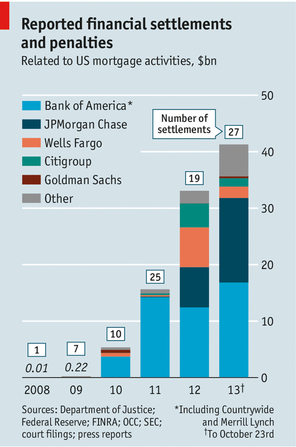
6 Nov 2013Settlement and fines for mortgage abuses are starting to add up to real money. Of course, as Matt Taibbi points out, this is still just a drop in the proverbial bucket compared to the related profits and scale of activities that took place.
(disclaimer: clever post title pilfered from the Economist)
Sharing Bank Spoils
In: Bailout Finance Source: FT
11 Jun 2012You’ll need an FT.com subscription to see it, but they have a nice presentation of where bank “spoils” (profits+staff pay) has been going to. Below are Bank of America and Citigroup.


European Debt
8 Feb 2012A billion here, a billion there – soon you’re talking about real money.
News reports often focus on debt to gdp ratios, but it’s powerful to actually show the magnitudes of each, and compare the amounts already committed to what remains to be financed, as is done here by Spiegel:


A rawer way of looking at the debt of all of the PIIGS, in piles of euros:

![clip_image002[4]](http://chartporn.org/wp-content/uploads/2012/02/clip_image0024.jpg "clip_image002[4]")
![clip_image002[6]](http://chartporn.org/wp-content/uploads/2012/02/clip_image0026.jpg "clip_image002[6]")
This version shows who loaned Greece the money:

European Response to Crisis
1 Feb 2012Almost makes it look like they’ve done a lot:

Charting the Euro Zone Crisis
20 Dec 2011A series of excellent annotated charts on the main indicators of the European crisis.


Eurozone Debt Crisis Dashboard
18 Nov 2011Some very well organized statistics on the Eurozone debt crisis, aggregated from the IMF, OECD, Eurostat, and the World Bank. It includes data on EFSF commitments, debt, SGP criteria, employment, trade, pensions, and mortgages. There are multiple dashboards, each with multiple tabs – so take the time to explore a bit. I particularly like the little sparklines – which I think do a great job of quickly illustrating trends, and don’t get used often enough.

What Wall Street Protesters are Angry About – in Charts
In: Bailout Employment Finance Politics Stock Market US Economy
14 Oct 2011A series of 30+ charts on unemployment, wages, corporate profits, income inequality, debt, taxes, and bailouts from the Business Insider. It’s actually quite an accurate compendium, and the narrative annotation spices up what are otherwise pretty dry charts from the St. Louis Fed (note: if you’ve never used the FRED data/graphing system, you should really go play with it – they even have an APP now). I particularly like the sequence where they illustrate that banks are borrowing money from the FED at basically zero interest rates, and using it to buy treasuries. Hilarious.

How Healthy is Your Bank?
13 Sep 2011From MSNBC and the American University: Identify your bank (or credit union) by name or location, then see how many non-performing loans and other troubled assets it has:


of related interest is this 2010 chart that Barry Ritholtz recently noted:

Fed Crisis Lending to Wall Street
23 Aug 2011Bloomberg compiled some stunning new data on Fed loans to Wall Street banks during the crisis based across multiple programs (Asset-Backed Commercial Paper Money Market Mutual Fund Liquidity Facility, Commercial Paper Funding Facility, discount window, PDCF, TAF, Term Securities Lending Facility and single-tranche open market operations). (related article; via The Big Picture)
I wish I could borrow from the Fed at <2% using junk bonds as collateral.

You get the below charts by selecting multiple banks to compare them:

Too Big to Fail
30 Jun 2011A pretty comprehensive explanation of the financial crisis. (via The Big Picture)

Bailout Scorecard
18 Mar 2011Despite media spin, the United States is a long way from getting all of the bailout money back. (via Ritholtz)


Rolling up TARP
4 Oct 2010A summary of the infamous Troubled Asset Relief Program. (via)

Golden Parachutes
28 Jul 2010An interesting table of the all-time biggest CEO payouts.

Double Dip Danger Signs
In: Bailout Finance Housing Source: WSJ Stock Market US Economy
1 Jul 2010The WSJ looks at indicators in seven areas to gauge whether we are sliding back into recession. Related article.


The Greek Tangle
9 Jun 2010Another look at the debt crisis:


What is Chart Porn?
An addictive collection of beautiful charts, graphs, maps, and interactive data visualization toys -- on topics from around the world.
Categories
- Bailout (118)
- Chartporn Related (3)
- Commentary (21)
- Culture (669)
- Emerging Markets (66)
- Employment (245)
- Environment/weather (133)
- Finance (298)
- Food (92)
- Global Economy (373)
- Graphic Design (bad) (26)
- Graphic Design (general) (183)
- Graphic Tools (23)
- History (158)
- Housing (162)
- Humor (204)
- Innovative (183)
- Interactive (545)
- Internet/tech (97)
- Maps (578)
- News Media (34)
- Politics (329)
- Reference (97)
- Science (331)
- Source: Economist (101)
- Source: FT (92)
- Source: NYT (147)
- Source: Ritholtz (76)
- Source: USA Today (27)
- Source: Washington Post (90)
- Source: WSJ (135)
- Sports (58)
- Stock Market (74)
- Uncategorized (2)
- Updated regularly (76)
- US Economy (553)
- Video (22)
- Aram Korevaar: This chart is now being used as a projection in which countries such as China see themselves as in a [...]
- David: Welcome back Chart Porn! [...]
- J S: Thanks for the great story. Miss reading this blog. Hope to see you more active again. [...]
- jake: I lived in a DC row house for 6 years, and I'm writing this comment from my tiny 1 bedroom apartment [...]
- ronny pettersen: Hilarious and unfortunately accurate... ;-) [...]