Graphic Design (general) Archive:
Star Wars Fonts
4 Feb 2016Bank Logos
14 Oct 2014I recently went to the eastern shore of Maryland and came across this awesome bank logo on the outside wall of a bank. It made me want to walk in and give them my money. and other people’s money. and sacrifice some children in their name.

Now let’s compare it to citibank’s logo, which only succeeds in evoking slightly positive associations for a series of tween magazines that I will never read:
I am a huge fan of simple and memorable. but I think branding has overtaken design – companies just pick something catchy and throw it in peoples faces over and over until it becomes “them”. It’s important sometimes to remember a time when a logo actually evoked real emotions. Look at the font selection. Look at the kerning. Look at the stone they chose for the outside wall of the bank as a background, that has aged beautifully over the years. Look at the bird. It’s a real sculpture with depth, shadows, and gravitas. I mean, wow, it’s just stunning.
Ok, now everyone can chime in with pithy observations about how this would look terrible on a webpage banner, or how it makes them think of nazis.
Suck it Pantone
14 May 2014Clean Forecast
13 May 2014I’m loving Weather Underground’s forecast data layout nowadays. Clear icons combined with layered charts. When something is done well, it seems so simple. **Muah**
I usually hate these kinds of infographics, but this one does summarize some basic guidelines. Of course, the main reason to learn the rules is so you can break them at the appropriate times. By the way, are these long tall infographics taught in high school or “social media 101” now or something? I get emailed 5-10 of these a day. Bizarre. Anyways, if you have some need for them, there’s a large collection over at Pinfographics.
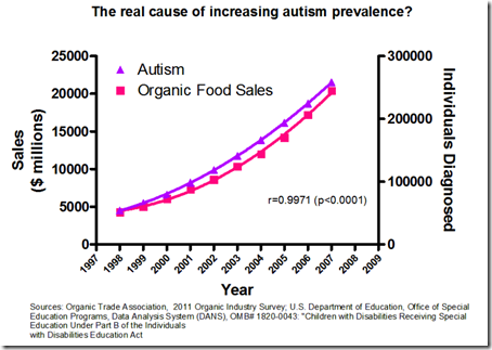
Correlation vs Causation
12 Jan 2014It’s important to know the difference between correlation and causation when using charts. Duh. Below is a good example of why.
Sometimes a Speech is Better
19 Nov 2013In honor of the 150th anniversary of an awesome speech, here’s the powerpoint version by Peter Novig:
Long term Unemployed
7 Nov 2013I like it. It never occurred to me to use colored lines to differentiate rising and falling values in this type of chart. I would suggest sorting by the change instead of the most recent observation, but I suppose it would depend on the point you were trying to make.
Logo Colors
24 Oct 2013While we’re talking about logos… do you agree with these color categories? Some of these brands are quite old. What came first, the color or the emotion?
Hidden Logo Messages
24 Oct 2013Some fascinating stuff in here. (And yes, I know these aren’t charts, but I like to also post on interesting graphic design issues.) (via)
I have no idea why I never noticed the 31 before. it’s pretty obvious.
Want more? Google “hidden logos”.
The Science Behind Data Visualization
16 Sep 2013How does your brain process visual information and relationships? Read this article to begin to understand it.
Here’s a related article on the topic by Stephen Few that you might find interesting.
And a walk-through example of why this is important by Cole Nussbaumer.
Great video describing some of the technologies that go into making the live coverage meaningful. (via TechCrunch)
All by the same company that brings you those first down lines, strike zones, and nascar labels.
16 Useless Infographics
28 Aug 2013Silly Alphabets
26 Jul 2013Color Theory in Practice
25 Jun 2013Lots of books try to convince us that different colors are associated with different emotions and messages, but John Nelson decided to put google image search results to the test. Check out the comments for some good discussion of the strengths and weaknesses of the technique.
What is Chart Porn?
An addictive collection of beautiful charts, graphs, maps, and interactive data visualization toys -- on topics from around the world.
Categories
- Bailout (118)
- Chartporn Related (3)
- Commentary (21)
- Culture (669)
- Emerging Markets (66)
- Employment (245)
- Environment/weather (133)
- Finance (298)
- Food (92)
- Global Economy (373)
- Graphic Design (bad) (26)
- Graphic Design (general) (183)
- Graphic Tools (23)
- History (158)
- Housing (162)
- Humor (204)
- Innovative (183)
- Interactive (545)
- Internet/tech (97)
- Maps (578)
- News Media (34)
- Politics (329)
- Reference (97)
- Science (331)
- Source: Economist (101)
- Source: FT (92)
- Source: NYT (147)
- Source: Ritholtz (76)
- Source: USA Today (27)
- Source: Washington Post (90)
- Source: WSJ (135)
- Sports (58)
- Stock Market (74)
- Uncategorized (2)
- Updated regularly (76)
- US Economy (553)
- Video (22)
- Aram Korevaar: This chart is now being used as a projection in which countries such as China see themselves as in a [...]
- David: Welcome back Chart Porn! [...]
- J S: Thanks for the great story. Miss reading this blog. Hope to see you more active again. [...]
- jake: I lived in a DC row house for 6 years, and I'm writing this comment from my tiny 1 bedroom apartment [...]
- ronny pettersen: Hilarious and unfortunately accurate... ;-) [...]


