Video Archive:
The Fallen of World War II
4 Feb 2016I don’t think most people realize how many Russians died during WWII and how that defined the rest of the 20th century. The below videographic tells the entire WWII story in detail.
Air Traffic Worldwide
15 Jan 201424 hours of global airplane traffic.
The Solar System
16 Dec 2013A very well executed videographic. Well paced with clear visualizations.
Pandemic Mapping
16 Dec 2013Interesting research and simulation of how pandemics propagate in the modern world: (via FastCoExist)

Map of Europe (1000AD to today)
16 Sep 2013Pretty crazy how many changes happened in the last 1000 years, compared to the (relative) stability of recent history.
Great video describing some of the technologies that go into making the live coverage meaningful. (via TechCrunch)
All by the same company that brings you those first down lines, strike zones, and nascar labels.
The Art of Data Visualization
15 May 2013A nice introductory video from PBS with Edward Tufte, Julie Steele, Josh Smith, and Jer Thorp. Every once in a while it’s good to remind yourself of basic principles.
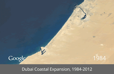
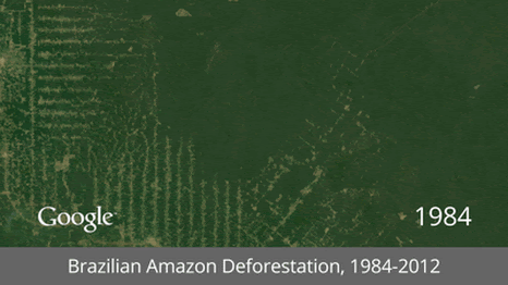
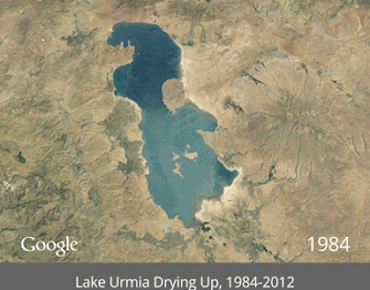
Satellite GIFs
15 May 2013It’s interesting how popular animated gifs have become again. I guess that even with high speed internet people are a little fed up with player load times and lags. Here GIFs are used to show time lapse satellite images of mankind’s impact on the earth. (google earth link)


Keynes vs Hayek – Fight of the century
28 Mar 2013OK, this isn’t a chart. But it is an incredibly well designed and hilarious rap video about economic theory. Images and methods are are powerful communication tools. Check out EconStories for more music videos and mini-documentaries.
Wealth Inequality in America
4 Mar 2013Not much new here – but it is well explained. Personally, instead of focusing on a subjective comparison of what people thought would be “fair”, I would have liked to see more visuals illustrating how this has changed over the past few decades.
Helical Orbits
26 Dec 2012Oskar Fischinger
18 Dec 2012I dabble in VJ’ing, and it’s amazing what you can do with todays tools, like Resolume. But take a look at what Oskar Fischinger did back in 1938 with pieces of paper hanging from wires in his synesthetic interpretation of Liszt’s Hungarian Rhapsody. Amazing. Actually, it’s kind of embarrassing. We are so spoiled.
Getting Lost
31 Oct 2012Feels like a music video for a slogan, using meaningless animated infographics.
How Much Have Olympians Improved?
In: Source: NYT Sports Video
6 Aug 2012Very cool videographics analyzing the history of the 100m race, long jump, and 100m freestyle swim:


Eastern Europe
30 Jul 2012“Eastern Europe” doesn’t really exist anymore. In fact, it never really did in the first place, according to this videographic.


What is Chart Porn?
An addictive collection of beautiful charts, graphs, maps, and interactive data visualization toys -- on topics from around the world.
Categories
- Bailout (118)
- Chartporn Related (3)
- Commentary (21)
- Culture (669)
- Emerging Markets (66)
- Employment (245)
- Environment/weather (133)
- Finance (298)
- Food (92)
- Global Economy (373)
- Graphic Design (bad) (26)
- Graphic Design (general) (183)
- Graphic Tools (23)
- History (158)
- Housing (162)
- Humor (204)
- Innovative (183)
- Interactive (545)
- Internet/tech (97)
- Maps (578)
- News Media (34)
- Politics (329)
- Reference (97)
- Science (331)
- Source: Economist (101)
- Source: FT (92)
- Source: NYT (147)
- Source: Ritholtz (76)
- Source: USA Today (27)
- Source: Washington Post (90)
- Source: WSJ (135)
- Sports (58)
- Stock Market (74)
- Uncategorized (2)
- Updated regularly (76)
- US Economy (553)
- Video (22)
- Aram Korevaar: This chart is now being used as a projection in which countries such as China see themselves as in a [...]
- David: Welcome back Chart Porn! [...]
- J S: Thanks for the great story. Miss reading this blog. Hope to see you more active again. [...]
- jake: I lived in a DC row house for 6 years, and I'm writing this comment from my tiny 1 bedroom apartment [...]
- ronny pettersen: Hilarious and unfortunately accurate... ;-) [...]