Environment/weather Archive:
America’s Sunniest Locations
In: Environment/weather Interactive Maps Source: Washington Post
17 Nov 2016A nice interactive map of daily sunlight.


Clean Forecast
13 May 2014I’m loving Weather Underground’s forecast data layout nowadays. Clear icons combined with layered charts. When something is done well, it seems so simple. **Muah**

Map of All Things US Energy
25 Feb 2014Map of all kinds of energy related things: coal fields, mines, oil/gas pipelines/storage, electrical transmission lines, wind turbine potential, offshore windspeeds, solar potential, etc. You get the idea.
It’s not the smoothest operating interactive map I’ve ever seen (lots of delays in loading, etc) – but it works if you’re patient.
Thanks to Mr. Brown for sending me the link.

January 2014 One of Hottest on Record
25 Feb 2014You wouldn’t know it is you lived on the East Coast, of course, but January 2014 was the 4th hottest on record, globally.

Freshy Snow Map
6 Feb 2014Real time interactive map of who is getting snowed on – particularly useful for skier and snowboarder trip planning. Click on any mountain to see last 24 hour snow totals, 5-day forecast, and the “freshy factor” (likelihood of finding fresh snow).

How Much Snow it Takes to Close School
1 Feb 2014The nice thing about reddit sourced graphics like this one is that they often include conversations with the author, and revisions to correct mistakes or make improvements.

Real Time Wind Globe
6 Jan 2014Ok, I lied. It’s really only updated every three hours – but it’s still pretty awesome. You can zoom in and rotate the globe to see whichever hemisphere you’re interested in.

You can even change the map projection used:

If All the Ice Melted
5 Nov 2013Hypothetical mapping of what coastlines would look like if all the ice in the world melted, raising ocean levels by 216 feet.


HOT HOT HOT
23 Oct 2013Climate change will not impact everywhere at the same time. The below map estimates when the average temperature of the coolest year will exceed the historic average hottest year. What does this mean? Besides that we’re all screwed, you may wish to reconsider your tropical retirement plans. (related article)

And the original study also has some nice visualizations:
Tide Predictions
25 Jun 2013An apparently beautiful diagram of tide predictions for June 2013 in the SF bay – unfortunately, she didn’t post a big enough version for me to be sure how good it really is. Boo.

Animated Wind Map
6 Jun 2013A very cool real time animated map of wind.

Also some historical snapshots, like Hurricane Sandy:

Energy Flow Maps
31 May 2013We’ve seen similar maps before, but it’s nice to have them all together from one reliable source.


2000 years of Global Temperatures
15 May 2013Interesting scientific work, building on prior studies from across the world. Rather than get into the findings in detail I refer you to the NYT article and a very detail FAQ at the authors’ website)

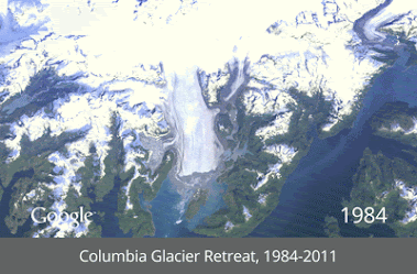
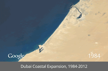
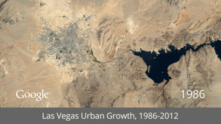
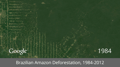
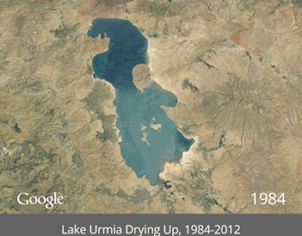
Satellite GIFs
15 May 2013It’s interesting how popular animated gifs have become again. I guess that even with high speed internet people are a little fed up with player load times and lags. Here GIFs are used to show time lapse satellite images of mankind’s impact on the earth. (google earth link)


Climate Change
13 Mar 2013Recent studies add to the evidence that we are changing the world:


If you want to see what “climate change” really means, as in what will be changing where, check out the 2013 National Climate Assessment report. It’s fantastic, and chuck full of visualizations:

One side effect: More shipping in the Arctic:


What is Chart Porn?
An addictive collection of beautiful charts, graphs, maps, and interactive data visualization toys -- on topics from around the world.
Categories
- Bailout (118)
- Chartporn Related (3)
- Commentary (21)
- Culture (669)
- Emerging Markets (66)
- Employment (245)
- Environment/weather (133)
- Finance (298)
- Food (92)
- Global Economy (373)
- Graphic Design (bad) (26)
- Graphic Design (general) (183)
- Graphic Tools (23)
- History (158)
- Housing (162)
- Humor (204)
- Innovative (183)
- Interactive (545)
- Internet/tech (97)
- Maps (578)
- News Media (34)
- Politics (329)
- Reference (97)
- Science (331)
- Source: Economist (101)
- Source: FT (92)
- Source: NYT (147)
- Source: Ritholtz (76)
- Source: USA Today (27)
- Source: Washington Post (90)
- Source: WSJ (135)
- Sports (58)
- Stock Market (74)
- Uncategorized (2)
- Updated regularly (76)
- US Economy (553)
- Video (22)
- Aram Korevaar: This chart is now being used as a projection in which countries such as China see themselves as in a [...]
- David: Welcome back Chart Porn! [...]
- J S: Thanks for the great story. Miss reading this blog. Hope to see you more active again. [...]
- jake: I lived in a DC row house for 6 years, and I'm writing this comment from my tiny 1 bedroom apartment [...]
- ronny pettersen: Hilarious and unfortunately accurate... ;-) [...]