Humor Archive:
Anatomy of Songs
In: Humor
17 Feb 2015Depressingly true. I watched the grammy’s recently and it was a long slow reminder of why I hate popular music of almost any genre.


Powerpoint Presentation of Doom!
12 Jan 2015Artist Julian Oliver recreated the horrible powerpoint templates used in Edward Snowden’s leaked NSA powerpoint presentations. Awesome.


Superbowl (and other) Porn Statistics
6 Feb 2014Amusing. Apparently Denver fans gave up watching before Seattle fans did. (Note: the image below is linked to an Imgur picture. The link to the article on PornHub is here.)

The below is a pretty fabulous interactive chart of how porn usage is affected by global events:

And how the 2013-14 winter’s Polar Vortex temperatures have affected Porn usage:

Famous Movie Quotes as Charts
16 Jan 2014Some entertaining, creative, and borderline obsessive work over at FlowingData creating charts illustrating the top 100 memorable movie quotes (as identified by the AFI).


Sometimes a Speech is Better
19 Nov 2013In honor of the 150th anniversary of an awesome speech, here’s the powerpoint version by Peter Novig:


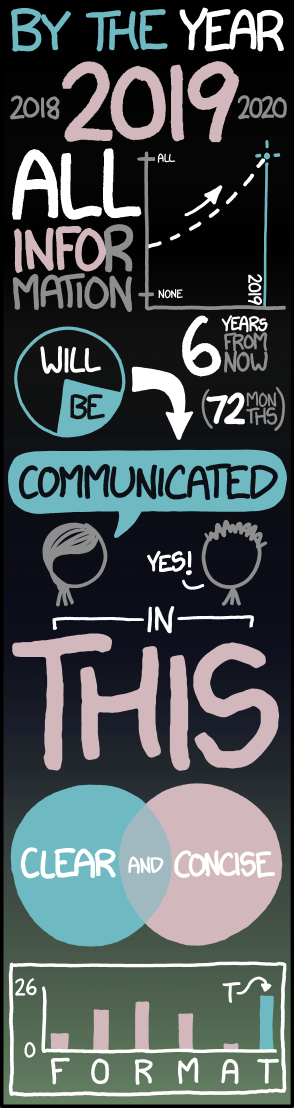
Infographic Template
6 Nov 2013I like it, but perhaps even the parodies are getting tedious at this point.

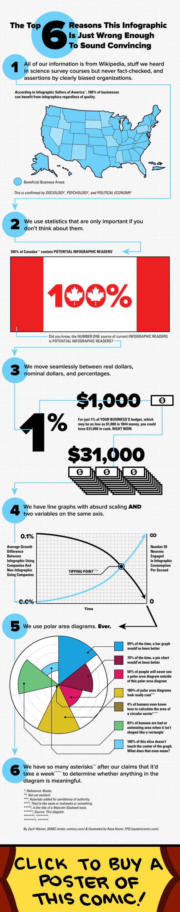
I Hate These
23 Oct 2013I receive dozens of these on a daily basis – almost all absent interesting content or useful information. xkcd sums it up:
The accuracy of this is discussed over at Economist Do It With Models.

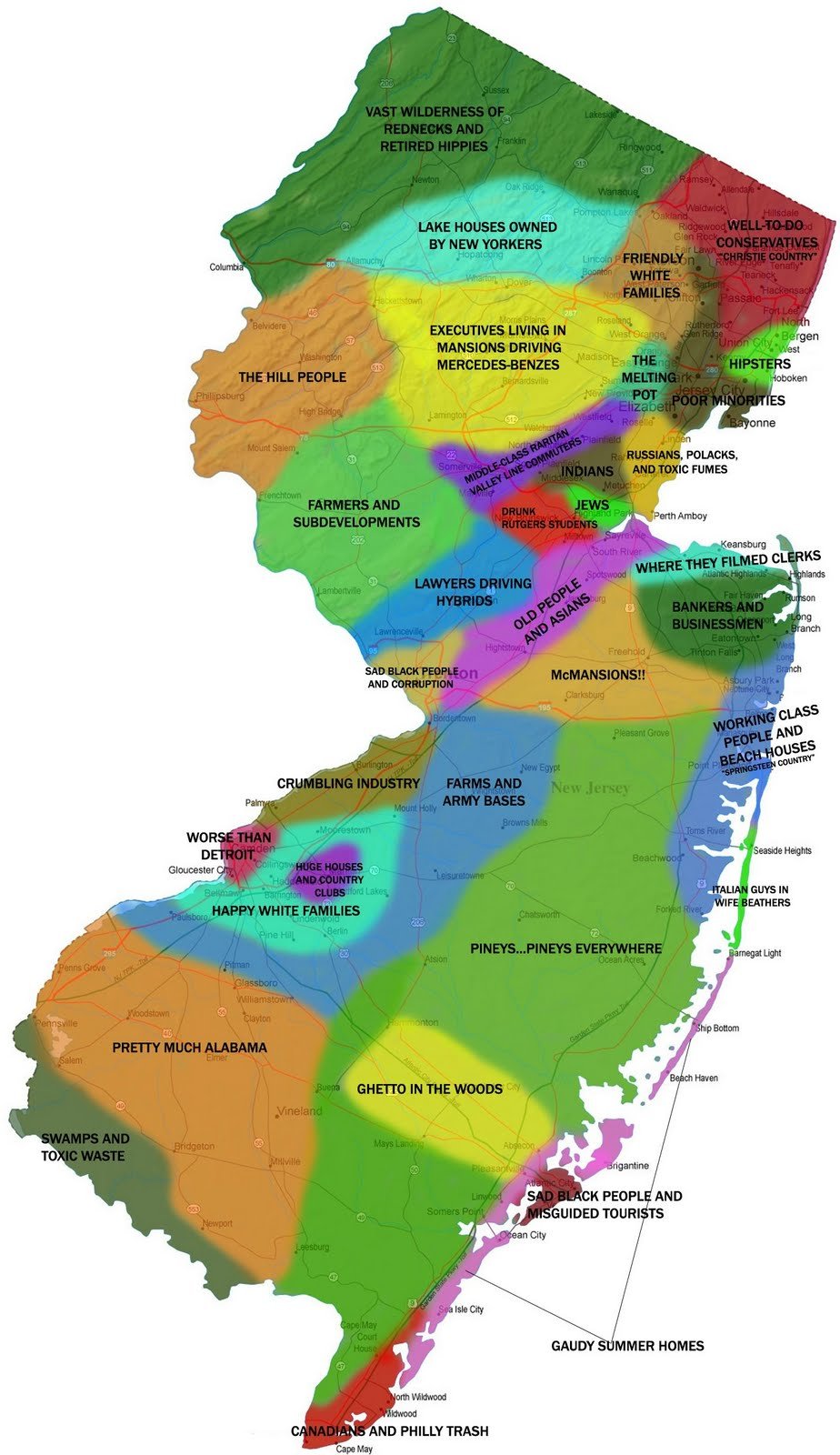
Atlas of Prejudice
5 Aug 2013Alphadesigner continues to take satirical mapping to a new level, with several dozen maps of stereotypes, from many different perspectives, updated regularly.


Geek Productivity
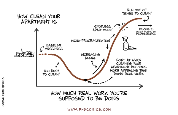
29 Apr 2013Pretty accurate. Some people just don’t understand that performing at a high level requires some rest periods in between the productivity. Or maybe we really are just lazy – I can’t say for sure.

Keynes vs Hayek – Fight of the century
28 Mar 2013OK, this isn’t a chart. But it is an incredibly well designed and hilarious rap video about economic theory. Images and methods are are powerful communication tools. Check out EconStories for more music videos and mini-documentaries.


What is Chart Porn?
An addictive collection of beautiful charts, graphs, maps, and interactive data visualization toys -- on topics from around the world.
Categories
- Bailout (118)
- Chartporn Related (3)
- Commentary (21)
- Culture (669)
- Emerging Markets (66)
- Employment (245)
- Environment/weather (133)
- Finance (298)
- Food (92)
- Global Economy (373)
- Graphic Design (bad) (26)
- Graphic Design (general) (183)
- Graphic Tools (23)
- History (158)
- Housing (162)
- Humor (204)
- Innovative (183)
- Interactive (545)
- Internet/tech (97)
- Maps (578)
- News Media (34)
- Politics (329)
- Reference (97)
- Science (331)
- Source: Economist (101)
- Source: FT (92)
- Source: NYT (147)
- Source: Ritholtz (76)
- Source: USA Today (27)
- Source: Washington Post (90)
- Source: WSJ (135)
- Sports (58)
- Stock Market (74)
- Uncategorized (2)
- Updated regularly (76)
- US Economy (553)
- Video (22)
- Aram Korevaar: This chart is now being used as a projection in which countries such as China see themselves as in a [...]
- David: Welcome back Chart Porn! [...]
- J S: Thanks for the great story. Miss reading this blog. Hope to see you more active again. [...]
- jake: I lived in a DC row house for 6 years, and I'm writing this comment from my tiny 1 bedroom apartment [...]
- ronny pettersen: Hilarious and unfortunately accurate... ;-) [...]