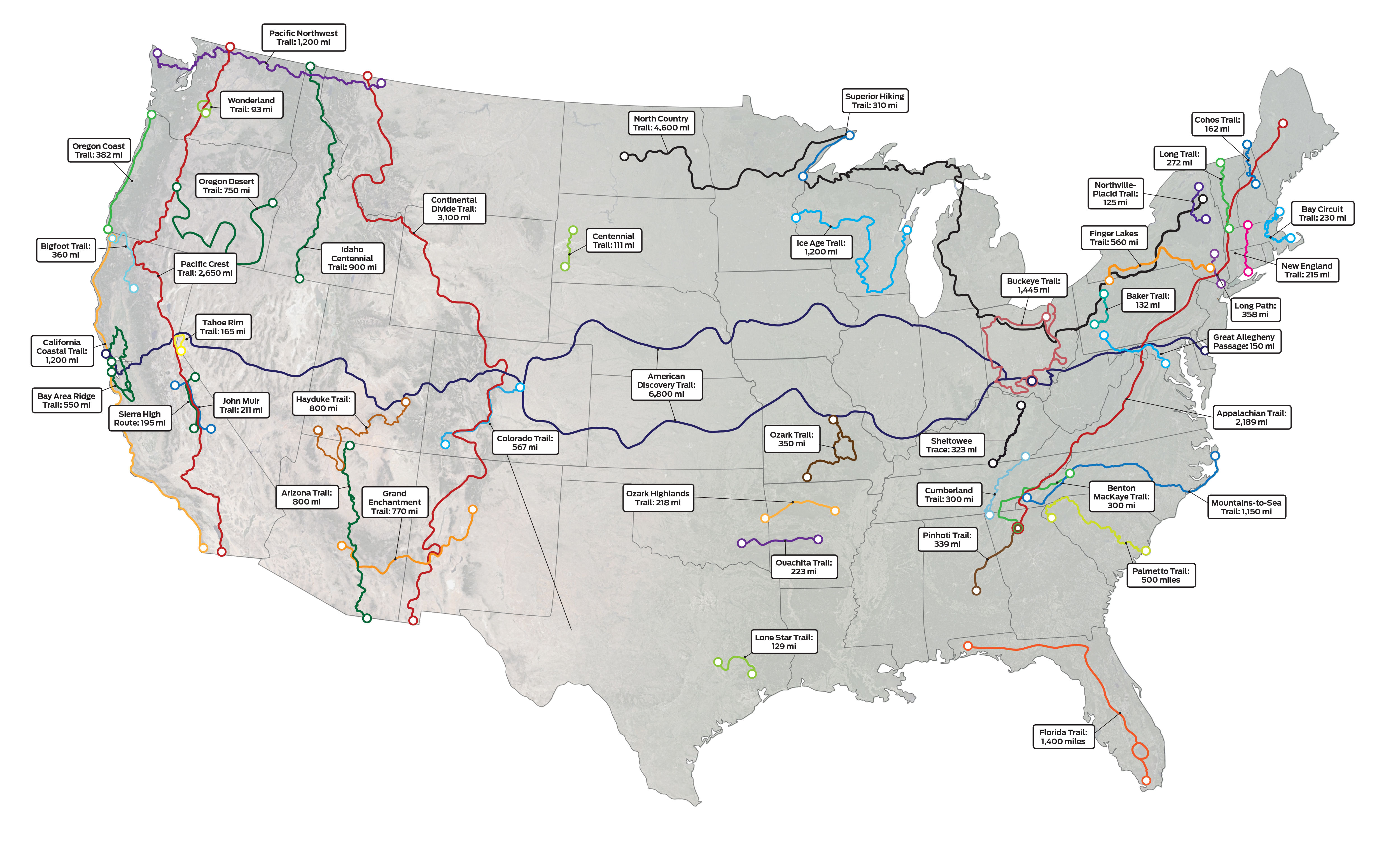
Maps Archive:
Long USA Hiking Trails
In: Maps
14 Jan 2020Lots of great hiking trails in the United States.
America’s Sunniest Locations
In: Environment/weather Interactive Maps Source: Washington Post
17 Nov 2016A nice interactive map of daily sunlight.


1921 Mid-atlantic Rail and Ferry Map
17 Nov 2016A modern representation of old rail and ferry routes in the mid-atlantic.


Stainless Steel City Maps
In: Maps
17 Nov 2016Nice laser cut maps of a number of cities based on openstreetmap vectors.

Post-election Analysis
17 Nov 2016Three very nice articles analyzing voting patterns:
Razor thin margins in important swing states:

What counties swung to the other party:

And an elegant but slightly hard to understand look at urban/rural differences:

Election Maps Lie
1 Nov 2016Well, actually all maps lie, in some ways or another. This is a nice article about what is wrong with election maps, and some weird maps that try to make them lie less.


Average Income by DC Metro Stop
17 Feb 2015An interested analysis, but not too surprising if you are already aware of DC income distributions. (via WashingtonPost blog article)


Looking Across the Ocean
10 Jul 2014This awesome map shows what really is over the horizon as you gaze across the waves.

Where Ya Running?
14 May 2014Strava has created a global heat map of running and biking data (77,688,848 rides and 19,660,163 runs).


Simplified Map of United States Highway System
In: Maps
30 Apr 2014Amazingly detailed map of highways. Done in Illustrator, apparently. Part of me is not sure why you would do it, however.


Major League Baseball Team Preference
In: Culture Interactive Maps Sports
30 Apr 2014Somewhat obvious, but fun to look at the details. The original NYT article points out some of the more contentious borders.

Tedious Map of the Solar System
In: Interactive Maps Science
10 Mar 2014Josh Worth created a horizontal map of the solar system using a scale of 1 pixel = diameter of moon. There’s a lot of nothing out there (but Josh does add some amusing commentary to help pass the time scrolling between planets).

Baby Name Popularity by State
10 Mar 2014Type in any name and see how popular it was across the USA over the past 60 years. (blog post explaining methodology)


What is Chart Porn?
An addictive collection of beautiful charts, graphs, maps, and interactive data visualization toys -- on topics from around the world.
Categories
- Bailout (118)
- Chartporn Related (3)
- Commentary (21)
- Culture (669)
- Emerging Markets (66)
- Employment (245)
- Environment/weather (133)
- Finance (298)
- Food (92)
- Global Economy (373)
- Graphic Design (bad) (26)
- Graphic Design (general) (183)
- Graphic Tools (23)
- History (158)
- Housing (162)
- Humor (204)
- Innovative (183)
- Interactive (545)
- Internet/tech (97)
- Maps (578)
- News Media (34)
- Politics (329)
- Reference (97)
- Science (331)
- Source: Economist (101)
- Source: FT (92)
- Source: NYT (147)
- Source: Ritholtz (76)
- Source: USA Today (27)
- Source: Washington Post (90)
- Source: WSJ (135)
- Sports (58)
- Stock Market (74)
- Uncategorized (2)
- Updated regularly (76)
- US Economy (553)
- Video (22)
- Aram Korevaar: This chart is now being used as a projection in which countries such as China see themselves as in a [...]
- David: Welcome back Chart Porn! [...]
- J S: Thanks for the great story. Miss reading this blog. Hope to see you more active again. [...]
- jake: I lived in a DC row house for 6 years, and I'm writing this comment from my tiny 1 bedroom apartment [...]
- ronny pettersen: Hilarious and unfortunately accurate... ;-) [...]