Finance Archive:
Payback Time for Subprime
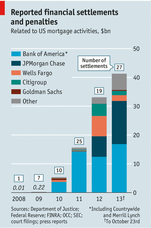
6 Nov 2013Settlement and fines for mortgage abuses are starting to add up to real money. Of course, as Matt Taibbi points out, this is still just a drop in the proverbial bucket compared to the related profits and scale of activities that took place.
(disclaimer: clever post title pilfered from the Economist)
US Corporations: Effective Tax Rates
31 May 2013A spiffy annotated interactive visualization by the NYT on what different industries actually pay in taxes. The differences in rates between industries illustrate who is getting tax breaks. The related article is worth a read.


Billionaires
25 Jan 2013Bloomberg has several interactive tools for filtering and ranking the the world’s billionaires.

If you click on any of them, individual profiles come up, like for Carlos Slim":

You can plot them by industry, gender, number of children and all kinds of other variables.

Sharing Bank Spoils
In: Bailout Finance Source: FT
11 Jun 2012You’ll need an FT.com subscription to see it, but they have a nice presentation of where bank “spoils” (profits+staff pay) has been going to. Below are Bank of America and Citigroup.


Fortune 500
In: Finance Stock Market
7 May 2012The 2012 Fortune 500 is out (which basically rates companies by revenue). I like this presentation of sales vs profits:
There in also a charting of the Top 10 that let’s you take a look at revenue vs profits:


Debt Restructuring (1970-2012)
4 Apr 2012Two charts examining the size of debt restructuring by countries. The second chart is more useful since it aggregates the restructurings of countries that had several over different years (Brazil, Mexico, Argentina, etc).


Update: Economic Indicators Dashboard
23 Mar 2012One of my favorite economic dashboards. It highlights major macro indicators, what direction they are trending, what the typical ranges are, and lets you drill down to explanations of why you should care about these numbers.

2012 Economic Freedom Map
In: Finance Global Economy History Interactive Maps Politics Updated regularly
6 Mar 2012I’m not a fan of the Heritage Foundation, and the one time I dug into the data of their Economic Freedom Index I found that they occasionally compare apples and oranges to get around data scarcity – BUT: they do put a large research effort into the report each year. The below interactive map is well executed – but you should drill down to country level data to get a feel for what is really being measured (click on a country, then the “learn more about this country” link that pops up in the lower left. Why this requires two steps I have no idea).

Global Wealth
21 Feb 2012There are a number of interesting and well designed charts in the 2011 Global Wealth Report from Credit Suisse. The private sector actually does a lot of good analysis and visualization work that just doesn’t get publicized much.


This one took me a minute to figure out – it’s showing distribution of wealth by decile:

There are a series of charts on wealth and age:


Thanks to Sean R for sending in the link!
Chinese Investment
13 Feb 2012Wow. I didn’t realize China’s investment in the USA was so small.

European Debt
8 Feb 2012A billion here, a billion there – soon you’re talking about real money.
News reports often focus on debt to gdp ratios, but it’s powerful to actually show the magnitudes of each, and compare the amounts already committed to what remains to be financed, as is done here by Spiegel:


A rawer way of looking at the debt of all of the PIIGS, in piles of euros:

![clip_image002[4]](http://chartporn.org/wp-content/uploads/2012/02/clip_image0024.jpg "clip_image002[4]")
![clip_image002[6]](http://chartporn.org/wp-content/uploads/2012/02/clip_image0026.jpg "clip_image002[6]")
This version shows who loaned Greece the money:

2012 Global Risk Map
In: Employment Environment/weather Finance Global Economy Interactive
3 Feb 2012The World Economic Forum always has some interesting visualizations and info-videos.
Global Risk Map:

Interactive Risk Explorer (be sure to play with the menu tabs on the right):

European Response to Crisis
1 Feb 2012Almost makes it look like they’ve done a lot:

Living in a QE World
31 Jan 2012Another problem brewing. The world is running out of places to kick the credit can. As usual, there is much insight to be gained from the discussion and comments over at Barry Ritholtz’s The Big Picture.


Update: Economic Indicators Dashboard
23 Jan 2012Updated for January: one of my favorite economic dashboards. It highlights major macro indicators, what direction they are trending, what the typical ranges are, and lets you drill down to explanations of why you should care. In other words, it’s a very sleek example of how to graph snapshot data while still providing valuable context.


What is Chart Porn?
An addictive collection of beautiful charts, graphs, maps, and interactive data visualization toys -- on topics from around the world.
Categories
- Bailout (118)
- Chartporn Related (3)
- Commentary (21)
- Culture (669)
- Emerging Markets (66)
- Employment (245)
- Environment/weather (133)
- Finance (298)
- Food (92)
- Global Economy (373)
- Graphic Design (bad) (26)
- Graphic Design (general) (183)
- Graphic Tools (23)
- History (158)
- Housing (162)
- Humor (204)
- Innovative (183)
- Interactive (545)
- Internet/tech (97)
- Maps (578)
- News Media (34)
- Politics (329)
- Reference (97)
- Science (331)
- Source: Economist (101)
- Source: FT (92)
- Source: NYT (147)
- Source: Ritholtz (76)
- Source: USA Today (27)
- Source: Washington Post (90)
- Source: WSJ (135)
- Sports (58)
- Stock Market (74)
- Uncategorized (2)
- Updated regularly (76)
- US Economy (553)
- Video (22)
- Aram Korevaar: This chart is now being used as a projection in which countries such as China see themselves as in a [...]
- David: Welcome back Chart Porn! [...]
- J S: Thanks for the great story. Miss reading this blog. Hope to see you more active again. [...]
- jake: I lived in a DC row house for 6 years, and I'm writing this comment from my tiny 1 bedroom apartment [...]
- ronny pettersen: Hilarious and unfortunately accurate... ;-) [...]