Internet/tech Archive:
TikTok’s search evolution
In: Internet/tech
20 Mar 20242 in 5 Americans use TikTok as a search engine.
Nearly 1 in 10 Gen Zers are more likely to rely on TikTok than Google as a search engine.
More than half of business owners (54%) use TikTok to promote their business, posting an average of 9 times per month.
1 in 4 small business owners use TikTok influencers for product sales or promotions.
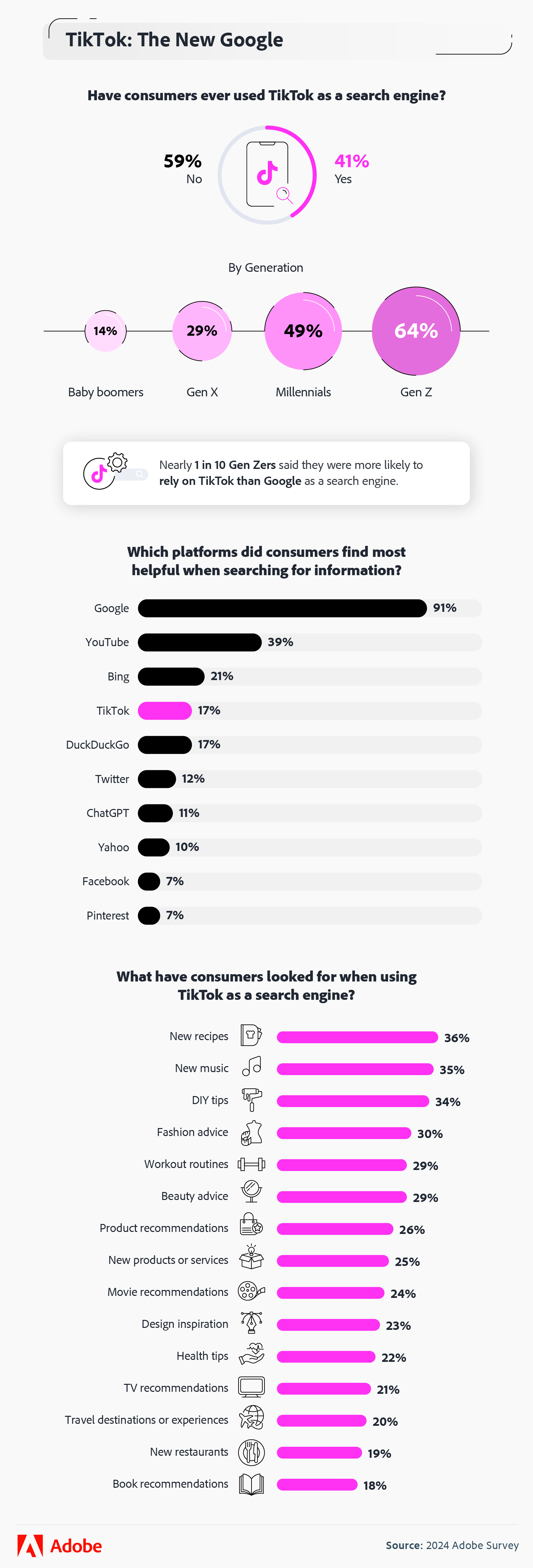
Source: Adobe
- Comments Off on TikTok’s search evolution
The Evolution of Cell Phones
In: Culture Internet/tech
4 Feb 2016How tech and culture evolve together.

Net Neutrality is not About Dolphin Fishing
In: Internet/tech
30 Apr 2014A real example of how the death of net neutrality will impact your internet experience.
Since Netflix gave into Comcast’s demands for payment in exchange for a promise to deliver movies smoothly over the Internet to Netflix’s customers, speeds on Comcast for Netflix users have rocketed upward. Speeds on the larger service providers have been decreasing steadilysince last fall, but following the deal, Comcast restored all the speed that Netflix had lost and much more in the space of a couple of months.

When to Buy Airline Tickets
In: Culture Internet/tech
9 Mar 2014Based on an analysis of 4,191,533 flights and 1.3 billion air fares, “in 2013 the best time to buy a domestic airline ticket was 54 days in advance, or 7 1/2 weeks on average.” Check out the related article for other insights.

Facebook Love
In: Culture Internet/tech
25 Feb 2014Facebook analyzed peoples online interactions zeroed around relationship status events. It turns out (not surprisingly I suppose) that relationship changes track closely with online interactions.

and what kind of posts they are interacting with:

Here’s what a breakup looks like:

Dead Startups
In: Internet/tech
28 Jan 2014Some interesting charts about failed start ups.


Real Time DDos Attack Map
In: Internet/tech
17 Jan 2014See where denial of service attacks are occurring based on hourly data. Shows flows as well as relevant news stories. You can scroll along the timeline to view different dates.

The History of Reddit
In: Culture Internet/tech
12 Jan 2014Interesting analysis of the composition of Reddit content. Randy Olson has a great blog post about how the chart was created.

How a Car Engine Works
In: Internet/tech Science
16 Sep 2013Beautiful annotated animation of how gas engines work. Check out the full size version by Jacob O’Neal.

Gmail Network Map
In: Culture Internet/tech
9 Jul 2013MIT has a fun toy which let’s you conduct network analysis of your gmail emails. There’s a thread over at Slashdot that discusses how this analysis of meta data is similar to the Snowden revealed PRISM project.

Evolution of Video Game Controllers
In: History Internet/tech
25 Jun 2013A trip down time-wasting memory lane.


How does Google shape its brand through design? Check out their “Visual Assets Guidelines“. It’s all very similar to the flat design movement, but the level of detail is fascinating.


History of Spying (on ourselves; 1791-2013)
11 Jun 2013A wonderful interactive timeline of legislation, rulings, and events related to domestic surveillance in the United States. You can drill down into each event for an explanation, and links to primary sources (like the full text of legislation, etc).

With the conference release of iOS 7 yesterday, there is much talk about it’s “flat design”. What is flat design? Designmodo has a nice article explaining the basics.

While I generally love flat design concepts, Apple really choked on some of the implementation – particularly the icon designs. Check out photos, newstand, game center, and settings below. Barf. They are the way too cluttered busy and abstract – the exact opposite of what they should be.

Geography of Hate
In: Culture Internet/tech Maps
15 May 2013This has been making the rounds. Based on 150,000 geocoded tweets from June 2012 to April 2013, filtered 1st by use of word, and then manually whether it was used in a negative or derogatory fashion.
Obviously this suffers from selection bias as it only includes people who bother to tweet, and those who aren’t ashamed to do it publicly. There’s also the usual population density distortion (last map below), which would be compounded by cell phone coverage out west. So, basically, this is another pretty visualization of social media meta data that doesn’t really mean much of anything. To be honest I’m surprised they only found 150,000 hateful tweets in 11 months. (The author’s FAQ is an interest read)
Homophobia:

Racist:

Disability:


What is Chart Porn?
An addictive collection of beautiful charts, graphs, maps, and interactive data visualization toys -- on topics from around the world.
Categories
- Bailout (118)
- Chartporn Related (3)
- Commentary (21)
- Culture (669)
- Emerging Markets (66)
- Employment (245)
- Environment/weather (133)
- Finance (298)
- Food (92)
- Global Economy (373)
- Graphic Design (bad) (26)
- Graphic Design (general) (183)
- Graphic Tools (23)
- History (158)
- Housing (162)
- Humor (204)
- Innovative (183)
- Interactive (545)
- Internet/tech (97)
- Maps (578)
- News Media (34)
- Politics (329)
- Reference (97)
- Science (331)
- Source: Economist (101)
- Source: FT (92)
- Source: NYT (147)
- Source: Ritholtz (76)
- Source: USA Today (27)
- Source: Washington Post (90)
- Source: WSJ (135)
- Sports (58)
- Stock Market (74)
- Uncategorized (2)
- Updated regularly (76)
- US Economy (553)
- Video (22)
- Aram Korevaar: This chart is now being used as a projection in which countries such as China see themselves as in a [...]
- David: Welcome back Chart Porn! [...]
- J S: Thanks for the great story. Miss reading this blog. Hope to see you more active again. [...]
- jake: I lived in a DC row house for 6 years, and I'm writing this comment from my tiny 1 bedroom apartment [...]
- ronny pettersen: Hilarious and unfortunately accurate... ;-) [...]