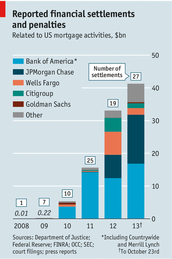
Settlement and fines for mortgage abuses are starting to add up to real money. Of course, as Matt Taibbi points out, this is still just a drop in the proverbial bucket compared to the related profits and scale of activities that took place.
(disclaimer: clever post title pilfered from the Economist)
Comment Form


What is Chart Porn?
An addictive collection of beautiful charts, graphs, maps, and interactive data visualization toys -- on topics from around the world.
Categories
- Bailout (118)
- Chartporn Related (3)
- Commentary (21)
- Culture (669)
- Emerging Markets (66)
- Employment (245)
- Environment/weather (133)
- Finance (298)
- Food (92)
- Global Economy (373)
- Graphic Design (bad) (26)
- Graphic Design (general) (183)
- Graphic Tools (23)
- History (158)
- Housing (162)
- Humor (204)
- Innovative (183)
- Interactive (545)
- Internet/tech (97)
- Maps (578)
- News Media (34)
- Politics (329)
- Reference (97)
- Science (331)
- Source: Economist (101)
- Source: FT (92)
- Source: NYT (147)
- Source: Ritholtz (76)
- Source: USA Today (27)
- Source: Washington Post (90)
- Source: WSJ (135)
- Sports (58)
- Stock Market (74)
- Uncategorized (2)
- Updated regularly (76)
- US Economy (553)
- Video (22)
- Aram Korevaar: This chart is now being used as a projection in which countries such as China see themselves as in a [...]
- David: Welcome back Chart Porn! [...]
- J S: Thanks for the great story. Miss reading this blog. Hope to see you more active again. [...]
- jake: I lived in a DC row house for 6 years, and I'm writing this comment from my tiny 1 bedroom apartment [...]
- ronny pettersen: Hilarious and unfortunately accurate... ;-) [...]
3 Responses to Payback Time for Subprime
Hugh Heinsohn
November 6th, 2013 at 15:30
This chart looks like it should interesting but it’s quite confusing. What exactly does the Y axis display? The amount of fines? Some (undefined) ratio? Would be interesting to see the data in a better designed infographic.
Sylvie
November 8th, 2013 at 10:31
This will never make up for the damage these banks have caused for the U.S. economy as well as the contagion spread globally. It is too vast to even quantify. Our gov’t was complicit and the next bubble is already forming. The Fed and namls rule the world.
Matt Jenkins
November 11th, 2013 at 04:59
Its the amount of payback in $bn, as per the label, isn’t it?