Radiation Doses
In: Science
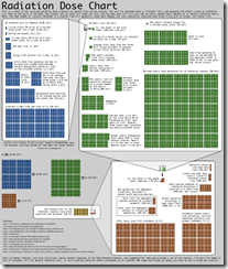
21 Mar 2011An easy to understand chart of radiation sources and the damage they do, from xkcd.
Thanks to everyone who emailed me about it!
Nuclear Fear Mongering
19 Mar 2011Ughhh. Type in your zip code and see how close you are to a nuclear plant!! There’s even a red target painted on the reactor!!! I’m primarily posting this so I have an excuse to link to this excellent article, which explains in detail what’s going on in Japan and why you shouldn’t run out to buy potassium pills and start digging a fallout shelter. I might also point out that we conducted 140+ atmospheric atomic tests in Nevada – I’m not saying that was a particularly intelligent or healthy thing to do, but let’s maintain a little perspective about fallout risks, shall we?
Elements of Design
19 Mar 2011Look. Study. Learn. It will be on the test. (via)
Are Public Employees Paid More?
19 Mar 2011Groupon Revenue Deal by Deal
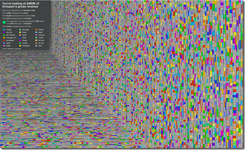
18 Mar 2011$480 million of revenue. Each box is a Groupon deal. The colors identify the city. Width (price) times height (number sold) equals area (revenue). Roll over any deal to see what it was for — lots of weird stuff in there.
Hipmunk Hotels
In: Innovative Maps Reference
18 Mar 2011I’ve praised Hipmunk’s slick airline reservation interface before. Now they’ve added hotels – and it’s awesome. Besides mapping out locations and allowing filtering on prices and amenities, you can also overlap heatmaps for food, tourism, shopping, nightlife, and “vice”. The map below is for Washington DC’s nightlife, and is pretty damn accurate.
A Century of Meat
18 Mar 2011Go chicken! I wonder why pork has such volatility? (related ethical dietary ponderings; Thanks to Patty Gaffney for the link!)
Bailout Scorecard
18 Mar 2011Despite media spin, the United States is a long way from getting all of the bailout money back. (via Ritholtz)
Rational Discussion Flowchart
17 Mar 2011Atomic Atlas
17 Mar 2011The FT has created two maps of the world’s nuclear power plants. The first is a fairly comprehensive collection of information on distribution, types, and history:
The second is an interactive googlemaps-based version which locates operating, under construction, planned, and shut down plants. (related article)
Peace Corps Volunteers
In: Culture Employment
16 Mar 2011What if There Weren’t So Many White People?
In: Culture
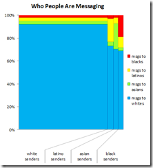
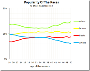
15 Mar 2011OkTrends has once again produced some interesting analysis of it’s online dating data – many pretty charts analyzing why white people are so popular. The narrative and conclusions are a bit complex, so I’ll let you go read them yourself.
Books Everyone Should Read
In: Culture
15 Mar 2011Tsunami Wave Progression
15 Mar 2011Amazing video of the wave as it moves across the Pacific.
Japan Crisis
13 Mar 2011Want to understand some of the technical aspects of the disaster?
Here’s a NYT interactive explanation of the quake itself:
A Washington Post explanation of what’s been happening at the nuclear plants:
Interactive graphs of the last 7 days of Japanese earthquakes on the left, historical comparison on the right:
And one that really brings home how much bigger this quake was than previous ones:
What is Chart Porn?
An addictive collection of beautiful charts, graphs, maps, and interactive data visualization toys -- on topics from around the world.
Categories
- Bailout (118)
- Chartporn Related (3)
- Commentary (21)
- Culture (669)
- Emerging Markets (66)
- Employment (245)
- Environment/weather (133)
- Finance (298)
- Food (92)
- Global Economy (373)
- Graphic Design (bad) (26)
- Graphic Design (general) (183)
- Graphic Tools (23)
- History (158)
- Housing (162)
- Humor (204)
- Innovative (183)
- Interactive (545)
- Internet/tech (97)
- Maps (578)
- News Media (34)
- Politics (329)
- Reference (97)
- Science (331)
- Source: Economist (101)
- Source: FT (92)
- Source: NYT (147)
- Source: Ritholtz (76)
- Source: USA Today (27)
- Source: Washington Post (90)
- Source: WSJ (135)
- Sports (58)
- Stock Market (74)
- Uncategorized (2)
- Updated regularly (76)
- US Economy (553)
- Video (22)
- Aram Korevaar: This chart is now being used as a projection in which countries such as China see themselves as in a [...]
- David: Welcome back Chart Porn! [...]
- J S: Thanks for the great story. Miss reading this blog. Hope to see you more active again. [...]
- jake: I lived in a DC row house for 6 years, and I'm writing this comment from my tiny 1 bedroom apartment [...]
- ronny pettersen: Hilarious and unfortunately accurate... ;-) [...]

