Running of the Bulls
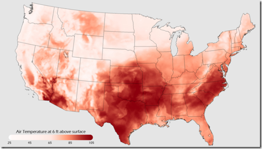
13 Jul 2011We’re Having a Heat Wave…
12 Jul 2011Most of the US is quite warm today. This map is from NOAA which maintains the Environmental Visualization Laboratory, which is chock full of cool maps and data and worth exploring.
Dude, Where’s My Job?
In: Employment US Economy
12 Jul 2011Nice timeline from the WSJ tracing cumulative job losses and gains. The related article does a good job of explaining what’s going on.
Space Shuttle Histories
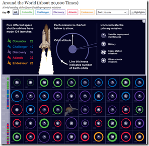
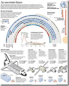
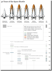
7 Jul 2011An assortment of cool graphics charting the history of the space shuttle. I watched a launch in person back in 1989 – it was awesome.
Bonus: HD video compilation of launches from different angles:
Car Color Preferences
In: Culture
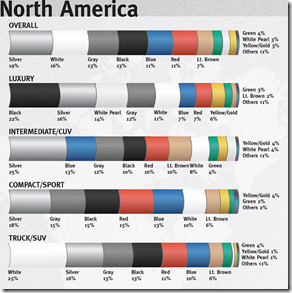
7 Jul 2011I’ve never understood why car colors are so boring. Here’s a related article from Road and Track.
More detail on just North America (the #’s vary because they are from different years)
Evolution of the Map of Africa (1554-1880)
7 Jul 201111 maps showing the evolution of what we thought Africa looked like. Personally, I’m fairly impressed by quickly they had it figured out. By the way, the site where I found this: www.howtobearetronaut.com is fantastic.
For comparison, here is Google’s satellite version, which I suppose is cheating:
Too Big to Fail
30 Jun 2011A pretty comprehensive explanation of the financial crisis. (via The Big Picture)
Map: Geographic Income
28 Jun 2011National Geographic mashed together income-level and population distribution to make this beautiful map.
Dwindling Food Variety
28 Jun 2011a study conducted in 1983 by the Rural Advancement Foundation International … compared USDA listings of seed varieties sold by commercial U.S. seed houses in 1903 with those in the U.S. National Seed Storage Laboratory in 1983. The survey, which included 66 crops, found that about 93 percent of the varieties had gone extinct.
Overworked America
In: Employment
28 Jun 2011Evolution of Alphabets
In: History Innovative
27 Jun 2011Animated evolution of the Latin character set from Phonecian. Other timelines are available.
God and Other Internet Searches
In: Culture Internet/tech
27 Jun 2011Believe it or not, when I title my posts, I do occasionally try to show mercy to my readers who are already skittish about browsing “chartporn.org” from work. This is one of those times. You’re welcome.
I like that they normalized the results to account for volume.
Mortgage Denial Rates
In: Housing Interactive Maps
27 Jun 2011Percent of mortgage applications that were denied in 2010. “In all, the nation’s 10 largest mortgage lenders denied 26.8% of loan applications in 2010, an increase from 23.5% in 2009.”
Slayer Dashboard
In: Culture
24 Jun 2011You have to love any graph that has “in percent of evil” as an axis – part of an amusing dashboard analyzing how “evil” Slayer albums and songs are, based on how often the lyrics reference blood, death, evil, heil, kill, satan, and war.
Update: Economic Indicators Dashboard
23 Jun 2011My favorite economic status tool. Point and/or click on anything and everything to learn something new about the economy, and why you should care.
What is Chart Porn?
An addictive collection of beautiful charts, graphs, maps, and interactive data visualization toys -- on topics from around the world.
Categories
- Bailout (118)
- Chartporn Related (3)
- Commentary (21)
- Culture (669)
- Emerging Markets (66)
- Employment (245)
- Environment/weather (133)
- Finance (298)
- Food (92)
- Global Economy (373)
- Graphic Design (bad) (26)
- Graphic Design (general) (183)
- Graphic Tools (23)
- History (158)
- Housing (162)
- Humor (204)
- Innovative (183)
- Interactive (545)
- Internet/tech (97)
- Maps (578)
- News Media (34)
- Politics (329)
- Reference (97)
- Science (331)
- Source: Economist (101)
- Source: FT (92)
- Source: NYT (147)
- Source: Ritholtz (76)
- Source: USA Today (27)
- Source: Washington Post (90)
- Source: WSJ (135)
- Sports (58)
- Stock Market (74)
- Uncategorized (2)
- Updated regularly (76)
- US Economy (553)
- Video (22)
- Aram Korevaar: This chart is now being used as a projection in which countries such as China see themselves as in a [...]
- David: Welcome back Chart Porn! [...]
- J S: Thanks for the great story. Miss reading this blog. Hope to see you more active again. [...]
- jake: I lived in a DC row house for 6 years, and I'm writing this comment from my tiny 1 bedroom apartment [...]
- ronny pettersen: Hilarious and unfortunately accurate... ;-) [...]


