Maps Archive:
State Budget Crises
In: Interactive Maps Politics Source: Washington Post US Economy
26 Apr 2011The Washington Post has mapped out a bunch of interesting stats concerning States’ Budget problems: shortfalls, pension liabilities, proposed cuts (health care, education, etc), and who is in charge. To sum up: this is yet another way we’re screwed beyond belief. (related article)
How Healthy is Your Housing Market?
In: Housing Interactive Maps
18 Apr 2011Trulia maps out some cool housing price stats: The number of days a listing is on the market before they lower the price, how much they lower it, and the probability it will be lowered again – all by zip code. (via)
This is in addition to Trulia’s existing housing dashboard and heat maps, which are nifty as well:
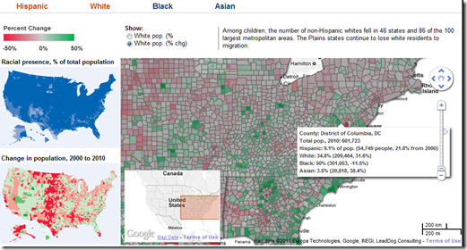
Where’s Whitey? Census 2010
In: Culture Interactive Maps
11 Apr 2011Interactive map that lets you explore America’s changing demographics by race, as well as the overall population movement between regions:
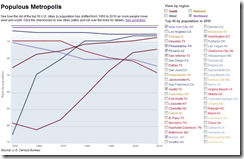
The below chart lets you compare metropolitan shifts across major cities (though it’s by ranking, which is a little odd):
Patchwork Nation
28 Mar 2011Patchwork Nation tracks a number of traditional economic and social indicators over time – but they also include some interesting alternative ones:
US Eugenical Laws
28 Mar 2011The map below shows which states had pro-sterilization laws back in 1935, and the number of “operations” in each. Want to know who the government deemed ineligible to breed? – browse this scary-ass book from 1922. Not feeling that brave? — the wikipedia entry will give you the practical bits.
The Gentrification of Washington DC
25 Mar 20112010 census data illustrates the gradual gentrification of DC – the city that was 70 percent black in the 1970s is now estimated at less than 50 percent. Heck, from 1990-2010 rising housing costs chased ME across town from Georgetown to Mount Pleasant to Capitol Hill. The related article has some interesting details.
There are also two interactive versions:
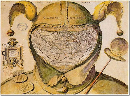
World Map Drawn on a Fool’s Head
21 Mar 2011Just a beautiful map. From around 1590. Interestingly, nobody knows who created it and it is interpreted as a sort of 16th century commentary/protest. (alternate high def link)
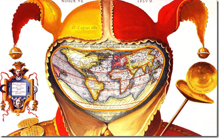
digging around I found this version as well:
The legend in the left panel reads: “Democritus of Abdera laughed at [the world], Heraclitus of Ephesus wept over it, Epichtonius Cosmopolites portrayed it” (3). Over the cap is the Latin version of the Greek dictum, “Know thyself” (4). Across the cap’s brow, the inscription translates as “O head, worthy of a dose of hellebore” (5).
The Latin quote just above the map is from Pliny the Elder (6): “For in the whole universe the earth is nothing els e and this is the substance of our glory, this is its habitation, here it is that we fill positions of power and covet wealth, and throw mankind into an uproar, and launch wars, even civil ones.”
The reason for so much trouble and strife is explained in the quote below the map, from Ecclesiastes: “The number of fools is infinite” (7). Another quote from that most depressing of Bible books, on the jester’s staff to the right, intones: “Vanity of vanities, all is vanity” (8). Inscribed on the badges adorning the shoulder belt are a few sayings in line with this cheerful message: “Oh, the worries of the world; oh, how much triviality is there in the world” (9), “Everyone is without sense” (10), and “All things are vanity: every man living” (11).
For some researchers, the sum of these messages, as well as their presentation in a cartographic setting, point to a little-known Christian sect called the Family of Love. This clandestine group is said to have numbered the Flemish cartographer Ortelius in its ranks. If this map is anything to go by, the Family of Love must have espoused a rather harsh and pessimistic view of the world, and of humanity’s place in it. (Source)
Nuclear Fear Mongering
19 Mar 2011Ughhh. Type in your zip code and see how close you are to a nuclear plant!! There’s even a red target painted on the reactor!!! I’m primarily posting this so I have an excuse to link to this excellent article, which explains in detail what’s going on in Japan and why you shouldn’t run out to buy potassium pills and start digging a fallout shelter. I might also point out that we conducted 140+ atmospheric atomic tests in Nevada – I’m not saying that was a particularly intelligent or healthy thing to do, but let’s maintain a little perspective about fallout risks, shall we?
Hipmunk Hotels
In: Innovative Maps Reference
18 Mar 2011I’ve praised Hipmunk’s slick airline reservation interface before. Now they’ve added hotels – and it’s awesome. Besides mapping out locations and allowing filtering on prices and amenities, you can also overlap heatmaps for food, tourism, shopping, nightlife, and “vice”. The map below is for Washington DC’s nightlife, and is pretty damn accurate.
Atomic Atlas
17 Mar 2011The FT has created two maps of the world’s nuclear power plants. The first is a fairly comprehensive collection of information on distribution, types, and history:
The second is an interactive googlemaps-based version which locates operating, under construction, planned, and shut down plants. (related article)
College Degrees (1940-2009)
12 Mar 2011An interactive map of adults with college degrees. Filter by race or income or drill down to your county. I’m not sure if it’s more surprising that it went from 4.6% to 27.5%, or that we’re only at 27.5% today. How long do you suppose before someone puts this next to a red/blue state map? (via Sociological Images)
1940 vs 2009:
Where are the Happiest People in America?
7 Mar 2011Gallup surveyed Americans on 20 different quality of life indicators (stress, depression, health problems, job satisfaction, exercise, etc), and the New York Times threw them all on a map for contemplation. Below is the composite “Well-Being index”. Thanks to Allison Stanfill for the link! (related article)
Gallup’s website compares the indicators over time:
A similar Gallup index of “US Satisfaction” was also recently visualized by Good:
London’s Ghost Tube Stations
In: Maps
24 Feb 2011Most Americans Don’t Have Passports
24 Feb 2011Only 30 percent of Americans have passports. The differences by state are about what you would expect (because of income, proximity to border, and small-mindedness). None of the states are very high – New Jersey was the highest, with just under 46%. (via)
Tahrir Square: Spontaneous Community
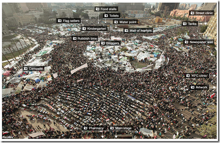
14 Feb 2011This interactive photo-map of Tahrir Square from the BBC highlights the creative ways the community organized itself, from news to medical care to flag merchants.
What is Chart Porn?
An addictive collection of beautiful charts, graphs, maps, and interactive data visualization toys -- on topics from around the world.
Categories
- Bailout (118)
- Chartporn Related (3)
- Commentary (21)
- Culture (669)
- Emerging Markets (66)
- Employment (245)
- Environment/weather (133)
- Finance (298)
- Food (92)
- Global Economy (373)
- Graphic Design (bad) (26)
- Graphic Design (general) (183)
- Graphic Tools (23)
- History (158)
- Housing (162)
- Humor (204)
- Innovative (183)
- Interactive (545)
- Internet/tech (97)
- Maps (578)
- News Media (34)
- Politics (329)
- Reference (97)
- Science (331)
- Source: Economist (101)
- Source: FT (92)
- Source: NYT (147)
- Source: Ritholtz (76)
- Source: USA Today (27)
- Source: Washington Post (90)
- Source: WSJ (135)
- Sports (58)
- Stock Market (74)
- Uncategorized (2)
- Updated regularly (76)
- US Economy (553)
- Video (22)
- Aram Korevaar: This chart is now being used as a projection in which countries such as China see themselves as in a [...]
- David: Welcome back Chart Porn! [...]
- J S: Thanks for the great story. Miss reading this blog. Hope to see you more active again. [...]
- jake: I lived in a DC row house for 6 years, and I'm writing this comment from my tiny 1 bedroom apartment [...]
- ronny pettersen: Hilarious and unfortunately accurate... ;-) [...]


