Internet/tech Archive:
Awesome Website Flowchart
In: Humor Internet/tech
13 Jun 2011Do you have an excellent idea for a website? This flowchart will tell you whether you have everything you need to make it a reality. (posted by digital talent agency Vitamin T – which explains all the web developer brown nosing – hehe.)
How to Respond to Blog Posts
In: Internet/tech
18 May 2011A well thought out flowchart from the US Air Force on communication strategies for responding to blog posts and comments.
Pharmaceutical company Pfizer adapted the Air Force’s version for their own use:
Either of which are preferable to the the instinctual response:
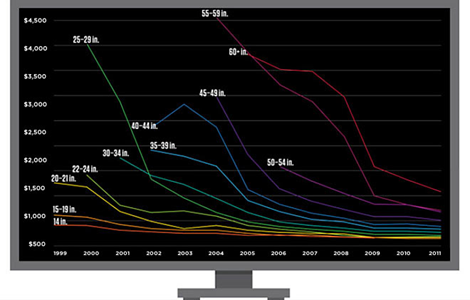
Falling Flatscreen Costs
In: Internet/tech Science
11 May 2011Bin Laden’s Death Causes Record Tweets
In: Culture Internet/tech
3 May 2011Over 5000 per second. (via)
Less depressing, the same flickr feed also has cool video of tweets per second on New Year’s Eve 2010 – you can watch midnight travel around the globe.
Gartner’s Magic Magic Quadrant
In: Humor Internet/tech
1 Apr 2011Gartner regularly maps out technology markets’ competitiveness – with one quadrant on their chart being “magic”. Well, this time they’ve mapped out Magicians. Thanks to Linda Smith for the link!
Groupon Revenue Deal by Deal
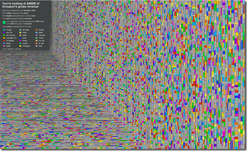
18 Mar 2011$480 million of revenue. Each box is a Groupon deal. The colors identify the city. Width (price) times height (number sold) equals area (revenue). Roll over any deal to see what it was for — lots of weird stuff in there.
What People are Liking on Facebook
In: Culture Internet/tech
11 Mar 2011Yahoo labs examined over 40 million likes on 45 different news/blog sites to see what people are interested in. The most popular article: “Why Chinese Mothers are Superior”; “New Zodiac Signs” was #2. Yes, this means our civilization is doomed, but in the meantime there are some interesting findings about articles’ social popularity and lifespans, and recommendations for more efficient social marketing (barf). Below are word clouds for the New York Times and Engadget – colors indicate how many likes the word received, size indicates how many articles the word appeared in. They have similar clouds for 27 different sites. (via Data Pointed)
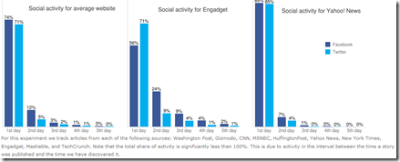
Chart of average article social lifespans:
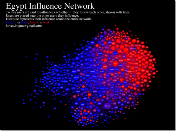
Egypt Twitter Network
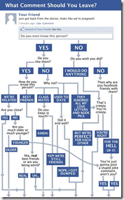
16 Feb 2011Facebook Comment Flowchart
4 Feb 2011Profane Twitter
In: Culture Internet/tech Maps
23 Jan 2011Daniel Huffman filtered 1.5 million tweets from March and April 2010 and mapped the rate of profanity across America. (via; note: the link below is to a 12mb pdf file)
The Media Universe
14 Jan 2011It’s surprising to me how often the organizations who create the data are so rarely the ones who take the time to visualize it properly <cough! US Government Cough!>. However in the below example TV habit watchdog nielsen has done a fine job of summing up the television and mobile phone markets. (via)
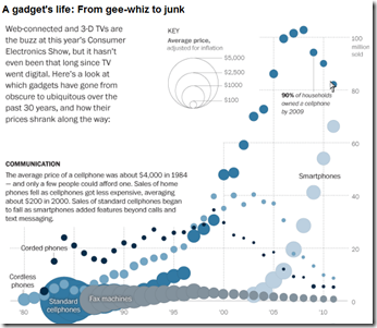
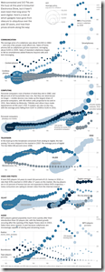
A very cool look at the cost and popularity of gadgets since the 1980s – covering phones, computers, TV, video, and audio. You can clearly see the “digital revolution” start around 2000, killing off earlier technologies; it’s also interesting to see the cost of any gizmo fall over time (the circles get smaller). By Alicia Parlapiano for the Washington post. (related article)
Facebook vs Twitter 2010
4 Jan 2011I usually try to avoid Facebook/Twitter infographics because 1) there are too damn many of them; 2) they don’t convey much information; and 3) most of them are badly designed. The one below manages to convey some very interesting comparative information, but I can’t help but think it could be better. Perhaps separating out each indicator so they can be compared side by side instead of constantly jumping back and forth between the two circles? Is this a good example of how graphic designers have to choose between aesthetics and ease of use? Anyone want to take a crack at a do-over?
The Bermuda Triangle of Productivity
In: Humor Internet/tech Maps
23 Dec 2010Forget all those “TOP TEN” lists, this pretty much sums up 2010 for me. (via)
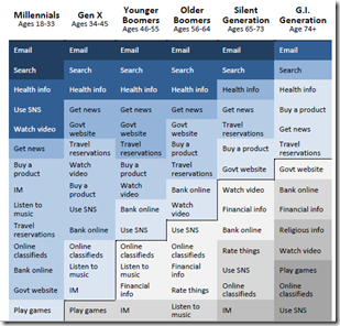
How Different Generations Use the Internet
In: Culture Internet/tech
16 Dec 2010Based on Pew Internet’s 2010 Generations report. (via; Thanks to Rebecca Southers for the link)
What is Chart Porn?
An addictive collection of beautiful charts, graphs, maps, and interactive data visualization toys -- on topics from around the world.
Categories
- Bailout (118)
- Chartporn Related (3)
- Commentary (21)
- Culture (669)
- Emerging Markets (66)
- Employment (245)
- Environment/weather (133)
- Finance (298)
- Food (92)
- Global Economy (373)
- Graphic Design (bad) (26)
- Graphic Design (general) (183)
- Graphic Tools (23)
- History (158)
- Housing (162)
- Humor (204)
- Innovative (183)
- Interactive (545)
- Internet/tech (97)
- Maps (578)
- News Media (34)
- Politics (329)
- Reference (97)
- Science (331)
- Source: Economist (101)
- Source: FT (92)
- Source: NYT (147)
- Source: Ritholtz (76)
- Source: USA Today (27)
- Source: Washington Post (90)
- Source: WSJ (135)
- Sports (58)
- Stock Market (74)
- Uncategorized (2)
- Updated regularly (76)
- US Economy (553)
- Video (22)
- Aram Korevaar: This chart is now being used as a projection in which countries such as China see themselves as in a [...]
- David: Welcome back Chart Porn! [...]
- J S: Thanks for the great story. Miss reading this blog. Hope to see you more active again. [...]
- jake: I lived in a DC row house for 6 years, and I'm writing this comment from my tiny 1 bedroom apartment [...]
- ronny pettersen: Hilarious and unfortunately accurate... ;-) [...]


