Internet/tech Archive:
Browser Market Share
24 Jan 2012Aesthetically this is obviously quite nice. The roll-over data is snappy quick. The color selection is clear and intuitive. But there’s something about these nested arc charts that I just don’t like – they don’t seem like a very good way to illustrate historical data. It was created as a simple example of the Axiis data visualization framework – which offers several other Flex based graphic tools. (Hat tip to Ryan C for sending this along!)
Manual Photography Cheat Sheet
In: Internet/tech
23 Jan 2012A brilliant chart of computer sales. Note the log scale!
There’s also an animated version (but I like the static one better):
Here’s a look at the same data in terms of market share:
(via Ritholtz)
4.74 Degrees of Separation
In: Culture Internet/tech
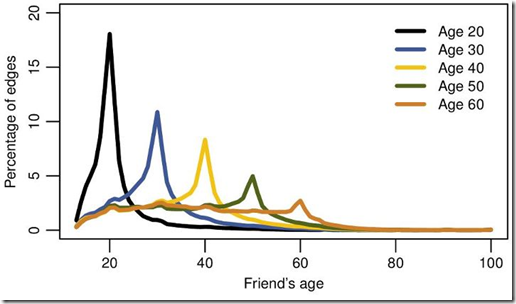
22 Nov 2011New research by Facebook based on user friends, reveals that there are not 6 degrees of separation between you and everyone else – but only 4.74. Other interesting tidbits: the distance is shrinking: in 2008 it was 5.28. If you just look at the United States, it’s only 4.
… 84% of all connections are between users in the same country. We also find that people tend to have a similar, albeit typically smaller, number of friends as their neighbors, and tend to be about the same age.
European Twitter Languages
2 Nov 2011Eric Fischer analyzed twitter meta data for location and language and ended up with a pretty good approximation of the normal geopolitical borders. He chose grey for English, since they speak that everywhere – it would be interesting to see a map of just English. There’s also a world version. (via FlowingData)
Google Ripples
In: Internet/tech
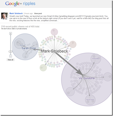
1 Nov 2011Ripples is a new visualization feature of Google+ which shows the propagation of posts across different users. Circles within circles indicate resharing. The easiest way to see this is to go into your Google+ stream, select “What’s Hot” from the list on the left, then click on the little arrow in the right hand corner of any post and select “view ripples”. You can click on a timeline at the bottom and watch the post spread, and also see some summary stats about influencers. (and yes, none of my friends are using Google+ much either, which is why this only looks good on public “what’s hot” posts)
What’s in a Tweet
3 Oct 2011Even though the “content limit” is only 140 characters, each tweet actually contains a crazy amount of meta-data. (related Economist article; via The Big Picture)
Proof That Mondays Suck
30 Sep 2011Cornell researchers analyzed mood content in 2.4million tweets (based on word choice) and found that Saturdays and Sunday garnered the most positive expressions and Mondays the most negative – well, during the day anyway. Interestingly, Saturday and Sunday nights were way up (down) there too. On a design note, perhaps the lower graph should have inverted the scale? (related article)
US State Budget Gaps
In: Finance Interactive Internet/tech Politics Source: FT US Economy
27 Sep 2011What is shocking to me is that there are 12 states with no shortfall.
Note: Some Financial Times features require a subscription.
Should You Argue on the Internet?
In: Humor Internet/tech
5 Aug 2011Top 20 Google Keywords
In: Internet/tech
23 Jul 2011If you care about SEO, this is kind of interesting. Personally, I think it’s a chart of which industries are clearly taking too much money out of our pockets if they can afford to pay that much per click. I’d love to suggest we all click on every insurance ad we see just to stick it to them – but they’d probably just raise our rates to makes up the difference. (via)
The Tech Company Web
In: Internet/tech
22 Jul 2011Interesting chart of how companies, employees, and acquisitions are all intertwined in the tech industry. Pay attention to which way the arrows are pointing (they look just like lines at first).
(via)
God and Other Internet Searches
In: Culture Internet/tech
27 Jun 2011Believe it or not, when I title my posts, I do occasionally try to show mercy to my readers who are already skittish about browsing “chartporn.org” from work. This is one of those times. You’re welcome.
I like that they normalized the results to account for volume.
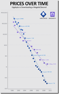
Storage vs Bandwidth (1986-2012)
In: Internet/tech
23 Jun 2011Interesting history of falling hard drive price and internet bandwidth costs. It is the bottoming out of these graphs that is making cloud computing possible. Thanks to David V. for the link!
What is Chart Porn?
An addictive collection of beautiful charts, graphs, maps, and interactive data visualization toys -- on topics from around the world.
Categories
- Bailout (118)
- Chartporn Related (3)
- Commentary (21)
- Culture (669)
- Emerging Markets (66)
- Employment (245)
- Environment/weather (133)
- Finance (298)
- Food (92)
- Global Economy (373)
- Graphic Design (bad) (26)
- Graphic Design (general) (183)
- Graphic Tools (23)
- History (158)
- Housing (162)
- Humor (204)
- Innovative (183)
- Interactive (545)
- Internet/tech (97)
- Maps (578)
- News Media (34)
- Politics (329)
- Reference (97)
- Science (331)
- Source: Economist (101)
- Source: FT (92)
- Source: NYT (147)
- Source: Ritholtz (76)
- Source: USA Today (27)
- Source: Washington Post (90)
- Source: WSJ (135)
- Sports (58)
- Stock Market (74)
- Uncategorized (2)
- Updated regularly (76)
- US Economy (553)
- Video (22)
- Aram Korevaar: This chart is now being used as a projection in which countries such as China see themselves as in a [...]
- David: Welcome back Chart Porn! [...]
- J S: Thanks for the great story. Miss reading this blog. Hope to see you more active again. [...]
- jake: I lived in a DC row house for 6 years, and I'm writing this comment from my tiny 1 bedroom apartment [...]
- ronny pettersen: Hilarious and unfortunately accurate... ;-) [...]


