Innovative Archive:
Typographic Maps
In: Innovative Maps
28 Apr 2011Gorgeous city maps constructed only using words. Prints are available for Washington DC, NYC, San Francisco, Boston and Chicago. I love these. In fact, I just ordered one.
Human Development Index Tree
27 Apr 2011Visualization of several United Nations indices on education, income, and health. I’m not quite sure what the point of using a “tree” is, but they obviously put some thought into it: The height of the tree trunk is proportional to the total value of the HDI. The size of the three branches are proportional to each sub-indicator. The branches are ordered in increasing order from left to right. The color of the trunk is the average of the color of the components.
Here’s a tree “legend”:
and a comparison of the United States and China:
Geologic Time
In: History Innovative
5 Apr 2011There have been a number of beautiful attempts to diagram geologic time.
Interactive timeline from the Smithsonian:
ezViz Desktop BI Tool
29 Mar 2011I receive a lot of emails asking what tools can be used to move past excel and create cool charts. Well, here’s one: ezViz is a very affordable ($79) desktop data visualization analysis tool that has many of the same cool features as much more expensive products such as Tableau and Spotfire. Starting with an excel spreadsheet you can easily assign variables to chart attributes, filter, and drill down through your data. Chart types include heatmaps, scatter bubbles, maps, and surface plots, among others. Watch the video and read the manual to see some of the nifty features included. Tableau and Spotfire are awesome and more powerful products, obviously, but they have priced themselves so far out of the reach of researchers and analysts that it’s nice to see a product like this fill in the gap a little.
The Wonderful Work of Karl Hartig
In: Culture Employment Finance Graphic Design (general) History Innovative Politics Science US Economy
22 Mar 2011Karl Hartig was creating beautiful complex data visualizations back when most of us “graphics experts” were still trying to figure out how to change colors in excel. Here is a selection of his work on population, electronics, energy, stocks, immigration, politics, and music. Soak it up!
Groupon Revenue Deal by Deal
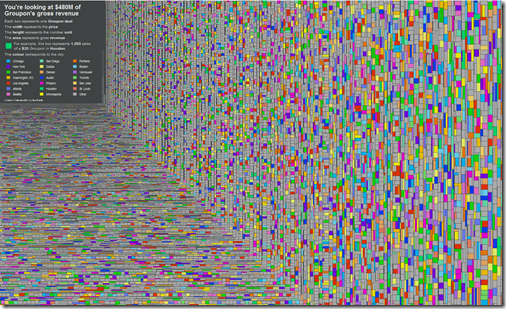
18 Mar 2011$480 million of revenue. Each box is a Groupon deal. The colors identify the city. Width (price) times height (number sold) equals area (revenue). Roll over any deal to see what it was for — lots of weird stuff in there.
Hipmunk Hotels
In: Innovative Maps Reference
18 Mar 2011I’ve praised Hipmunk’s slick airline reservation interface before. Now they’ve added hotels – and it’s awesome. Besides mapping out locations and allowing filtering on prices and amenities, you can also overlap heatmaps for food, tourism, shopping, nightlife, and “vice”. The map below is for Washington DC’s nightlife, and is pretty damn accurate.
Weather Porn
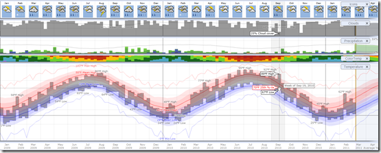
10 Mar 2011Weatherspark allows you to explore the entire historical record of more than 4,000 weather stations around the globe, using a variety of beautifully interactive graphs. Sites like this make me so click-happy – everything is so smooth and well-executed I can’t stop playing with all the options just to see what happens. Try drilling down from annual to daily data, for example, and watch how everything dynamically rescales. (via)
Here is Washington, DC 2009-11:
Movie Barcode Art
In: Culture Innovative
9 Mar 2011Moviebarcode takes each frame of a movie, stretches it out vertically, then squashes them all together into a uniform block. I’ve read some criticism of these for not conveying much useful information (true), but I think they have value from an aesthetic point of view — particularly when comparing them to each other.
Case-Shiller as Rollercoaster (1890-2010)
In: History Housing Innovative
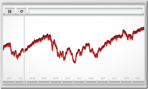
8 Mar 2011View the inflation adjusted Case-Shiller home price index as if you were riding the chart on a roller coaster. An update of the classic version from Speculative Bubble (that only went through 2007).
Dow Jones 2010, in Music
7 Mar 2011No it’s not a musical. Artist Bard Edlund’s “Dow Piano” translates the performance of the Dow each day onto a three octave scale, and adjusts the volume of each note according to trading volume. I guess instead of data visualization we could call this data audioization – or we could just call it cool.
Budget Forecasts vs Reality
2 Mar 2011This is from 2010, but I wanted to post it because it’s an excellent way to visualize the quality of economic projections. The New York Times refers to it as a “porcupine” chart.
Human Charts
In: Culture Innovative
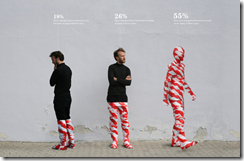
9 Feb 2011Taking a more artistic approach to chart design, artist Peter Ørntoft explored the results of an opinion poll on various Danish social topics with striking photographs. (via)
Movie Sequels: Better or Worse Than Original?
In: Culture Innovative
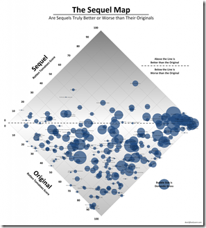
16 Jan 2011Using crowd-sourced ratings from Rotten Tomatoes, this chart puts the original movies on one axis and the sequels on the other. At first the 45 degree rotation threw me off, but the more I stared at it, the more I liked it. It would be interesting to color the circles by decade – I think I see some groupings of bad choices.
Bloodwork Results Re-Visualized
In: Innovative Science
24 Dec 2010Information is Beautiful won a Wired contest to re-design the standard medical bloodwork test results – you know, so you could actually understand what they meant. The result is much easier to understand.
 | to |  |
What is Chart Porn?
An addictive collection of beautiful charts, graphs, maps, and interactive data visualization toys -- on topics from around the world.
Categories
- Bailout (118)
- Chartporn Related (3)
- Commentary (21)
- Culture (669)
- Emerging Markets (66)
- Employment (245)
- Environment/weather (133)
- Finance (298)
- Food (92)
- Global Economy (373)
- Graphic Design (bad) (26)
- Graphic Design (general) (183)
- Graphic Tools (23)
- History (158)
- Housing (162)
- Humor (204)
- Innovative (183)
- Interactive (545)
- Internet/tech (97)
- Maps (578)
- News Media (34)
- Politics (329)
- Reference (97)
- Science (331)
- Source: Economist (101)
- Source: FT (92)
- Source: NYT (147)
- Source: Ritholtz (76)
- Source: USA Today (27)
- Source: Washington Post (90)
- Source: WSJ (135)
- Sports (58)
- Stock Market (74)
- Uncategorized (2)
- Updated regularly (76)
- US Economy (553)
- Video (22)
- Aram Korevaar: This chart is now being used as a projection in which countries such as China see themselves as in a [...]
- David: Welcome back Chart Porn! [...]
- J S: Thanks for the great story. Miss reading this blog. Hope to see you more active again. [...]
- jake: I lived in a DC row house for 6 years, and I'm writing this comment from my tiny 1 bedroom apartment [...]
- ronny pettersen: Hilarious and unfortunately accurate... ;-) [...]

