Logo Colors
24 Oct 2013While we’re talking about logos… do you agree with these color categories? Some of these brands are quite old. What came first, the color or the emotion?

Hidden Logo Messages
24 Oct 2013Some fascinating stuff in here. (And yes, I know these aren’t charts, but I like to also post on interesting graphic design issues.) (via)
Do you see “MOM”?

The arrow in FedEx?

The bear in Toblerone?

I have no idea why I never noticed the 31 before. it’s pretty obvious.

Want more? Google “hidden logos”.
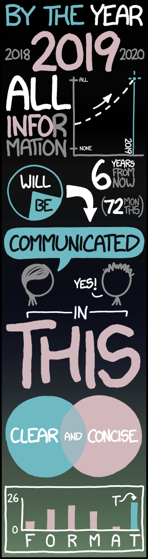
I Hate These
23 Oct 2013I receive dozens of these on a daily basis – almost all absent interesting content or useful information. xkcd sums it up:
HOT HOT HOT
23 Oct 2013Climate change will not impact everywhere at the same time. The below map estimates when the average temperature of the coolest year will exceed the historic average hottest year. What does this mean? Besides that we’re all screwed, you may wish to reconsider your tropical retirement plans. (related article)

And the original study also has some nice visualizations:
Obama’s $6 Trillion of Debt
In: Politics US Economy
17 Oct 2013I try to stay out of most political debates, but I want to toss a chart out to add a little perspective on the “Obama has added $6 Trillion of debt” talking point.
Check out the below chart (created in about 20 seconds using the awesome free St. Louis Fed online data tools).

The gap between the red and blue lines in each year is our deficit – that’s how much we need to borrow to keep the government running. The sum of all those deficits equals our debt. Make sense?
The rate of expenditure (red line) has been increasing pretty steadily no matter who has been president.
What has really been changing, obviously, is revenue (the blue line): first from the Bush tax cuts (2001-03), and then the recession (2008-2010; because less GDP = less tax revenue).
If you look at the end of the red line you’ll see that spending has been leveling out the past two years – for the first time in a long time. Also, revenue is increasing. We are starting down the path to fiscal recovery. We probably should be patting ourselves on the back a little, but of course no one wants to give either party any credit for this.
Personally I think we can cut expenditures AND increase revenues to close that gap (and turn it into a surplus), but nobody wants to have an adult conversation about that – thus the childlike brinkmanship and finger pointing.
Raw: a Vector Visualization Tool
15 Oct 2013Raw is a pretty cool (and free!) online tool for creating vector outputs of uncommon visualizations. You copy and paste your data, select a few options, and it cranks out the visualization. What’s so nice is that it doesn’t stop there – you can then save it in svg output, and then take that into Illustrator or other vector editing software for finishing touches. It’s nice to see free tools that understand that some users need professional quality outputs. Of course, you can also just download a PNG version and throw it up on the web if you want.
The speed at which it generates the charts is also pretty impressive considering the complexities.
Treemaps with adjustable colors, size, etc:

Alluvial charts:

Dendrograms:

Circular dendrograms:

Scatter, bubble, and packed circle charts:


and Binned hexagons:

The accuracy of this is discussed over at Economist Do It With Models.

The Science Behind Data Visualization
16 Sep 2013How does your brain process visual information and relationships? Read this article to begin to understand it.


Here’s a related article on the topic by Stephen Few that you might find interesting.
And a walk-through example of why this is important by Cole Nussbaumer.
How a Car Engine Works
In: Internet/tech Science
16 Sep 2013Beautiful annotated animation of how gas engines work. Check out the full size version by Jacob O’Neal.

Map of Europe (1000AD to today)
16 Sep 2013Pretty crazy how many changes happened in the last 1000 years, compared to the (relative) stability of recent history.
Great video describing some of the technologies that go into making the live coverage meaningful. (via TechCrunch)
All by the same company that brings you those first down lines, strike zones, and nascar labels.
Animated Infographic
29 Aug 2013I have to given them credit, although this is essentially still just linkbait content-wise, the animated presentation of the information is innovative and really does keep your attention. Well done. This almost needs a new name: storygraphic?

16 Useless Infographics
28 Aug 2013Compiled over at the Guardian with the correct amount of snark:

Chart of Electromagnetic Radiations
In: Science
22 Aug 2013A beautiful classic from 1944:

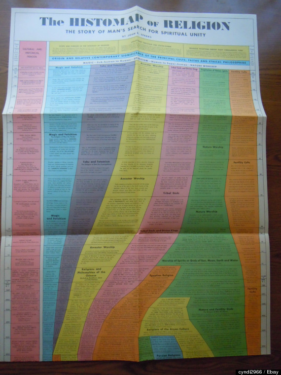
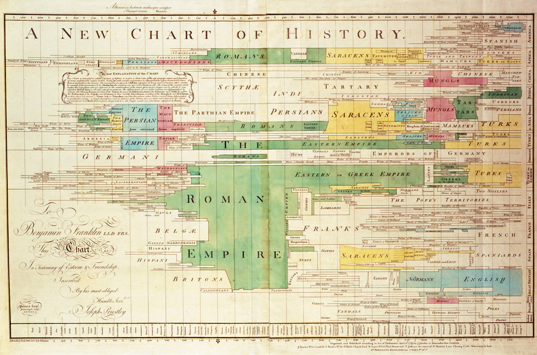
Timeline Maps
21 Aug 2013I like these vintage history maps. They are nice and information dense, and you can almost smell your old school when you look at them.


Below is the hard to find “Histomap of Religion” which recently sold online for $405.
Here’s the 1881 “Synchronological Chart of Universal History” which is one of the best chart titles of all time, and stretched 23 feet long.

![]()


What is Chart Porn?
An addictive collection of beautiful charts, graphs, maps, and interactive data visualization toys -- on topics from around the world.
Categories
- Bailout (118)
- Chartporn Related (3)
- Commentary (21)
- Culture (669)
- Emerging Markets (66)
- Employment (245)
- Environment/weather (133)
- Finance (298)
- Food (92)
- Global Economy (373)
- Graphic Design (bad) (26)
- Graphic Design (general) (183)
- Graphic Tools (23)
- History (158)
- Housing (162)
- Humor (204)
- Innovative (183)
- Interactive (545)
- Internet/tech (97)
- Maps (578)
- News Media (34)
- Politics (329)
- Reference (97)
- Science (331)
- Source: Economist (101)
- Source: FT (92)
- Source: NYT (147)
- Source: Ritholtz (76)
- Source: USA Today (27)
- Source: Washington Post (90)
- Source: WSJ (135)
- Sports (58)
- Stock Market (74)
- Uncategorized (2)
- Updated regularly (76)
- US Economy (553)
- Video (22)
- Aram Korevaar: This chart is now being used as a projection in which countries such as China see themselves as in a [...]
- David: Welcome back Chart Porn! [...]
- J S: Thanks for the great story. Miss reading this blog. Hope to see you more active again. [...]
- jake: I lived in a DC row house for 6 years, and I'm writing this comment from my tiny 1 bedroom apartment [...]
- ronny pettersen: Hilarious and unfortunately accurate... ;-) [...]