Sometimes a Speech is Better
19 Nov 2013In honor of the 150th anniversary of an awesome speech, here’s the powerpoint version by Peter Novig:


Richie Rich
11 Nov 2013Where are people with the highest incomes and most education living? Here’s a map:


The Geography of Pizza
In: Food
7 Nov 2013Nearest pizza parlor chain within a 10 mile radius:

Individually:

But there are other important pizza questions. How much of pizza sales do the chains represent?

How do the sales breakdown?

Who has the most pizza stores? NYC! Oddly, though, Miami has the most per capita.


p.s. – I love pizza. The best pizza in the world is Pontillos.
Top Baby Name by State (1960-2012)
7 Nov 2013

Long term Unemployed
7 Nov 2013I like it. It never occurred to me to use colored lines to differentiate rising and falling values in this type of chart. I would suggest sorting by the change instead of the most recent observation, but I suppose it would depend on the point you were trying to make.

Payback Time for Subprime
6 Nov 2013Settlement and fines for mortgage abuses are starting to add up to real money. Of course, as Matt Taibbi points out, this is still just a drop in the proverbial bucket compared to the related profits and scale of activities that took place.
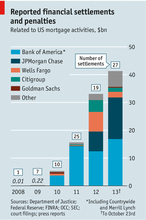
(disclaimer: clever post title pilfered from the Economist)
Gender Gap
In: Culture
6 Nov 2013The Economist created these summary charts of political, economic, health, and education gender gaps based on the WEFs 2013 Global Gender Gap Report.

Infographic Template
6 Nov 2013I like it, but perhaps even the parodies are getting tedious at this point.

Maps Urbane
In: Maps
5 Nov 2013An assortment of somewhat irreverent (but not necessarily inaccurate) maps.


If All the Ice Melted
5 Nov 2013Hypothetical mapping of what coastlines would look like if all the ice in the world melted, raising ocean levels by 216 feet.


DC Gunfire
4 Nov 2013A map of gunshots detected in Washington DC since 2009 using triangulated sonic sensors. The system allows police to be quickly dispatched to within yards of where the guns were fired (though the related article doesn’t go into much detail about whether that leads to catching the shooters).

Keynote ‘13 Sucks
30 Oct 2013
Apple finally released a new version of Keynote last week – and it is terrible.
In an effort to make the ios version of Keynote on ipads/iphones work the same as the OSX version, they removed a lot of features and dumbed down others. I call this “iosification”.
What’s worse, they did not bother to make the software backwards compatible. None of my existing presentations play properly in the new version. Font alignments have changed, slide transitions have disappeared, builds no longer build properly, image and movie adjustments have disappeared, smartbuilds have all been removed, build indicators have been removed, alpha layers no longer function the same, and formatting options previously easily accessed from one context sensitive smart toolbar are now buried in multiple menu pages. I could go on, but that was enough for me to close the program and re-open the old version so I could actually get some work done.
If people only used Keynote for 5th grade book reports, this would not be a big deal. I can see that having portability between the desktop and mobile devices would be nice. However, a lot of professionals use Keynote to produce high quality presentations – pulling together outputs from Photoshop, Illustrator, and After Effects, and data visualization platforms.
I have long suspected that the reason iWork ’09 was not being updated was because they were waiting until the processing capabilities of the mobile platforms were fast enough to run a new unified version. I would have preferred it if they had waited a little longer, instead of lowering the capabilities of the software to the lowest common denominator.
Oh well. There is some hope that Apple will listen to the power user community and restore crippled functionality, like they did after they broke Final Cut Pro back in 2011. In the meantime, I think most experienced users will use the old version, or take a closer look at Powerpoint.
By all accounts, iWork’s word processing software “Pages” has been similarly gelded. (The spreadsheet software “Numbers” has always sucked, so I don’t know if anyone even noticed any changes there.)
If you want to follow the reaction online, check out Apple’s keynote discussion groups:
https://discussions.apple.com/community/iwork/keynote?view=discussions
Update 11/6/13:
Apple has responded to user discontent with plans to re-introduce some of the missing features in the coming months:
http://support.apple.com/kb/HT6049?viewlocale=en_US&locale=en_US
PopChartLab created this compendium of audio recording and playing devices over time. It’s pretty comprehensive. However, I think PopChartLab is on the verge of becoming the Buzzfeed of infocharts: pointless compiled lists of cartoonized objects. Cocktail Chart of Film and Literature?!? Fictional Beers?!? Nebula of NES Games?! Shark jumped.
Going back to the original topic: am I the only who occasionally calls his iPod a “walkman”?


Evolution of Western Dance Music
24 Oct 2013Nicely done. I suspect some people might think that London is given credit for more than it deserves.

Middle Wage Jobs
In: Employment US Economy
24 Oct 2013Jobs that pay from $14-21 have been hit the hardest during the recession.

And low wage jobs make up a lot of the employment recovery. When capital is so subsidized by the government (low interest rates + QE), labor will be less in demand.


What is Chart Porn?
An addictive collection of beautiful charts, graphs, maps, and interactive data visualization toys -- on topics from around the world.
Categories
- Bailout (118)
- Chartporn Related (3)
- Commentary (21)
- Culture (669)
- Emerging Markets (66)
- Employment (245)
- Environment/weather (133)
- Finance (298)
- Food (92)
- Global Economy (373)
- Graphic Design (bad) (26)
- Graphic Design (general) (183)
- Graphic Tools (23)
- History (158)
- Housing (162)
- Humor (204)
- Innovative (183)
- Interactive (545)
- Internet/tech (97)
- Maps (578)
- News Media (34)
- Politics (329)
- Reference (97)
- Science (331)
- Source: Economist (101)
- Source: FT (92)
- Source: NYT (147)
- Source: Ritholtz (76)
- Source: USA Today (27)
- Source: Washington Post (90)
- Source: WSJ (135)
- Sports (58)
- Stock Market (74)
- Uncategorized (2)
- Updated regularly (76)
- US Economy (553)
- Video (22)
- Aram Korevaar: This chart is now being used as a projection in which countries such as China see themselves as in a [...]
- David: Welcome back Chart Porn! [...]
- J S: Thanks for the great story. Miss reading this blog. Hope to see you more active again. [...]
- jake: I lived in a DC row house for 6 years, and I'm writing this comment from my tiny 1 bedroom apartment [...]
- ronny pettersen: Hilarious and unfortunately accurate... ;-) [...]