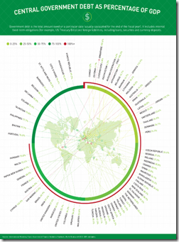
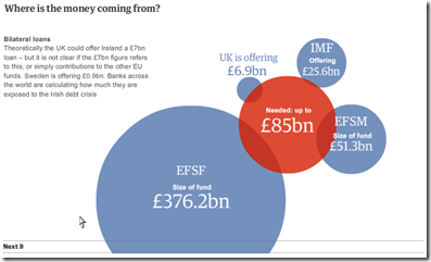
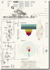
Ok, the content of this chart is nothing new – and the intent is basically linkbait. But the design is fairly intriguing: it’s an exploding map to a badly overlapped radial chart, with categories. It both works and doesn’t work. I love it and hate it at the same time. Bravo!
Some additional entertaining stereotypical cartography. My favorite is “Europe According to the Vatican”. All part of Yanko Tsvetkov’s Mapping Stereotypes project.
Balance the US Budget
30 Nov 2010Another “You Make the Cuts” interactive, this one from the FT. Set your targets, select your cuts, and then see who is affected.
Note: Some FT features require a subscription.
World Bank Data Visualizer
In: Emerging Markets Global Economy History Interactive Reference
30 Nov 2010Graph a wide range of World Development Indicators, gapminder-style, using the World Bank’s Data Visualizer. There is also a trade-related version.
Formula 1
In: Innovative Sports
30 Nov 2010Stunningly beautiful graphics on Formula 1 tracks and races, by Luis Chumpitaz. He even managed to make bilingual diagrams looks good. (Thanks to William Navarro for the link.)
The Ireland Problem
24 Nov 2010Falling TV Subscriptions
22 Nov 2010For the first time since the dawn of cable TV, the number of U.S. households paying for TV subscriptions is falling, marking a potential turning point in the TV business.
Part of a multi-part Washington Post Investigation. Each dot represents a death; word clouds illustrate information on the circumstances, sentencing, and other details.
Airport Security Timeline
In: Politics
21 Nov 2010Italian Justice
21 Nov 2010A beautiful analysis of the Italian criminal system. Seriously, check it out. Why don’t our crime statistics make this much sense?!
American Human Development Index
In: Employment Food Housing Interactive Maps Science US Economy
21 Nov 2010Based on the idea that well-being cannot be measured by GDP alone, the Human Development Index looks at over 100 indicators, which you can explore on maps and charts at the most detailed level, or as aggregates (health, education, income). The chart display does seem to have problems separating out Washington DC, however – since we don’t actually have a congressional district — <sigh>. (via)
The 18th Century’s Internet
21 Nov 2010A very cool video describing Stanford University’s tracking of written letter networks of the 18th century. (Project site; related article; via)
Inflation After the Bubble: US vs Japan
21 Nov 2010I always like these crisis-rebased comparison charts. (via)
Why Get Married?
In: Culture Interactive
18 Nov 2010A recent survey examined changing view and practices on marriage, children, and household composition. This interactive from the Pew Research Center laid it out best:(full poll report)
The below analysis from Time Magazine spells some of the subtler points:

What is Chart Porn?
An addictive collection of beautiful charts, graphs, maps, and interactive data visualization toys -- on topics from around the world.
Categories
- Bailout (118)
- Chartporn Related (3)
- Commentary (21)
- Culture (669)
- Emerging Markets (66)
- Employment (245)
- Environment/weather (133)
- Finance (298)
- Food (92)
- Global Economy (373)
- Graphic Design (bad) (26)
- Graphic Design (general) (183)
- Graphic Tools (23)
- History (158)
- Housing (162)
- Humor (204)
- Innovative (183)
- Interactive (545)
- Internet/tech (97)
- Maps (578)
- News Media (34)
- Politics (329)
- Reference (97)
- Science (331)
- Source: Economist (101)
- Source: FT (92)
- Source: NYT (147)
- Source: Ritholtz (76)
- Source: USA Today (27)
- Source: Washington Post (90)
- Source: WSJ (135)
- Sports (58)
- Stock Market (74)
- Uncategorized (2)
- Updated regularly (76)
- US Economy (553)
- Video (22)
- Aram Korevaar: This chart is now being used as a projection in which countries such as China see themselves as in a [...]
- David: Welcome back Chart Porn! [...]
- J S: Thanks for the great story. Miss reading this blog. Hope to see you more active again. [...]
- jake: I lived in a DC row house for 6 years, and I'm writing this comment from my tiny 1 bedroom apartment [...]
- ronny pettersen: Hilarious and unfortunately accurate... ;-) [...]

