Why Graphic Designers are Hard to Date
13 Dec 2010Foreclosure Delays (2007-2010)
13 Dec 2010This map timeline shows how the average number of days owners spend in delinquency before being foreclosed on has more than doubled since 2007.
Census Map (1910-2010)
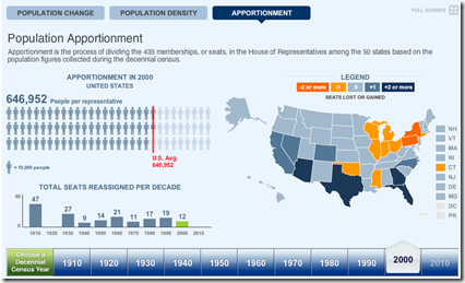
13 Dec 2010The 2010 data isn’t being released until next week, but the Census Bureau has pre-staged a very nice multi-part interactive map displaying state level data and related congressional apportionments from 1910-2010. (thanks to Samantha O’Neil for the link!)
Girl Talk Deconstructed
In: Culture
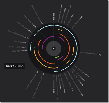
9 Dec 2010Girl Talk’s new mashup album “All Day” is actually quite good (though I sometime wish he had a longer attention span). Tiffany Farrant has deconstructed the samples used in each track into some nifty diagrams.
Map of Metal
In: History Interactive Maps
9 Dec 2010A truly impressive interactive map of Heavy Metal music. Scroll through the decades of genres (separated by chains) from the 60s til today. Click on any skull to read a description and hear related tracks. (Thanks to Michael Lewis for the link!)
\m/
Google Foreclosure Maps
8 Dec 2010If you select map type “More…/Real Estate”, and check “Foreclosure” as the listing type, Google will map out all the foreclosures for you. Every dot in the below map is a foreclosure in the Washington DC region (yikes!).
Obama’s Tax Deal
8 Dec 2010A nice graphic from the Washington Post breaks down the cost components of the tentative agreement, and the projected economic impact.
Floyd Norris presents some interesting data indicating that it was the least expensive homes whose prices went up the most, and are now falling the fastest. Barry Ritholtz sees this as more proof that the bubble was in credit – not housing.
Justin O’Beirne has written up a very nice analysis of what design tweaks make Google maps easier to read than Bing or Yahoo’s. (Thanks to Sean R for the link!)
America’s Health (1990-2010)
In: Interactive Maps Science
7 Dec 2010A nice interactive exploration of America’s health based on 42 different indicators. One minor complaint: There’s no data for Washington, DC (where I live).
Sketchy Santas
4 Dec 2010… the number of Santas available and a parent’s desire to have their children see St. Nick in a timely manner, loosely determines the potential sketchiness of Santas in your area. As demand (D) increases, you can expect a corresponding increase in quantity (Q) or available Santas and the sketchiness (S) of any given Santa. (via)
The Deficit Reduction Commission
3 Dec 2010A clear multi-part description of the recommendations of the National Commission of Fiscal Responsibility and Reform. There are some pretty aggressive changes being proposed. Unfortunately, Congress is unlikely to implement many of them.
History of Social Media (550bc to 2010)
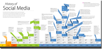
3 Dec 2010A pretty annotated timeline. Not much new here, and it seems a bit redundant to put the date on every cell, considering that they’re organized by column. (via)
Stoning to Death
In: Culture
2 Dec 2010Wow. It turns out that how they stone people to death, according to Islamic Penal Code, is actually much much worse than I had imagined it. Related story. (via)
3G/4G/LTE/WTF?
In: Internet/tech
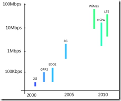
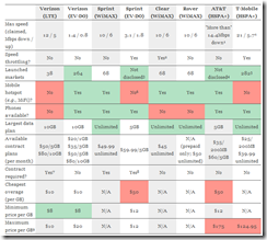
2 Dec 2010You have no doubt seen T-mobile’s ads for it’s new 4G service. But it turns out it’s not really 4G. In fact, nobody really has 4G yet (2) – and T-mobile’s 4G is using the same tech as AT&Ts 3G. And next month Verizon will launch it’s 4gLTE. Make sense? Of course not. The below figures and related articles try to clear things up a bit for both phone and wireless data plans.
What is Chart Porn?
An addictive collection of beautiful charts, graphs, maps, and interactive data visualization toys -- on topics from around the world.
Categories
- Bailout (118)
- Chartporn Related (3)
- Commentary (21)
- Culture (669)
- Emerging Markets (66)
- Employment (245)
- Environment/weather (133)
- Finance (298)
- Food (92)
- Global Economy (373)
- Graphic Design (bad) (26)
- Graphic Design (general) (183)
- Graphic Tools (23)
- History (158)
- Housing (162)
- Humor (204)
- Innovative (183)
- Interactive (545)
- Internet/tech (97)
- Maps (578)
- News Media (34)
- Politics (329)
- Reference (97)
- Science (331)
- Source: Economist (101)
- Source: FT (92)
- Source: NYT (147)
- Source: Ritholtz (76)
- Source: USA Today (27)
- Source: Washington Post (90)
- Source: WSJ (135)
- Sports (58)
- Stock Market (74)
- Uncategorized (2)
- Updated regularly (76)
- US Economy (553)
- Video (22)
- Aram Korevaar: This chart is now being used as a projection in which countries such as China see themselves as in a [...]
- David: Welcome back Chart Porn! [...]
- J S: Thanks for the great story. Miss reading this blog. Hope to see you more active again. [...]
- jake: I lived in a DC row house for 6 years, and I'm writing this comment from my tiny 1 bedroom apartment [...]
- ronny pettersen: Hilarious and unfortunately accurate... ;-) [...]


