Usefulness of Education
In: Employment Humor
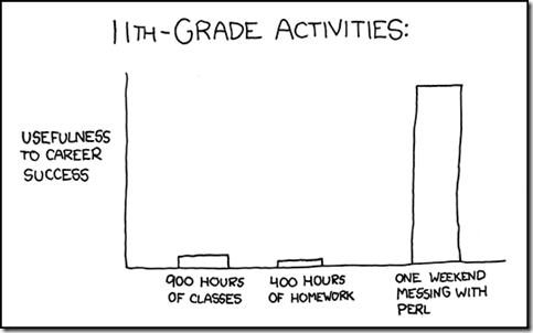
2 Mar 2011I had a conversation last night about “knowledge” education vs “skill” education that reminded me of this xkcd chart. The skills I learned hacking computers and building art projects have contributed much more to my career success than anything I learned in graduate school.
Budget Forecasts vs Reality
2 Mar 2011This is from 2010, but I wanted to post it because it’s an excellent way to visualize the quality of economic projections. The New York Times refers to it as a “porcupine” chart.
Revolution
1 Mar 2011I will occasionally veer slightly away from the chart world into graphic design and image theory. If you don’t like it: suffer.
Tax Breaks vs Budget Cuts
In: Politics
28 Feb 2011This table compares 10 US social safety-net programs being targeted for elimination by congress, and proportionately sized tax breaks for corporations/wealthy. Thanks to Sean Speer for the link.
Child Brides
28 Feb 2011In some parts of the world, marrying young is commonplace. I couldn’t find the exact comparison for the United States, but the median age when married is 26 (2009). Wikipedia lists data for additional countries, if you’re interested.
MBA Student Mobility
25 Feb 2011The Financial Times surveyed 5000+ alumni from the top 50 MBA programs in the world and mapped out where they came from, where they went to school, and where they ended up. It’s slightly confusing at first, because they do not map all of the students at once – it shows only one country of origin at a time. Still, it’s very cool if you pay attention to where the dots flow when you change categories. (related article)
note: access to some FT features requires a subscription.
Housing Market Heat Map
In: Housing
25 Feb 2011I don’t know why it took so long for someone to graph the Case-Shiller data this way, but I like it:
London’s Ghost Tube Stations
In: Maps
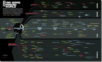
24 Feb 2011Timeline: How Star Wars Changed the World
In: Culture
24 Feb 2011Most Americans Don’t Have Passports
24 Feb 2011Only 30 percent of Americans have passports. The differences by state are about what you would expect (because of income, proximity to border, and small-mindedness). None of the states are very high – New Jersey was the highest, with just under 46%. (via)
Exo-Planets
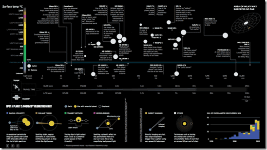
24 Feb 2011This infographic lays out what is known about all of the planets that have been identified outside of our solar system. Also, Information is Beautiful has put together a lovely post about the steps that went into creating it.
Google and Eyebeam have created a $10,000 dataviz challenge for designers to visualize how individual federal income taxes are spent. The site includes details, data, and a few cool examples, like the one below that lets you input your income and see how the government shelled out your shekels. Submissions are due by March 27, 2011. (Thanks to Melissa Mac for the link!)
An inspirational British version:
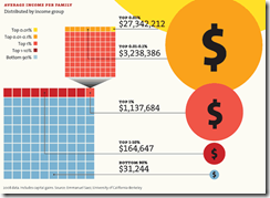
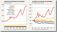
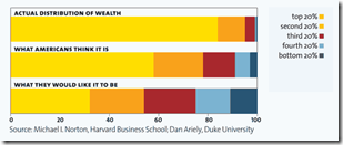
and a excellent interactive chart one that let’s you examine the changing income inequality in the united states (and probably the only good use I’ve seen of a pie chart in a long time):
Projections of when China’s GDP will be bigger than the USA’s, based on several different growth rates. There’s also an interactive version.
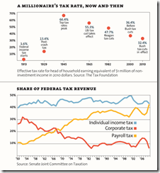
It’s the Inequality Stupid
22 Feb 2011“Eight charts that explain everything that’s wrong with America”, from Mother Jones. (Thanks to Matt Brown for the link!)
What is Chart Porn?
An addictive collection of beautiful charts, graphs, maps, and interactive data visualization toys -- on topics from around the world.
Categories
- Bailout (118)
- Chartporn Related (3)
- Commentary (21)
- Culture (669)
- Emerging Markets (66)
- Employment (245)
- Environment/weather (133)
- Finance (298)
- Food (92)
- Global Economy (373)
- Graphic Design (bad) (26)
- Graphic Design (general) (183)
- Graphic Tools (23)
- History (158)
- Housing (162)
- Humor (204)
- Innovative (183)
- Interactive (545)
- Internet/tech (97)
- Maps (578)
- News Media (34)
- Politics (329)
- Reference (97)
- Science (331)
- Source: Economist (101)
- Source: FT (92)
- Source: NYT (147)
- Source: Ritholtz (76)
- Source: USA Today (27)
- Source: Washington Post (90)
- Source: WSJ (135)
- Sports (58)
- Stock Market (74)
- Uncategorized (2)
- Updated regularly (76)
- US Economy (553)
- Video (22)
- Aram Korevaar: This chart is now being used as a projection in which countries such as China see themselves as in a [...]
- David: Welcome back Chart Porn! [...]
- J S: Thanks for the great story. Miss reading this blog. Hope to see you more active again. [...]
- jake: I lived in a DC row house for 6 years, and I'm writing this comment from my tiny 1 bedroom apartment [...]
- ronny pettersen: Hilarious and unfortunately accurate... ;-) [...]

