Geologic Time
In: History Innovative
5 Apr 2011There have been a number of beautiful attempts to diagram geologic time.


Interactive timeline from the Smithsonian:

Gartner’s Magic Magic Quadrant
In: Humor Internet/tech
1 Apr 2011Gartner regularly maps out technology markets’ competitiveness – with one quadrant on their chart being “magic”. Well, this time they’ve mapped out Magicians. Thanks to Linda Smith for the link!

The trans-atlantic slave trade database has been assembling historic records of slave ship voyages. The stunning fact to me: of the 12 or so million slaves brought to the new world, only about 400,000 came to mainland North America. The database itself can be explored through a system of searches and pivot tables, right down to the names of the ships’ captains.

Baggage Fees
30 Mar 2011I hate baggage fees. Interesting fact from below: when airlines started charging fees, 25% of passengers switched to carry-ons — resulting in longer lines at security checkpoints, higher TSA costs, and longer delays in loading/unloading planes. In conclusion: airlines are charging you more money to make your flight experience worse.


ezViz Desktop BI Tool
29 Mar 2011I receive a lot of emails asking what tools can be used to move past excel and create cool charts. Well, here’s one: ezViz is a very affordable ($79) desktop data visualization analysis tool that has many of the same cool features as much more expensive products such as Tableau and Spotfire. Starting with an excel spreadsheet you can easily assign variables to chart attributes, filter, and drill down through your data. Chart types include heatmaps, scatter bubbles, maps, and surface plots, among others. Watch the video and read the manual to see some of the nifty features included. Tableau and Spotfire are awesome and more powerful products, obviously, but they have priced themselves so far out of the reach of researchers and analysts that it’s nice to see a product like this fill in the gap a little.


An 85 foot long annotated timeline of early American financial and industrial history. Similar to the 1775-1943 Booms and Busts timeline I posted last year, this one isn’t quite as technical, but the historical notes are fascinating: 1877: “Guaranteed Mtges coming into use”, 1899: “100 taxis in New York”, 1910: “Movie censorship being demanded”. (via)

Patchwork Nation
28 Mar 2011Patchwork Nation tracks a number of traditional economic and social indicators over time – but they also include some interesting alternative ones:
Cracker Barrel restaurants and Whole Foods Stores:


Gun shops and Casinos:


Bankruptcies 2007 vs 2010:


Change in family income 1980-2010:

US Eugenical Laws
28 Mar 2011The map below shows which states had pro-sterilization laws back in 1935, and the number of “operations” in each. Want to know who the government deemed ineligible to breed? – browse this scary-ass book from 1922. Not feeling that brave? — the wikipedia entry will give you the practical bits.

The Gentrification of Washington DC
25 Mar 20112010 census data illustrates the gradual gentrification of DC – the city that was 70 percent black in the 1970s is now estimated at less than 50 percent. Heck, from 1990-2010 rising housing costs chased ME across town from Georgetown to Mount Pleasant to Capitol Hill. The related article has some interesting details.

There are also two interactive versions:


US Housing Prices, Nominal and Real (1890-2010)
In: History Housing US Economy
25 Mar 2011Housing prices trends don’t look the same if you adjust for inflation.

On a side note, the designer of the above, Catherine Mulbrandon over at Visualizing Economics, has a kickstarter campaign to fund production of a new publication on US Income. She does great work and I recommend you donate, if so inclined.
Teen Drug Use
24 Mar 2011I usually don’t post these column-style infographics anymore, because most of them are shitty link-bait. But this one on teen drug use cites a quality recent source, doesn’t over-use symbols or clip art, properly highlights key observations, and uses a consistent color scheme. Nice work! Oh, and high school kids – don’t do drugs.
![]()
Turns out there are more than 100 ways to spell Muammar Muhammand al-Gaddafi’s name in English. Here is a chart of the variations:
Original and phonetic:
![]()
(via)
Update: Economic Indicators Dashboard
23 Mar 2011One of my favorite economic dashboards. It highlights major macro indicators, what direction they are trending, and what the typical ranges are. It also lets you drill down to explanations of why you should care, and historical values.

The Wonderful Work of Karl Hartig
In: Culture Employment Finance Graphic Design (general) History Innovative Politics Science US Economy
22 Mar 2011Karl Hartig was creating beautiful complex data visualizations back when most of us “graphics experts” were still trying to figure out how to change colors in excel. Here is a selection of his work on population, electronics, energy, stocks, immigration, politics, and music. Soak it up!


World Map Drawn on a Fool’s Head
21 Mar 2011Just a beautiful map. From around 1590. Interestingly, nobody knows who created it and it is interpreted as a sort of 16th century commentary/protest. (alternate high def link)
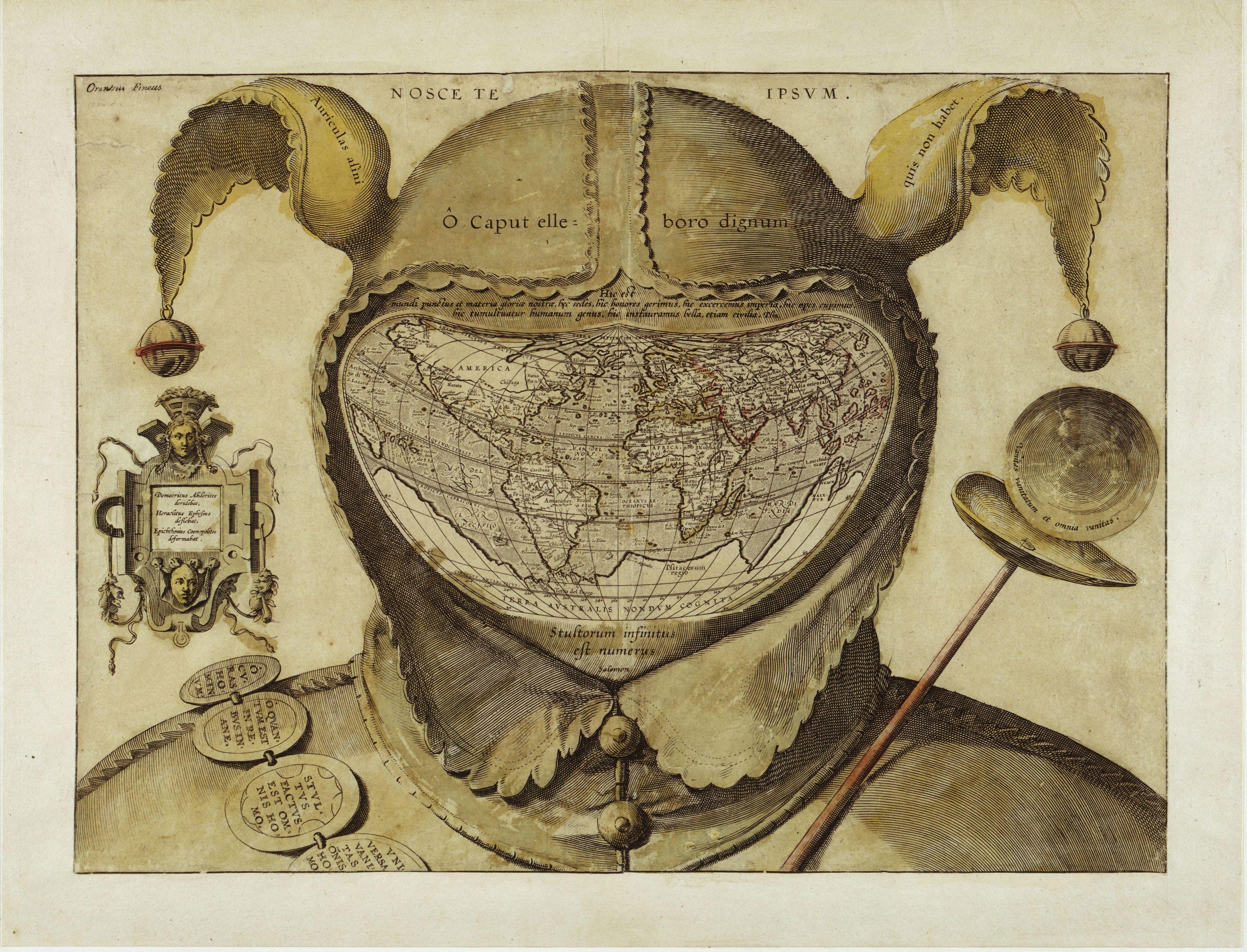

digging around I found this version as well:

The legend in the left panel reads: “Democritus of Abdera laughed at [the world], Heraclitus of Ephesus wept over it, Epichtonius Cosmopolites portrayed it” (3). Over the cap is the Latin version of the Greek dictum, “Know thyself” (4). Across the cap’s brow, the inscription translates as “O head, worthy of a dose of hellebore” (5).
The Latin quote just above the map is from Pliny the Elder (6): “For in the whole universe the earth is nothing els e and this is the substance of our glory, this is its habitation, here it is that we fill positions of power and covet wealth, and throw mankind into an uproar, and launch wars, even civil ones.”
The reason for so much trouble and strife is explained in the quote below the map, from Ecclesiastes: “The number of fools is infinite” (7). Another quote from that most depressing of Bible books, on the jester’s staff to the right, intones: “Vanity of vanities, all is vanity” (8). Inscribed on the badges adorning the shoulder belt are a few sayings in line with this cheerful message: “Oh, the worries of the world; oh, how much triviality is there in the world” (9), “Everyone is without sense” (10), and “All things are vanity: every man living” (11).
For some researchers, the sum of these messages, as well as their presentation in a cartographic setting, point to a little-known Christian sect called the Family of Love. This clandestine group is said to have numbered the Flemish cartographer Ortelius in its ranks. If this map is anything to go by, the Family of Love must have espoused a rather harsh and pessimistic view of the world, and of humanity’s place in it. (Source)


What is Chart Porn?
An addictive collection of beautiful charts, graphs, maps, and interactive data visualization toys -- on topics from around the world.
Categories
- Bailout (118)
- Chartporn Related (3)
- Commentary (21)
- Culture (669)
- Emerging Markets (66)
- Employment (245)
- Environment/weather (133)
- Finance (298)
- Food (92)
- Global Economy (373)
- Graphic Design (bad) (26)
- Graphic Design (general) (183)
- Graphic Tools (23)
- History (158)
- Housing (162)
- Humor (204)
- Innovative (183)
- Interactive (545)
- Internet/tech (97)
- Maps (578)
- News Media (34)
- Politics (329)
- Reference (97)
- Science (331)
- Source: Economist (101)
- Source: FT (92)
- Source: NYT (147)
- Source: Ritholtz (76)
- Source: USA Today (27)
- Source: Washington Post (90)
- Source: WSJ (135)
- Sports (58)
- Stock Market (74)
- Uncategorized (2)
- Updated regularly (76)
- US Economy (553)
- Video (22)
- Aram Korevaar: This chart is now being used as a projection in which countries such as China see themselves as in a [...]
- David: Welcome back Chart Porn! [...]
- J S: Thanks for the great story. Miss reading this blog. Hope to see you more active again. [...]
- jake: I lived in a DC row house for 6 years, and I'm writing this comment from my tiny 1 bedroom apartment [...]
- ronny pettersen: Hilarious and unfortunately accurate... ;-) [...]