Update: Economic Indicators Dashboard
25 Apr 2011Inflation Heat Map
25 Apr 2011Consumer prices are moving unevenly across the world. Economic growth, supply and demand, currency values and a variety of other factors drive consumer prices up — inflation — or down — deflation. Bars and figures show change from a year earlier in consumer price indexes.
How to Make a Movie
In: Culture
25 Apr 2011Flowcharts of the sure-win boiler plate formulas for making a horror, action, porn, animated, or short film movie. These were created as advertisements for European pay-TV company CANAL+.
The Seasons of my Discontent
In: Culture
20 Apr 2011Besides the “summer blockbusters” there are some interesting trends about what types of movies are released when. I’m not quite sure what the difference between action and adventure is supposed to be. Also, statistically speaking, shouldn’t this be run through some regressions and/or be seasonally adjusted somehow? Are there more receipts in the summer because more people are attending, or because more movies are released then? I bet there’s a good paper out there somewhere.
Fascinating Sex Statistics
In: Culture
20 Apr 2011This one has it all: Exercise v orgasm, interactive charts of a woman’s sex drive and confidence at different ages (and body types), vegetarian oral sex, twitter sex, masturbation by religion, rough sex v age, rough/gentle sex word clouds, GDP vs casual sex. All of these are based on analysis of the OKCupid dating site’s users self-identified characteristics. Awesome work!
Teachers Salaries World Wide
In: Culture Employment
19 Apr 2011I’m sure the devil is in the details, as usual, but aggregate statistics like this are always good background to any debate. Thanks to KD Kelly for the link!
Gender Bias in Toy Ads
In: Culture
19 Apr 2011Wordle‘s really are fun, aren’t they? This one compares words from 27 boy-toy commercials with 32 girl-toy commercials. Am I the only one that sees the endogenous bias irony concerning which toys are “for boys” and which were “for girls?” The author went by what toys were listed in the Boys section of Toys-r-Us’s website, but that just shifts the bias to another source.
“Boys”:
“Girls”:
How Healthy is Your Housing Market?
In: Housing Interactive Maps
18 Apr 2011Trulia maps out some cool housing price stats: The number of days a listing is on the market before they lower the price, how much they lower it, and the probability it will be lowered again – all by zip code. (via)
This is in addition to Trulia’s existing housing dashboard and heat maps, which are nifty as well:
This is Not my Beautiful Chart
15 Apr 2011The only thing good about this infographic is the title. Massive dot pie chart? Ick. Color selection? Ick ick. And since you have to read the text and numbers for any kind of comprehension to take place, why bother with the pies at all? Man, I’m grumpy today.
Housing Prices (1890-2011)
15 Apr 2011Updated chart of the classic Case-Shiller housing price index. On the one hand it looks like the decline may be bottoming out – but on the other, there is still massive intervention supporting the market and we could very likely overshoot fair value.
Top Tax Rates (1916-2010)
15 Apr 2011More excellent work from VisualizingEconomics:
Federal Tax Receipt
In: Politics
15 Apr 2011From the White House: enter the amount of taxes you paid and see what it gets spent on. (via)
Going Clubbing in Canada
12 Apr 2011The images were obviously chosen to be inflammatory – but the infographic is carefully constructed to do so in a serious way.
Where’s Whitey? Census 2010
In: Culture Interactive Maps
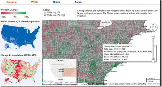
11 Apr 2011Interactive map that lets you explore America’s changing demographics by race, as well as the overall population movement between regions:
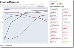
The below chart lets you compare metropolitan shifts across major cities (though it’s by ranking, which is a little odd):
What is Chart Porn?
An addictive collection of beautiful charts, graphs, maps, and interactive data visualization toys -- on topics from around the world.
Categories
- Bailout (118)
- Chartporn Related (3)
- Commentary (21)
- Culture (669)
- Emerging Markets (66)
- Employment (245)
- Environment/weather (133)
- Finance (298)
- Food (92)
- Global Economy (373)
- Graphic Design (bad) (26)
- Graphic Design (general) (183)
- Graphic Tools (23)
- History (158)
- Housing (162)
- Humor (204)
- Innovative (183)
- Interactive (545)
- Internet/tech (97)
- Maps (578)
- News Media (34)
- Politics (329)
- Reference (97)
- Science (331)
- Source: Economist (101)
- Source: FT (92)
- Source: NYT (147)
- Source: Ritholtz (76)
- Source: USA Today (27)
- Source: Washington Post (90)
- Source: WSJ (135)
- Sports (58)
- Stock Market (74)
- Uncategorized (2)
- Updated regularly (76)
- US Economy (553)
- Video (22)
- Aram Korevaar: This chart is now being used as a projection in which countries such as China see themselves as in a [...]
- David: Welcome back Chart Porn! [...]
- J S: Thanks for the great story. Miss reading this blog. Hope to see you more active again. [...]
- jake: I lived in a DC row house for 6 years, and I'm writing this comment from my tiny 1 bedroom apartment [...]
- ronny pettersen: Hilarious and unfortunately accurate... ;-) [...]


