What Makes a Hit Song?
In: Culture History Innovative
23 Jun 2011Rutgers students Shaun Ellis and Thomas Engelhardt tried to discover the secrets sauce behind a “hit” song by analyzing 4,200+ songs that made it to the top ten of Billboard’s Hot-100 chart. Using the echonest api, they took a look at tempo, duration, time signature, key, and abstracts like “energy” and “danceability”. The main results are laid out here.
The fun part is, they made the whole data set available in Tableau for us to play with (download Tableau reader (free) and the dataset). Using the filters, you can answer bizarre questions such as how many hits in 1979 were on the charts more than 20 weeks that were recorded in the key of C (answer: 7). Or you can look at the data over time to discover all kinds of interesting long-term trends:
A scatter of all of the songs illustrates that the average tempo is 120 BPM.
Finally proven mathematically, songs of the 1980s consistently had the highest “danceability” (suck it, 90s!):
Hits are getting longer in length:
You can document the much maligned increase in loudness after the introduction of the CD, though it is also part of a longer-term trend.
If you have the full version of Tableau, you can design your own charts (but you probably don’t, because Tableau is too damn expensive).
Update: There are a few additional Tableau visualizations of this data available (that don’t require you to install anything) that are also quite interesting.
Storage vs Bandwidth (1986-2012)
In: Internet/tech
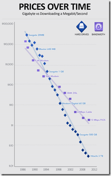
23 Jun 2011Interesting history of falling hard drive price and internet bandwidth costs. It is the bottoming out of these graphs that is making cloud computing possible. Thanks to David V. for the link!
Used Car Prices
In: Innovative Reference
22 Jun 2011Daniel Rathbone created this tool to aggregate used car prices from Craigslist. Besides being a useful way to shop for cars, it’s also interesting to see how different brands and models hold up in value over time. For example, check out the Accord vs Corvette below.
Commencement Speeches
21 Jun 2011The NYT analyzed word usage in 40 2011 commencement speeches. The results are largely what you would expect. However, the differences between private, public, and religious schools are kinda interesting. (related speeches)
Doctorate Gender Gap
In: Culture Employment
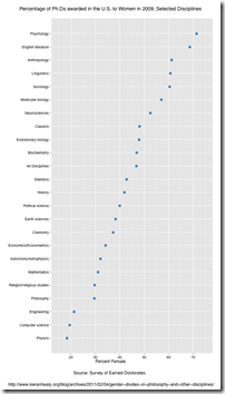
21 Jun 2011Percentage of 2009 Phd’s awarded to women, by discipline. (via)
(Not) Spreading the Wealth
20 Jun 2011Foreclosures
In: Housing Maps Source: NYT
20 Jun 2011The backlog of mortgage delinquencies continues to stagnate after court rulings slowed the process in most states. The housing market won’t really be operating as a “market” for quite some time.
Try Your Hand at Saving Social Security
18 Jun 2011Interactive tool from the WSJ. Select benefit reductions, tax increases, and/or benefit increases to see if you can make it solvent. (note: to get around WSJ paywall, google search for “saving social security wsj” then jump to the tool using the result there)
Magic Carpet Timeline of Modern Music
In: Culture Interactive
17 Jun 2011The Guardian re-used the slick interface last seen detailing Middle East Protests to explore modern music. You can also filter by genre if you want. Me likey!
Money Wasters
In: Culture
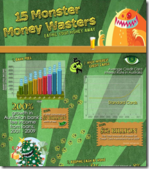
17 Jun 2011If you look past the font salad and translucent charts, there are actually some inspiring reminders here on how to stop wasting your money.
Hollywood Career-o-Matic
In: Culture Interactive
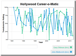
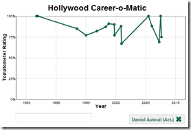
15 Jun 2011Chart the career of major actors and directors, based on Rotten Tomatoes’ aggregation of reviews – just type in who you want to see. Below are John Malkovich and Gary Oldman (who have had very busy diverse careers), and Daniel Auteuil, who has the highest consistent rating. If nothing else, it’s a cool way to explore movies – the rollovers remind you of precisely what bombs you have been erasing from your memory. (via FlowingData)
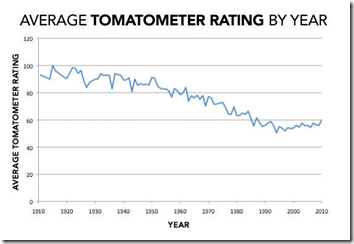
The Slate article also compiles some interesting aggregate stats. For example, on average, movies have been getting worse:
Life Expectancy
In: Culture Interactive Maps Science Source: Washington Post
15 Jun 2011Average life expectancy varies a lot by location, gender, and race. International comparisons done by the original study conclude that the US is falling behind the rest of the industrialized world.
From a design point of view, take a look at the below version of the map from the original study — the use of a higher contrast color scheme and non-linear legend ranges results in a more striking view of the results. I’m not sure which one I like better. The top one is more information rich and cleaner – but the bottom one slaps you in the face with meaning.
What is Causing the Deficit?
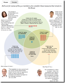
14 Jun 2011A number of these charts have been making the rounds, using different measures. Some of the projections obviously have to be taken with a grain of salt, but the basic message appears to be that letting the Bush era tax cuts expire would relieve a lot of budget pressure. Each of the links below go to fairly in-depth blog posts.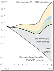
Awesome Website Flowchart
In: Humor Internet/tech
13 Jun 2011Do you have an excellent idea for a website? This flowchart will tell you whether you have everything you need to make it a reality. (posted by digital talent agency Vitamin T – which explains all the web developer brown nosing – hehe.)
What is Chart Porn?
An addictive collection of beautiful charts, graphs, maps, and interactive data visualization toys -- on topics from around the world.
Categories
- Bailout (118)
- Chartporn Related (3)
- Commentary (21)
- Culture (669)
- Emerging Markets (66)
- Employment (245)
- Environment/weather (133)
- Finance (298)
- Food (92)
- Global Economy (373)
- Graphic Design (bad) (26)
- Graphic Design (general) (183)
- Graphic Tools (23)
- History (158)
- Housing (162)
- Humor (204)
- Innovative (183)
- Interactive (545)
- Internet/tech (97)
- Maps (578)
- News Media (34)
- Politics (329)
- Reference (97)
- Science (331)
- Source: Economist (101)
- Source: FT (92)
- Source: NYT (147)
- Source: Ritholtz (76)
- Source: USA Today (27)
- Source: Washington Post (90)
- Source: WSJ (135)
- Sports (58)
- Stock Market (74)
- Uncategorized (2)
- Updated regularly (76)
- US Economy (553)
- Video (22)
- Aram Korevaar: This chart is now being used as a projection in which countries such as China see themselves as in a [...]
- David: Welcome back Chart Porn! [...]
- J S: Thanks for the great story. Miss reading this blog. Hope to see you more active again. [...]
- jake: I lived in a DC row house for 6 years, and I'm writing this comment from my tiny 1 bedroom apartment [...]
- ronny pettersen: Hilarious and unfortunately accurate... ;-) [...]








Households Like You
In: Commentary Interactive Source: NYT
20 Jun 2011Select your household type (married, kids, rooomies, etc) and view some summary statistics from the American Community Survey.