Repetitive Tasks
In: Humor Internet/tech
10 May 2012Yep. This pretty much describes my career. Progress is the result of a lazy man finding an easier way of doing things.
Gay Rights
In: Culture Interactive
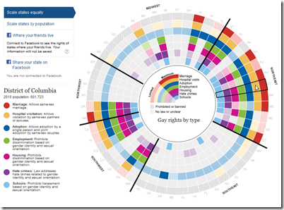
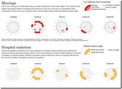
9 May 2012A nice interactive visualization of gay rights in the United States, by State. This was created by the Guardian in the UK – where, interestingly, the conservatives support gay rights.
Why Do I Feel Thirsty?
8 May 2012This visualization shows the size of a sphere that would contain all of the Earth’s water compared to the size of the Earth. Yikes! That’s a lot of dirt and rock!
Thanks to D. Cramer for emailing me the link!
Fashion Color Forecaster
In: Culture Innovative
7 May 2012The Pimkie clothing company has come up with an interesting real-time fashion indicator: They video what people are wearing as they walk down the street in Paris, Milan, and Antwerp (supposed fashion capitals), and analyze what color pixels are moving. You can then look at the findings in real time, for yesterday, last week, or last month. Apparently, peach-ish red is huge right now in Paris. (via StoryTellingWithData)
Fortune 500
In: Finance Stock Market
7 May 2012Update: Scale of the Universe
In: Interactive Science
1 May 2012Cary and Michael Huang have updated their zoomable scale of everything (first seen in 2010). The graphics are nicer and smoother, they’ve replaced the annotations with a scale in the corner, and everything can be clicked on for popup detail. Thankfully, they also now let you turn off the dreadful music. Thanks to Shrub for sending me the link!
The Illusion of Choice
26 Apr 2012This has been making the rounds lately. I find it as interesting to look at the minimalist design inherent in modern logos as the ownership concentrations.
Science Fiction to Reality Timeline
25 Apr 2012When scientific advances were first theorized vs when they became reality. After a close viewing I would say whoever wrote this wasn’t particularly well-read, or even a very good geek – a lot of things on both sides are just plain wrong. Great idea. Crappy execution. Anybody want to try their hand at a version that includes da Vinci, Verne, and Heinlein (just for starters).
Coin World
In: Innovative Maps
20 Apr 2012Elegant Growth
19 Apr 2012Sometimes you have to strangle software to get what you want. I was looking for a new way to compare world growth across analytical groups. Starting with an excel bubble chart, I noticed that sorting the values by growth rate, and sizing them by GDP value, produces a very beautiful visualization of the distribution. Looking closer, however, I noticed that excel literally draws the graph in the sorted order (lowest to highest in this case), resulting in some of the smaller balls being hidden by the larger ones:
To fix this turned out to be quite complicated, requiring some software hopping. First you have to copy and paste the chart into Powerpoint, then right-click/save-as-picture into an enhanced metafile (.emf), which you can then open in Illustrator where you can bring all the hidden balls to the front. Anyways, the end result is below. I hope the technique is useful to anyone looking to do some post-production excel chart tweaking.
Evolution of a Political Map
13 Apr 2012A nice progression of intermediate steps in preparing a newspaper map of Santorum’s campaign, using R.
Apollo Astronaut Assignments
12 Apr 2012Not the most aesthetically pleasing figure I’ve ever seen – but there’s a ton of information crammed in.
Zombie Apocalypse Map
In: Culture Humor Interactive Maps
11 Apr 2012Use this interactive google-mashup-map to locate emergency supplies in the event of a zombie outbreak. This should help you not walk past guns and supplies like in that stupid Walking Dead show.
What America Buys
9 Apr 2012What is Chart Porn?
An addictive collection of beautiful charts, graphs, maps, and interactive data visualization toys -- on topics from around the world.
Categories
- Bailout (118)
- Chartporn Related (3)
- Commentary (21)
- Culture (669)
- Emerging Markets (66)
- Employment (245)
- Environment/weather (133)
- Finance (298)
- Food (92)
- Global Economy (373)
- Graphic Design (bad) (26)
- Graphic Design (general) (183)
- Graphic Tools (23)
- History (158)
- Housing (162)
- Humor (204)
- Innovative (183)
- Interactive (545)
- Internet/tech (97)
- Maps (578)
- News Media (34)
- Politics (329)
- Reference (97)
- Science (331)
- Source: Economist (101)
- Source: FT (92)
- Source: NYT (147)
- Source: Ritholtz (76)
- Source: USA Today (27)
- Source: Washington Post (90)
- Source: WSJ (135)
- Sports (58)
- Stock Market (74)
- Uncategorized (2)
- Updated regularly (76)
- US Economy (553)
- Video (22)
- Aram Korevaar: This chart is now being used as a projection in which countries such as China see themselves as in a [...]
- David: Welcome back Chart Porn! [...]
- J S: Thanks for the great story. Miss reading this blog. Hope to see you more active again. [...]
- jake: I lived in a DC row house for 6 years, and I'm writing this comment from my tiny 1 bedroom apartment [...]
- ronny pettersen: Hilarious and unfortunately accurate... ;-) [...]


