Immigration / Emigration
In: Interactive Science
28 Feb 2013A very slick interactive tool for exploring world migration.

Not much of a graph design wise, but it does drive home the data to vaccine skeptics. Get your shots!!

You are unlikely to die… oh wait
15 Feb 2013Which of these do you worry about?

The Rent is Too Damn High
In: Housing Interactive Maps
7 Feb 2013Heat maps of apartment rental prices in DC:

and Boston:

and many many other cities using a tool created by Jeff Kaufman.
(via welovedc)
Fancy Big Mac Index
7 Feb 2013This year, in interactive format, allowing you to select a base currency and see the changes over time.

Price per Gallon
In: Food
5 Feb 2013You gotta wonder how they calculated the beer and wine price.

Stock Market and GDP
5 Feb 2013For fairly intelligent discussion of whether this means anything, check out the comments over at The Big Picture.

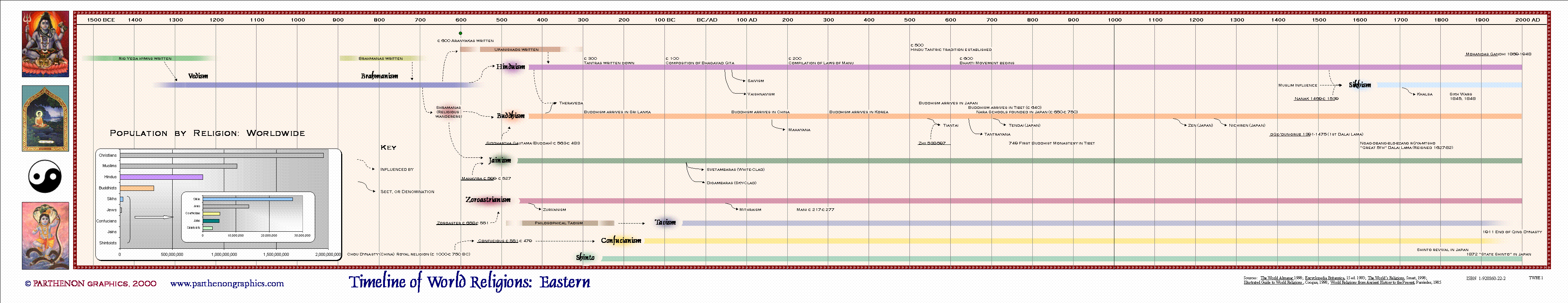
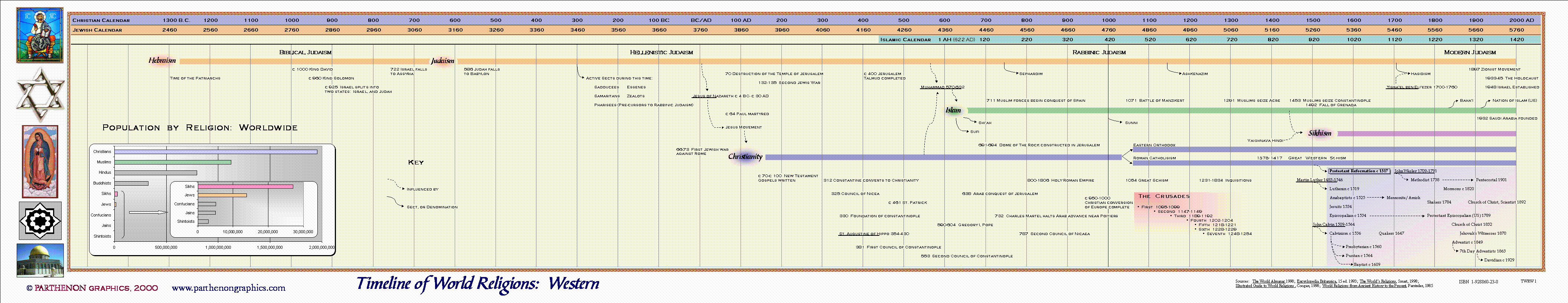
Timeline of World Religions
29 Jan 2013I’m not expert enough on any of these to say whether this is accurate or not. A clear explanation of what the different colors and line widths would have been helpful.

Some other versions:

Billionaires
25 Jan 2013Bloomberg has several interactive tools for filtering and ranking the the world’s billionaires.

If you click on any of them, individual profiles come up, like for Carlos Slim":

You can plot them by industry, gender, number of children and all kinds of other variables.

Update: Economic Indicators Dashboard
25 Jan 2013One of my favorite economic dashboards. It highlights major macro indicators, what direction they are trending, what the typical ranges are, and lets you drill down to explanations of why you should care. Looks like a lot of indicators are finally in the “typical” range.
Things might be getting back to normal.

California for Beginners
25 Jan 2013Amusing and accurate. Unfortunately, I couldn’t find the original source to link back to.
update: created by Julian Lozos. Nice work!


Travel Speed (1800-1930)
11 Jan 2013Sure, the internet and the information revolution has been fun. But before that there was the communication revolution. And before that, it was transportation:


(original source: 1932 Atlas of the Historical Geography of the United States, which has a number of other cool historical maps)
More Hotness
10 Jan 2013Apparently the forecasts for the current heat-wave in Australia are so hot that the Bureau of Meteorology had to add two new colors to it’s forecasting map:

And here is the NYT version of of the 2012 temperature map. I like the city histograms at the bottom.

2012 Hottest Year on Record
9 Jan 2013It didn’t just FEEL hot. It WAS hot.


What is Chart Porn?
An addictive collection of beautiful charts, graphs, maps, and interactive data visualization toys -- on topics from around the world.
Categories
- Bailout (118)
- Chartporn Related (3)
- Commentary (21)
- Culture (669)
- Emerging Markets (66)
- Employment (245)
- Environment/weather (133)
- Finance (298)
- Food (92)
- Global Economy (373)
- Graphic Design (bad) (26)
- Graphic Design (general) (183)
- Graphic Tools (23)
- History (158)
- Housing (162)
- Humor (204)
- Innovative (183)
- Interactive (545)
- Internet/tech (97)
- Maps (578)
- News Media (34)
- Politics (329)
- Reference (97)
- Science (331)
- Source: Economist (101)
- Source: FT (92)
- Source: NYT (147)
- Source: Ritholtz (76)
- Source: USA Today (27)
- Source: Washington Post (90)
- Source: WSJ (135)
- Sports (58)
- Stock Market (74)
- Uncategorized (2)
- Updated regularly (76)
- US Economy (553)
- Video (22)
- Aram Korevaar: This chart is now being used as a projection in which countries such as China see themselves as in a [...]
- David: Welcome back Chart Porn! [...]
- J S: Thanks for the great story. Miss reading this blog. Hope to see you more active again. [...]
- jake: I lived in a DC row house for 6 years, and I'm writing this comment from my tiny 1 bedroom apartment [...]
- ronny pettersen: Hilarious and unfortunately accurate... ;-) [...]