US Economy Archive:
Retail Sales by Business
In: Finance Interactive Source: WSJ Updated regularly US Economy
20 Dec 2010A beautiful data visualization of retail sales by type of business. I usually hate stacked bar charts because you really can’t compare what’s happening to any stack except the bottom and the total. The WSJ solves that problem by letting you click on any individual sector, which smoothly animates into a chart of just those bars. Well done! It would be interesting to see this done for the components of GDP.
Update: Philip Izzo pointed out to me that the WSJ’s interactive area chart of the Fed’s balance sheet (below) also allows the same kind of drill-down. In addition, both of these are updated regularly as new data is released.
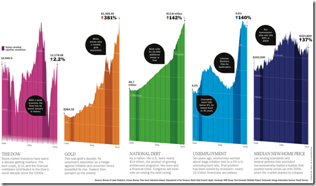
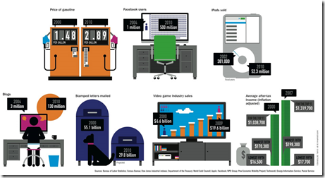
A Decade of Facts and Figures
15 Dec 2010I suppose we should prepare ourselves for the inevitable deluge of “end of decade” infographics. The below are from Time Magazine (which also has already compiled 40+ 2010 top ten lists – ick.)
Obama’s Tax Deal
8 Dec 2010A nice graphic from the Washington Post breaks down the cost components of the tentative agreement, and the projected economic impact.
Floyd Norris presents some interesting data indicating that it was the least expensive homes whose prices went up the most, and are now falling the fastest. Barry Ritholtz sees this as more proof that the bubble was in credit – not housing.
The Deficit Reduction Commission
3 Dec 2010A clear multi-part description of the recommendations of the National Commission of Fiscal Responsibility and Reform. There are some pretty aggressive changes being proposed. Unfortunately, Congress is unlikely to implement many of them.
Balance the US Budget
30 Nov 2010Another “You Make the Cuts” interactive, this one from the FT. Set your targets, select your cuts, and then see who is affected.
Note: Some FT features require a subscription.
American Human Development Index
In: Employment Food Housing Interactive Maps Science US Economy
21 Nov 2010Based on the idea that well-being cannot be measured by GDP alone, the Human Development Index looks at over 100 indicators, which you can explore on maps and charts at the most detailed level, or as aggregates (health, education, income). The chart display does seem to have problems separating out Washington DC, however – since we don’t actually have a congressional district — <sigh>. (via)
Inflation After the Bubble: US vs Japan
21 Nov 2010I always like these crisis-rebased comparison charts. (via)
Quantitative Easing Explained by Cartoons
In: Finance US Economy
15 Nov 2010What does quantitative easing mean? (via Zero Edge and Matt Taibbi)
How Would You Fix the Budget?
15 Nov 2010The NYT presents you with a number of options for cutting the deficit and displays the cumulative effect in 2015 and 2030. (related article on project methodology)
Hip-Hop Explanation of Currency Wars
12 Nov 2010The amount of time someone put into this video is staggering. Oh, and it’s fairly accurate, and absolutely hilarious. “In the future all macroeconomic issues will be explained through hip-hop.” (via)
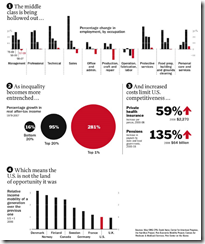
Income inequality and out of control costs of living. I think this could have used a few more charts – maybe one on static wages?
As of today you can tack on another half trillion.
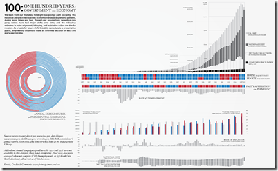
100 Years of US Government and Economy
2 Nov 2010A comprehensive timeline of parties and indicators. (via)
Prescription for a Sickly Economy
In: Finance Interactive Source: Washington Post Stock Market US Economy
2 Nov 2010Five-part interactive explanation of quantitative easing. My favorite part: “The Fed will likely buy $100s of billions of Treasury bonds using money that it creates out of thin air”
What is Chart Porn?
An addictive collection of beautiful charts, graphs, maps, and interactive data visualization toys -- on topics from around the world.
Categories
- Bailout (118)
- Chartporn Related (3)
- Commentary (21)
- Culture (669)
- Emerging Markets (66)
- Employment (245)
- Environment/weather (133)
- Finance (298)
- Food (92)
- Global Economy (373)
- Graphic Design (bad) (26)
- Graphic Design (general) (183)
- Graphic Tools (23)
- History (158)
- Housing (162)
- Humor (204)
- Innovative (183)
- Interactive (545)
- Internet/tech (97)
- Maps (578)
- News Media (34)
- Politics (329)
- Reference (97)
- Science (331)
- Source: Economist (101)
- Source: FT (92)
- Source: NYT (147)
- Source: Ritholtz (76)
- Source: USA Today (27)
- Source: Washington Post (90)
- Source: WSJ (135)
- Sports (58)
- Stock Market (74)
- Uncategorized (2)
- Updated regularly (76)
- US Economy (553)
- Video (22)
- Aram Korevaar: This chart is now being used as a projection in which countries such as China see themselves as in a [...]
- David: Welcome back Chart Porn! [...]
- J S: Thanks for the great story. Miss reading this blog. Hope to see you more active again. [...]
- jake: I lived in a DC row house for 6 years, and I'm writing this comment from my tiny 1 bedroom apartment [...]
- ronny pettersen: Hilarious and unfortunately accurate... ;-) [...]


