Source: NYT Archive:
Inflation: The Details
18 Feb 2011Sure, inflation in January was only 1.6%:
but there’s a lot of variation in the products that make up the CPI (butter was up 19.6% y-y, for example), which this tool from the WSJ lets you explore:
Want to know how the CPI weights all of these goods? Check out this oldie but goodie:
What You Don’t Know About Unemployment
11 Jan 2011We hear the big unemployment number each month (currently 9.4%), and we all know someone who’s been unemployed for a while. But how bad is it really? Let’s say I lost my job tomorrow – how bad is it out there for someone just like me? (note: if you click on the links you can enter your own attributes)
Geography?: Washington DC traditionally has higher unemployment, but it looks like that trend might soon reverse?
Age?: That’s good news. Someone my age has a slight advantage.
Sex?: Wow. I didn’t see that coming. Men have been disproportionately affected by this recession.
If you don’t mind that the data is from 2009, you can select all of the above and also add in education using the NYT visualization below. So all together, someone like me only faces a 3.9% unemployment rate – versus, say, a 15-24 yr old black male with no college, who faces a 48.5% unemployment rate. 
Another piece of the unemployment picture that doesn’t get much coverage is how different sectors are performing. Let’s take a look at jobs gained and lost since 2000 (note: this is in millions of jobs, not percent)
Manufacturing, construction, and retail have gotten clobbered, while government, health care, and education are about the only professions showing growth.
Well, I hope you found these tools enlightening and helped you understand that the one number they spend so much time talking about in the media doesn’t even begin to tell the whole story. If you want to dig further yourself, all of the raw data is available for download from the BLS.
Carbon Counting, Global Warming, and Dumbass Comments
In: Environment/weather Science Source: NYT Source: Ritholtz
23 Dec 2010 | The New York Times has an excellent article and accompanying charts about the scientist who first discovered rising CO2 levels. I came across the article via Barry Ritholtz’s blog, where he delivered this lovely bit of snark:
|
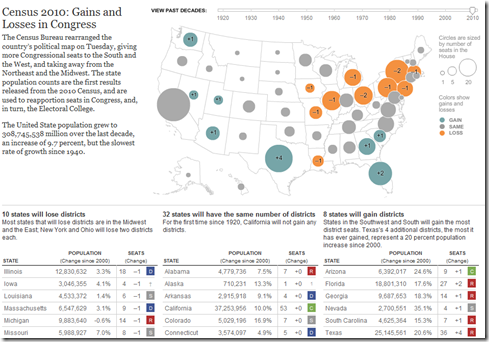
10 states will lose congressional districts (mostly in the northeast) ; 8 will gain (mostly in the south and southwest), and the other 32 will stay the same. The tables below the map show the change in state populations since 2000. You can also use the timeline to view the re-apportionments back to 1920. (related article; related NYT political blog; Census press release)
And the official total? There are 308,745,538 people in the United States.
Mapping America
15 Dec 2010The NYT’s has created a huge variety of interactive maps based on the Census Bureau’s American Community Survey. Click on “view more maps” to see different breakdowns (income, race, housing, education). Roll-overs popup details at the county or census area level. Related article.
Here’s the percentage of foreign born population in Washington DC:
Change in income level since 2000:
This one shows how racially divided DC still is (green vs blue)”:
They also used the data for some more detailed analysis, such as “How NYC’s Racial Makeup has changed since 2000” (clockwise from upper left: white, hipanic, asian, black). Related article.
Map of American Slavery:1860
14 Dec 2010Contrary to my expectations, the use of slaves across the pre-civil war South was pretty diverse – as this map and accompanying article in the NYT shows. There is also an interactive version with annotated popups. (via)
Floyd Norris presents some interesting data indicating that it was the least expensive homes whose prices went up the most, and are now falling the fastest. Barry Ritholtz sees this as more proof that the bubble was in credit – not housing.
Inflation After the Bubble: US vs Japan
21 Nov 2010I always like these crisis-rebased comparison charts. (via)
How Would You Fix the Budget?
15 Nov 2010The NYT presents you with a number of options for cutting the deficit and displays the cumulative effect in 2015 and 2030. (related article on project methodology)
As of today you can tack on another half trillion.
2010 Election Results
3 Nov 2010As usual, the best graphical analysis comes from the New York Times. Click through this map to understand the big shifts in the clearest possible way.
Election Forecast Map
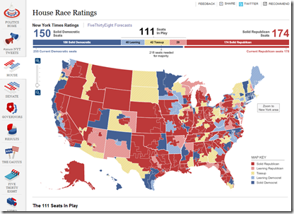
1 Nov 2010Interactive map of forecasts from the NYT’s FiveThirtyEight blog, covering all the races. (via Ritholtz)
The New Campaign Money Paradigm
In: Politics Source: NYT
12 Oct 2010The Supreme Court’s ruling on contributions last year is having a strong impact on how money is flowing into elections this year – but it’s not the only reason spending has doubled since 2006. Related article.
Rolling up TARP
4 Oct 2010A summary of the infamous Troubled Asset Relief Program. (via)
Fly Me! Airlines 1975-2010
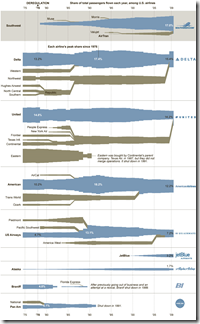
30 Sep 2010A typically cool graphic from the NYT showing the births, deaths, assimilations, and growth of airlines since the 1970s.
What is Chart Porn?
An addictive collection of beautiful charts, graphs, maps, and interactive data visualization toys -- on topics from around the world.
Categories
- Bailout (118)
- Chartporn Related (3)
- Commentary (21)
- Culture (669)
- Emerging Markets (66)
- Employment (245)
- Environment/weather (133)
- Finance (298)
- Food (92)
- Global Economy (373)
- Graphic Design (bad) (26)
- Graphic Design (general) (183)
- Graphic Tools (23)
- History (158)
- Housing (162)
- Humor (204)
- Innovative (183)
- Interactive (545)
- Internet/tech (97)
- Maps (578)
- News Media (34)
- Politics (329)
- Reference (97)
- Science (331)
- Source: Economist (101)
- Source: FT (92)
- Source: NYT (147)
- Source: Ritholtz (76)
- Source: USA Today (27)
- Source: Washington Post (90)
- Source: WSJ (135)
- Sports (58)
- Stock Market (74)
- Uncategorized (2)
- Updated regularly (76)
- US Economy (553)
- Video (22)
- Aram Korevaar: This chart is now being used as a projection in which countries such as China see themselves as in a [...]
- David: Welcome back Chart Porn! [...]
- J S: Thanks for the great story. Miss reading this blog. Hope to see you more active again. [...]
- jake: I lived in a DC row house for 6 years, and I'm writing this comment from my tiny 1 bedroom apartment [...]
- ronny pettersen: Hilarious and unfortunately accurate... ;-) [...]


