Science Archive:
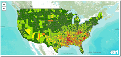
We’re Having a Heat Wave…
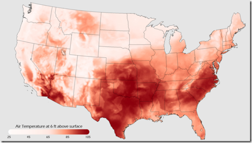
12 Jul 2011Most of the US is quite warm today. This map is from NOAA which maintains the Environmental Visualization Laboratory, which is chock full of cool maps and data and worth exploring.
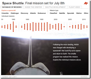
Space Shuttle Histories
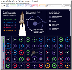
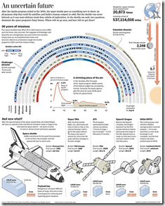
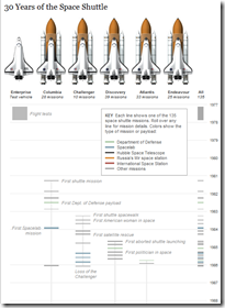
7 Jul 2011An assortment of cool graphics charting the history of the space shuttle. I watched a launch in person back in 1989 – it was awesome.
Bonus: HD video compilation of launches from different angles:
Dwindling Food Variety
28 Jun 2011a study conducted in 1983 by the Rural Advancement Foundation International … compared USDA listings of seed varieties sold by commercial U.S. seed houses in 1903 with those in the U.S. National Seed Storage Laboratory in 1983. The survey, which included 66 crops, found that about 93 percent of the varieties had gone extinct.
Life Expectancy
In: Culture Interactive Maps Science Source: Washington Post
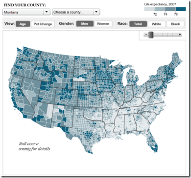
15 Jun 2011Average life expectancy varies a lot by location, gender, and race. International comparisons done by the original study conclude that the US is falling behind the rest of the industrialized world.
From a design point of view, take a look at the below version of the map from the original study — the use of a higher contrast color scheme and non-linear legend ranges results in a more striking view of the results. I’m not sure which one I like better. The top one is more information rich and cleaner – but the bottom one slaps you in the face with meaning.
Global Energy
8 Jun 2011A structured sankey diagram showing 2005 energy production and consumption, broken down several different ways.
Electric Vehicle Charging Stations
23 May 2011Carstations.com lets you search for local charging sites, add new ones, and read reviews/comments about each. Personally, I was surprised there were this many out there.
Updated: Snake Oil Supplements
21 May 2011Information is Beautiful has updated their interactive visualization of the effectiveness of various health supplements, based on scientific research. You can also view the raw research data they dug up to draw your own conclusions.
Sitting is Killing You
19 May 2011Obvious link bait, but I have to confess that I love the colors and the chart-junk choices. Also, I know from personal experience that sitting all day is bad for us. Thanks to Megan Fowler for the link.
Falling Flatscreen Costs
In: Internet/tech Science
11 May 2011Starry Starry Night
In: Interactive Maps Science
3 May 2011The Photopic Sky Survey is an interactive 5000 megapixel photograph of the entire night sky stitched together from 37,000+ photos. A beautiful example of data aggregation, annotation, and exploration. One of the coolest parts? It was done by an “amateur” photographer, just because he wanted to. (project site)
The Wonderful Work of Karl Hartig
In: Culture Employment Finance Graphic Design (general) History Innovative Politics Science US Economy
22 Mar 2011Karl Hartig was creating beautiful complex data visualizations back when most of us “graphics experts” were still trying to figure out how to change colors in excel. Here is a selection of his work on population, electronics, energy, stocks, immigration, politics, and music. Soak it up!
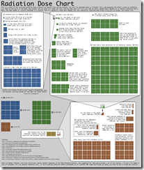
Radiation Doses
In: Science
21 Mar 2011An easy to understand chart of radiation sources and the damage they do, from xkcd.
Thanks to everyone who emailed me about it!
Nuclear Fear Mongering
19 Mar 2011Ughhh. Type in your zip code and see how close you are to a nuclear plant!! There’s even a red target painted on the reactor!!! I’m primarily posting this so I have an excuse to link to this excellent article, which explains in detail what’s going on in Japan and why you shouldn’t run out to buy potassium pills and start digging a fallout shelter. I might also point out that we conducted 140+ atmospheric atomic tests in Nevada – I’m not saying that was a particularly intelligent or healthy thing to do, but let’s maintain a little perspective about fallout risks, shall we?
Atomic Atlas
17 Mar 2011The FT has created two maps of the world’s nuclear power plants. The first is a fairly comprehensive collection of information on distribution, types, and history:
The second is an interactive googlemaps-based version which locates operating, under construction, planned, and shut down plants. (related article)
What is Chart Porn?
An addictive collection of beautiful charts, graphs, maps, and interactive data visualization toys -- on topics from around the world.
Categories
- Bailout (118)
- Chartporn Related (3)
- Commentary (21)
- Culture (669)
- Emerging Markets (66)
- Employment (245)
- Environment/weather (133)
- Finance (298)
- Food (92)
- Global Economy (373)
- Graphic Design (bad) (26)
- Graphic Design (general) (183)
- Graphic Tools (23)
- History (158)
- Housing (162)
- Humor (204)
- Innovative (183)
- Interactive (545)
- Internet/tech (97)
- Maps (578)
- News Media (34)
- Politics (329)
- Reference (97)
- Science (331)
- Source: Economist (101)
- Source: FT (92)
- Source: NYT (147)
- Source: Ritholtz (76)
- Source: USA Today (27)
- Source: Washington Post (90)
- Source: WSJ (135)
- Sports (58)
- Stock Market (74)
- Uncategorized (2)
- Updated regularly (76)
- US Economy (553)
- Video (22)
- Aram Korevaar: This chart is now being used as a projection in which countries such as China see themselves as in a [...]
- David: Welcome back Chart Porn! [...]
- J S: Thanks for the great story. Miss reading this blog. Hope to see you more active again. [...]
- jake: I lived in a DC row house for 6 years, and I'm writing this comment from my tiny 1 bedroom apartment [...]
- ronny pettersen: Hilarious and unfortunately accurate... ;-) [...]

