Science Archive:
Greenhouse Gases
14 Aug 2009The Guardian’s DataBlog brings us some environmental infographics on greenhouse gases.
Sources: (from the World Resources Institute)
CO2 emission map, with interactive country drill-downs:
Fun With Infectious Diseases
In: Global Economy Innovative Interactive Maps Science Source: FT
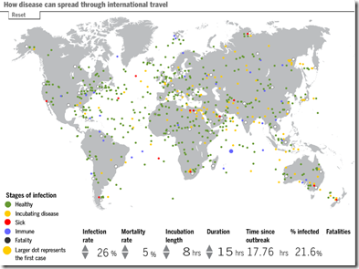
6 Aug 2009A morbid tool from the FT. Click on any traveler on the map to make him sick, then watch the disease spread. Modify the infection rate, mortality rates, and other factors to see how they affect the simulation.
Changing British Meals
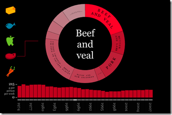
6 Aug 2009Cool interactive presentation of the changing composition of British eating since 1974, by food group. I’d love to see this for the USA. Spotted by FlowingData.
10 Things you should know about water.
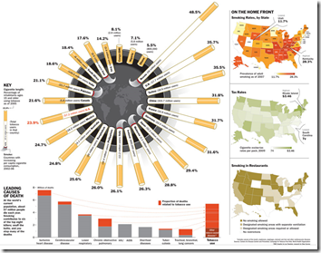
3 Aug 2009Smoking Stats: World and US
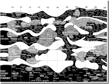
29 Jul 2009Architecture
In: Culture Innovative Maps Science
29 Jul 2009Seafood Heatmap?
29 Jul 2009What seafoods are safe to eat? Being overfished? Good magazine has a guide. (roughly: blue=good, yellow=maybe, black=bad; see the article for details). More interesting, perhaps, is the Seafood Watch iphone app which was mentioned in the comments.
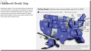
Child Obesity
In: Maps Science Source: WSJ
23 Jul 2009Looks like a nice chart. Too bad it’s squished, 3d, and slightly out of focus. I get the impression a lot of graphics people are either on their summer vacations already, or distracted getting ready for them (I know I am).
Who Says We Work Too Much?
In: Culture Innovative Science
8 Jul 2009A compendium of US Holidays, including lots of odd little facts. From Good.
Ok, enough war and money. Here are two (stunningly similar) infographics on what goes into all those fireworks. Have a nice holiday weekend everyone!
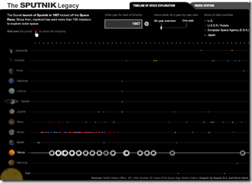
Space
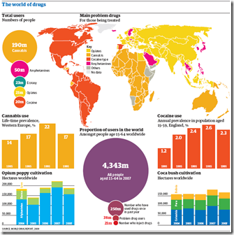
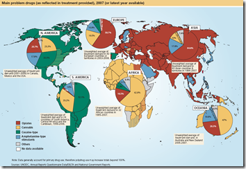
2 Jul 2009World Drug Report
25 Jun 2009Below is a chart from the UNODC’s 2009 World Drug Report. I focus a lot on media sources and blogs, but a lot of great information visualization is being done by NGOs/thinks tanks/etc.
House-Like Self-Diagnosis
24 Jun 2009WSJ article on visible symptoms of many diseases. The accompanying graphic is aesthetically pleasing, but a little disappointing info wise.
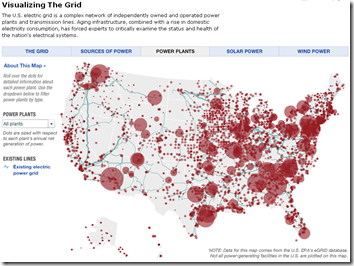
The Grid
16 Jun 2009This interactive map provides obscene amount of information on the structure and composition of the United States electrical grid, including breakdowns by type of power (wind, solar, etc), info roll-overs, potential alternative capacity, and proposed upgrades. Related article(s).
Death Odds, 1845-2006
31 May 2009A great animated chart showing the likelihood of dying at different ages over the years. I would think demographic data like this would be ripe for interesting visualizations. Nice job understandinguncertainty.org!
Two earlier posts/versions (one & two) don’t go back as far, but include the detailed explanation and some additional breakdown by risk factors.
ps – this data is for the UK.
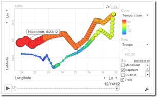
pps – the same site conducts a similar analysis of Charles Minard’s famous infographic of Napolean’s 1812 campaign (odds of dying as the campaign goes on), as well as a cool animated bubble heat map of the size and location of the army:
What is Chart Porn?
An addictive collection of beautiful charts, graphs, maps, and interactive data visualization toys -- on topics from around the world.
Categories
- Bailout (118)
- Chartporn Related (3)
- Commentary (21)
- Culture (669)
- Emerging Markets (66)
- Employment (245)
- Environment/weather (133)
- Finance (298)
- Food (92)
- Global Economy (373)
- Graphic Design (bad) (26)
- Graphic Design (general) (183)
- Graphic Tools (23)
- History (158)
- Housing (162)
- Humor (204)
- Innovative (183)
- Interactive (545)
- Internet/tech (97)
- Maps (578)
- News Media (34)
- Politics (329)
- Reference (97)
- Science (331)
- Source: Economist (101)
- Source: FT (92)
- Source: NYT (147)
- Source: Ritholtz (76)
- Source: USA Today (27)
- Source: Washington Post (90)
- Source: WSJ (135)
- Sports (58)
- Stock Market (74)
- Uncategorized (2)
- Updated regularly (76)
- US Economy (553)
- Video (22)
- Aram Korevaar: This chart is now being used as a projection in which countries such as China see themselves as in a [...]
- David: Welcome back Chart Porn! [...]
- J S: Thanks for the great story. Miss reading this blog. Hope to see you more active again. [...]
- jake: I lived in a DC row house for 6 years, and I'm writing this comment from my tiny 1 bedroom apartment [...]
- ronny pettersen: Hilarious and unfortunately accurate... ;-) [...]


