Politics Archive:
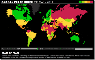
Global Peace Index (2007-11)
7 Jun 2011Based on 23 indicators. Iceland and New Zealand are at the top, with Somalia and Iraq at the bottom. (original study)
There is also a nice video explaining some of the results and changes over last year.
On the left, a comparison of budget proposals. On the right, a videographic that is sort of “debt ceiling for dummies”. Both from the Washington Post.
Conflict Deaths (1915-Present)
21 May 2011In a strange juxtaposition of imagery, this photo uses fake blood and kitchen containers to visualize 38 million deaths from various conflicts. Overall, I really like the concept, but from the way the objects are arranged and the angle of the photograph (with the blood taking up only the lower 20% of the photo), they visually seem small to me. Also, I don’t quite get the “World Cuisine” title, despite the food/cooking metaphor.
Flying Carpet of Middle East Protests
In: Graphic Design (general) Interactive News Media Politics
4 May 2011There were so many of these last month I stopped looking at them – but this one is cute. Yes, I said cute. It’s an interactive flying timeline of protest milestones for 17 countries. Click on any of them to bring up a full Guardian article. They are also keeping it up to date (as of today, anyway).
Guantanamo Prisoners Database
4 May 2011Very nice interactive chart of the history of Guantanamo prisoners, based on some excellent research by the New York Times and NPR. I could point out all the thoughtful design elements going on here, but you’ll figure it out (hint: move the slider on the timeline at the top).
State Budget Crises
In: Interactive Maps Politics Source: Washington Post US Economy
26 Apr 2011The Washington Post has mapped out a bunch of interesting stats concerning States’ Budget problems: shortfalls, pension liabilities, proposed cuts (health care, education, etc), and who is in charge. To sum up: this is yet another way we’re screwed beyond belief. (related article)
This is Not my Beautiful Chart
15 Apr 2011The only thing good about this infographic is the title. Massive dot pie chart? Ick. Color selection? Ick ick. And since you have to read the text and numbers for any kind of comprehension to take place, why bother with the pies at all? Man, I’m grumpy today.
Top Tax Rates (1916-2010)
15 Apr 2011More excellent work from VisualizingEconomics:
Federal Tax Receipt
In: Politics
15 Apr 2011From the White House: enter the amount of taxes you paid and see what it gets spent on. (via)
Turns out there are more than 100 ways to spell Muammar Muhammand al-Gaddafi’s name in English. Here is a chart of the variations:
Original and phonetic:
![]()
(via)
The Wonderful Work of Karl Hartig
In: Culture Employment Finance Graphic Design (general) History Innovative Politics Science US Economy
22 Mar 2011Karl Hartig was creating beautiful complex data visualizations back when most of us “graphics experts” were still trying to figure out how to change colors in excel. Here is a selection of his work on population, electronics, energy, stocks, immigration, politics, and music. Soak it up!
Are Public Employees Paid More?
19 Mar 2011Middle Eastern Demographics, Part 2
9 Mar 2011The Washington Post has updated the population bulge charts I mentioned last month. This time they are interactive, and include three additional countries (Egypt, Bahrain, Tunisia). Below you can see the big differences between Egypt and the United States.
Budget Forecasts vs Reality
2 Mar 2011This is from 2010, but I wanted to post it because it’s an excellent way to visualize the quality of economic projections. The New York Times refers to it as a “porcupine” chart.
Revolution
1 Mar 2011I will occasionally veer slightly away from the chart world into graphic design and image theory. If you don’t like it: suffer.
What is Chart Porn?
An addictive collection of beautiful charts, graphs, maps, and interactive data visualization toys -- on topics from around the world.
Categories
- Bailout (118)
- Chartporn Related (3)
- Commentary (21)
- Culture (669)
- Emerging Markets (66)
- Employment (245)
- Environment/weather (133)
- Finance (298)
- Food (92)
- Global Economy (373)
- Graphic Design (bad) (26)
- Graphic Design (general) (183)
- Graphic Tools (23)
- History (158)
- Housing (162)
- Humor (204)
- Innovative (183)
- Interactive (545)
- Internet/tech (97)
- Maps (578)
- News Media (34)
- Politics (329)
- Reference (97)
- Science (331)
- Source: Economist (101)
- Source: FT (92)
- Source: NYT (147)
- Source: Ritholtz (76)
- Source: USA Today (27)
- Source: Washington Post (90)
- Source: WSJ (135)
- Sports (58)
- Stock Market (74)
- Uncategorized (2)
- Updated regularly (76)
- US Economy (553)
- Video (22)
- Aram Korevaar: This chart is now being used as a projection in which countries such as China see themselves as in a [...]
- David: Welcome back Chart Porn! [...]
- J S: Thanks for the great story. Miss reading this blog. Hope to see you more active again. [...]
- jake: I lived in a DC row house for 6 years, and I'm writing this comment from my tiny 1 bedroom apartment [...]
- ronny pettersen: Hilarious and unfortunately accurate... ;-) [...]


