Maps Archive:
California for Beginners
25 Jan 2013Amusing and accurate. Unfortunately, I couldn’t find the original source to link back to.
update: created by Julian Lozos. Nice work!
Travel Speed (1800-1930)
11 Jan 2013Sure, the internet and the information revolution has been fun. But before that there was the communication revolution. And before that, it was transportation:
(original source: 1932 Atlas of the Historical Geography of the United States, which has a number of other cool historical maps)
More Hotness
10 Jan 2013Apparently the forecasts for the current heat-wave in Australia are so hot that the Bureau of Meteorology had to add two new colors to it’s forecasting map:
And here is the NYT version of of the 2012 temperature map. I like the city histograms at the bottom.
California Shooting Location Map
2 Jan 2013An amusing map from 1927, showing which areas of California could be used to film movies that you wanted to look like other parts of the world.
Helical Orbits
26 Dec 2012DC Metro Station Traffic
In: Maps
21 Dec 2012Interesting analysis of metro traffic. But I am always left wanting by ordinal rankings. Perhaps coloring the stations themselves in a heatmap manner while desaturating the line colors would have been more useful.
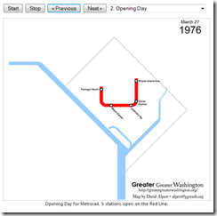
On the same site is the awesome “Evolution of Metrorail” utility that let’s you cycle through the opening of new stations since 1976:
What’s Killing People
18 Dec 2012The Institute for Health Metrics and Evaluation collects detailed information on global health issues, and produces a number of interesting visualizations.
How people died in 2010 – by cause, age, and filterable by sex and region:
Life expectancy in the US (1989-2009). Who knew it varied so much?
Drill-downable US Causes of Death (1970-2006)
and many many more.
London Underground 1932-33
12 Dec 2012I’ve always read how well designed HC Beck’s 1933 version of the London underground was. It only occurred to me the other day that I never had seen the old version for comparison. There are definitely significant improvements (…improvements that have proven very useful as the system grew further), but I can’t say it blows me away. Of course, that might be because we now view those design features as commonplace.
1932:
1933:
Heat Maps
25 Nov 2012More 2012 Election Maps
14 Nov 2012Hopefully these will be the last ones of the cycle – though these were nicely done by the Chicago Sun-Times’ Max Rust:
By margin of victory (technically, the same data as the “purple america” map that used blue/red hues).
by electoral votes:
Map Resized by 2008 Election Spending
4 Nov 2012Nice work by NPR – though I generally prefer non-contiguous cartograms.
Thanks to Fez for sending in the link!
Federal Debt (1790-2037)
In: Maps Politics US Economy
1 Nov 2012From the generally impartial Pew Center:
Increase in federal support to states during recession:

Where the federal grant money went as percent of state revenue:
Election Projections
2 Oct 2012Some fantastically clear interactive maps from the Washington Post, identifying tossups in each race (Presidential, Senate, House, Governor).
Who Pays Income Tax?
18 Sep 2012I’m a little surprised by the increase in non-payers over the years.
Non payers by state. I’m not sure I agree with using ordinal coloring – especially when so many states fall into the 30-40% range.
What is Chart Porn?
An addictive collection of beautiful charts, graphs, maps, and interactive data visualization toys -- on topics from around the world.
Categories
- Bailout (118)
- Chartporn Related (3)
- Commentary (21)
- Culture (669)
- Emerging Markets (66)
- Employment (245)
- Environment/weather (133)
- Finance (298)
- Food (92)
- Global Economy (373)
- Graphic Design (bad) (26)
- Graphic Design (general) (183)
- Graphic Tools (23)
- History (158)
- Housing (162)
- Humor (204)
- Innovative (183)
- Interactive (545)
- Internet/tech (97)
- Maps (578)
- News Media (34)
- Politics (329)
- Reference (97)
- Science (331)
- Source: Economist (101)
- Source: FT (92)
- Source: NYT (147)
- Source: Ritholtz (76)
- Source: USA Today (27)
- Source: Washington Post (90)
- Source: WSJ (135)
- Sports (58)
- Stock Market (74)
- Uncategorized (2)
- Updated regularly (76)
- US Economy (553)
- Video (22)
- Aram Korevaar: This chart is now being used as a projection in which countries such as China see themselves as in a [...]
- David: Welcome back Chart Porn! [...]
- J S: Thanks for the great story. Miss reading this blog. Hope to see you more active again. [...]
- jake: I lived in a DC row house for 6 years, and I'm writing this comment from my tiny 1 bedroom apartment [...]
- ronny pettersen: Hilarious and unfortunately accurate... ;-) [...]


