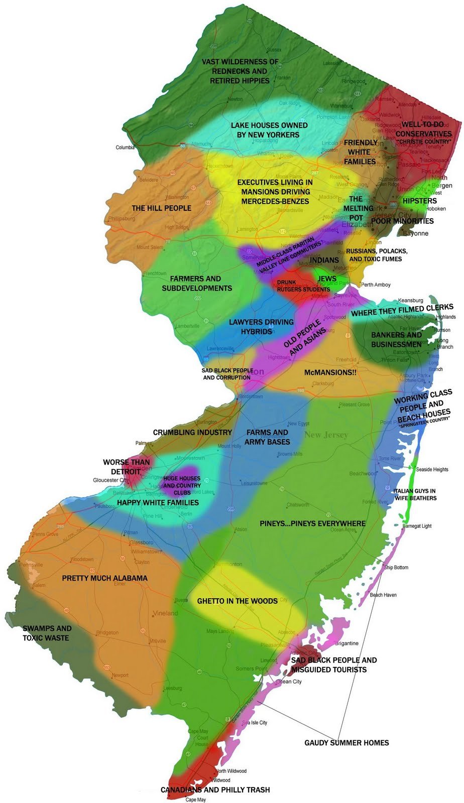
Maps Archive:
Atlas of Prejudice
5 Aug 2013Alphadesigner continues to take satirical mapping to a new level, with several dozen maps of stereotypes, from many different perspectives, updated regularly.


Red Heads and Blondes
5 Aug 2013

How Old are the Buildings in Brooklyn?
In: History Interactive Maps
5 Aug 2013An absurdly detailed map of Brooklyn color-coded by the age of the buildings.

NYC Bike Share Usage
In: Culture Interactive Maps
30 Jul 2013A clever animation of how the bikes move around throughout the day. You have to watch it on slow to really get a feeling of what’s going on.

Meteorite Sightings (1913-2013)
26 Jul 2013Meteorite fireballs witnessed from 1913. I’m not sure what is gained by putting this on a map. Also, since this is just eyewitness accounts, it suffers from population density bias.

New DC Metro Maps
18 Jun 2013There really aren’t many differences between the two current proposals, which were designed to incorporate the new Silver Line to Dulles airport. As mentioned in the WashPost comments, the only major flaw I see is using the same color for the background beltway and DC boundary as for the Silver Line.


To be honest, I still prefer a lot of the options that Cameron Booth proposed in his 2010 reworking:

22 Maps of Linguistic Differences
11 Jun 2013This has been making the rounds. I like that they used alpha shading to show variations. And it’s pop, not soda.

Animated Wind Map
6 Jun 2013A very cool real time animated map of wind.

Also some historical snapshots, like Hurricane Sandy:

United States Immigration
30 May 2013Immigration has always been a tough issue to deal with.

The chart reminds me of this John Stewart bit on immigration and “Traditional America”:
Geography of Hate
In: Culture Internet/tech Maps
15 May 2013This has been making the rounds. Based on 150,000 geocoded tweets from June 2012 to April 2013, filtered 1st by use of word, and then manually whether it was used in a negative or derogatory fashion.
Obviously this suffers from selection bias as it only includes people who bother to tweet, and those who aren’t ashamed to do it publicly. There’s also the usual population density distortion (last map below), which would be compounded by cell phone coverage out west. So, basically, this is another pretty visualization of social media meta data that doesn’t really mean much of anything. To be honest I’m surprised they only found 150,000 hateful tweets in 11 months. (The author’s FAQ is an interest read)
Homophobia:

Racist:

Disability:


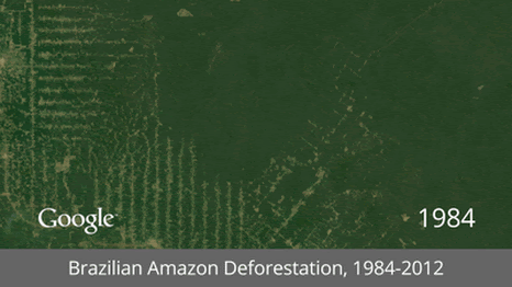
Satellite GIFs
15 May 2013It’s interesting how popular animated gifs have become again. I guess that even with high speed internet people are a little fed up with player load times and lags. Here GIFs are used to show time lapse satellite images of mankind’s impact on the earth. (google earth link)


What the Space Station is Taking Pictures of
In: Innovative Maps Science
25 Mar 2013Using location data from over 1 million photos taken by astronauts on the International Space Station provides us with another “revealed” map of the world. These big data meta analysis generally annoy me, but for some reason when they are done on a map I find them downright artistic.

The author, Nathan Bergey, has additional breakdown maps by mission, etc on his website if you’re interested.
The Rent is Too Damn High
In: Housing Interactive Maps
7 Feb 2013Heat maps of apartment rental prices in DC:

and Boston:

and many many other cities using a tool created by Jeff Kaufman.
(via welovedc)
Fancy Big Mac Index
7 Feb 2013This year, in interactive format, allowing you to select a base currency and see the changes over time.


What is Chart Porn?
An addictive collection of beautiful charts, graphs, maps, and interactive data visualization toys -- on topics from around the world.
Categories
- Bailout (118)
- Chartporn Related (3)
- Commentary (21)
- Culture (669)
- Emerging Markets (66)
- Employment (245)
- Environment/weather (133)
- Finance (298)
- Food (92)
- Global Economy (373)
- Graphic Design (bad) (26)
- Graphic Design (general) (183)
- Graphic Tools (23)
- History (158)
- Housing (162)
- Humor (204)
- Innovative (183)
- Interactive (545)
- Internet/tech (97)
- Maps (578)
- News Media (34)
- Politics (329)
- Reference (97)
- Science (331)
- Source: Economist (101)
- Source: FT (92)
- Source: NYT (147)
- Source: Ritholtz (76)
- Source: USA Today (27)
- Source: Washington Post (90)
- Source: WSJ (135)
- Sports (58)
- Stock Market (74)
- Uncategorized (2)
- Updated regularly (76)
- US Economy (553)
- Video (22)
- Aram Korevaar: This chart is now being used as a projection in which countries such as China see themselves as in a [...]
- David: Welcome back Chart Porn! [...]
- J S: Thanks for the great story. Miss reading this blog. Hope to see you more active again. [...]
- jake: I lived in a DC row house for 6 years, and I'm writing this comment from my tiny 1 bedroom apartment [...]
- ronny pettersen: Hilarious and unfortunately accurate... ;-) [...]