Maps Archive:
Religion Maps
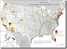
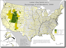
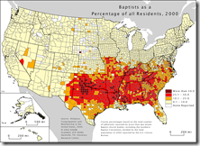
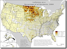
18 Aug 2009Where is the real bible belt? What about the Pentacostal belt? (there isn’t one – they’re very spread out) Fascinating maps showing how regional some Christian church’s are. Below are a few breakdowns – there are 20+ on the site. Spotted by Nathan over at FlowingData, originally from Valparaiso University.
Development aid
In: Global Economy Maps
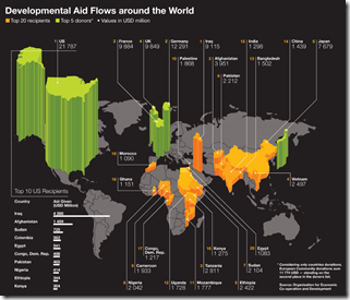
18 Aug 2009Only includes the top 20 recipients and top 5 donors. This is a map that screams for an interactive version with roll over numbers rather than all the lines (and more country coverage)
Hard Workers
In: Global Economy Maps
18 Aug 2009Hours worked per week around the world. Via DataViz.
Greenhouse Gases
14 Aug 2009The Guardian’s DataBlog brings us some environmental infographics on greenhouse gases.
Sources: (from the World Resources Institute)
CO2 emission map, with interactive country drill-downs:
Day n Nite
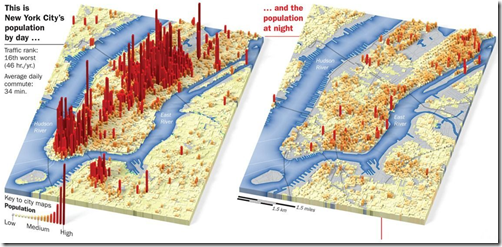
14 Aug 2009NYC’s population: daytime versus night. Via Gizmodo.
Life is a Series of Months
12 Aug 2009The average persons life in months, with some milestone achievements colored in. I like the idea of the presentation. but could use more work. Spotted at DataViz. originally(?) from SubversiveInfluence.
Fun With Infectious Diseases
In: Global Economy Innovative Interactive Maps Science Source: FT
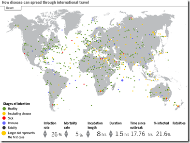
6 Aug 2009A morbid tool from the FT. Click on any traveler on the map to make him sick, then watch the disease spread. Modify the infection rate, mortality rates, and other factors to see how they affect the simulation.
UNEP Atlas of Environmental Impact
6 Aug 2009Click on any item on the map, then on “Story”. Spotted over at Kelso’s Corner.
Global Recession Map
In: Global Economy Maps Source: Economist Updated regularly US Economy
3 Aug 2009From the Economist:
Which is just a recycled version of Moody’s regularly updated map (that includes pop-up drill downs):
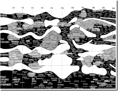
Architecture
In: Culture Innovative Maps Science
29 Jul 2009Stock Exchange Capitalization Map
29 Jul 2009Housing Fraud in Florida
In: Housing Maps US Economy
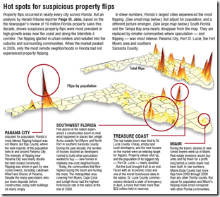
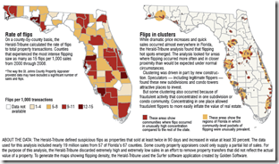
27 Jul 2009The Herald-Tribune is running a five-day investigative series on the rampant housing fraud in Florida. “Since 2000, more than 50,000 Florida properties flipped under circumstances that fraud investigators identify as suspicious — where homes, vacant land or commercial properties were bought and resold in 90 days or less and increased in value by at least 30 percent.” Wow!
Child Obesity
In: Maps Science Source: WSJ
23 Jul 2009Looks like a nice chart. Too bad it’s squished, 3d, and slightly out of focus. I get the impression a lot of graphics people are either on their summer vacations already, or distracted getting ready for them (I know I am).
US States’ Fiscal Problem
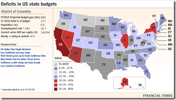
13 Jul 2009As of 5/15/09. Roll-overs provide detailed data. Related article.
Map of Human Sexuality
In: Culture Humor Interactive Maps
12 Jul 2009It’s quite entertaining in it’s comprehensiveness, and the online interactive feature of adding your own “travel pins” puts it over the top.
What is Chart Porn?
An addictive collection of beautiful charts, graphs, maps, and interactive data visualization toys -- on topics from around the world.
Categories
- Bailout (118)
- Chartporn Related (3)
- Commentary (21)
- Culture (669)
- Emerging Markets (66)
- Employment (245)
- Environment/weather (133)
- Finance (298)
- Food (92)
- Global Economy (373)
- Graphic Design (bad) (26)
- Graphic Design (general) (183)
- Graphic Tools (23)
- History (158)
- Housing (162)
- Humor (204)
- Innovative (183)
- Interactive (545)
- Internet/tech (97)
- Maps (578)
- News Media (34)
- Politics (329)
- Reference (97)
- Science (331)
- Source: Economist (101)
- Source: FT (92)
- Source: NYT (147)
- Source: Ritholtz (76)
- Source: USA Today (27)
- Source: Washington Post (90)
- Source: WSJ (135)
- Sports (58)
- Stock Market (74)
- Uncategorized (2)
- Updated regularly (76)
- US Economy (553)
- Video (22)
- Aram Korevaar: This chart is now being used as a projection in which countries such as China see themselves as in a [...]
- David: Welcome back Chart Porn! [...]
- J S: Thanks for the great story. Miss reading this blog. Hope to see you more active again. [...]
- jake: I lived in a DC row house for 6 years, and I'm writing this comment from my tiny 1 bedroom apartment [...]
- ronny pettersen: Hilarious and unfortunately accurate... ;-) [...]

