Maps Archive:
Google Map Overlays
9 Dec 2013National Geographic is adding 500 of their classic maps to the Google public data archive. Basically, these are layers mapped onto Google’s existing map engine. The press release contained two examples, but bizarrely, no link to the public gallery where the NattyG maps will eventually appear.

In some ways, this strikes me as a bit silly. but having access to these historical maps at all is a good thing, and it’s remarkable how accurate many of them were.

The Geography of Words
4 Dec 2013We’ve seen maps of languages around the world but it’s interesting to look a little deeper at how specific words differ across countries. Michael Kelley makes a few guesses over at Business Insider as to what explains some of the difference.


Public Radio Map
2 Dec 2013An interactive map showing the range of radio stations in the United States.


I tried to find a version of this including commercial stations, but the best was maps of coverage areas for single stations from radio-locator.com.

Richie Rich
11 Nov 2013Where are people with the highest incomes and most education living? Here’s a map:


Top Baby Name by State (1960-2012)
7 Nov 2013

Maps Urbane
In: Maps
5 Nov 2013An assortment of somewhat irreverent (but not necessarily inaccurate) maps.


If All the Ice Melted
5 Nov 2013Hypothetical mapping of what coastlines would look like if all the ice in the world melted, raising ocean levels by 216 feet.


DC Gunfire
4 Nov 2013A map of gunshots detected in Washington DC since 2009 using triangulated sonic sensors. The system allows police to be quickly dispatched to within yards of where the guns were fired (though the related article doesn’t go into much detail about whether that leads to catching the shooters).

Evolution of Western Dance Music
24 Oct 2013Nicely done. I suspect some people might think that London is given credit for more than it deserves.

HOT HOT HOT
23 Oct 2013Climate change will not impact everywhere at the same time. The below map estimates when the average temperature of the coolest year will exceed the historic average hottest year. What does this mean? Besides that we’re all screwed, you may wish to reconsider your tropical retirement plans. (related article)

And the original study also has some nice visualizations:
Map of Europe (1000AD to today)
16 Sep 2013Pretty crazy how many changes happened in the last 1000 years, compared to the (relative) stability of recent history.
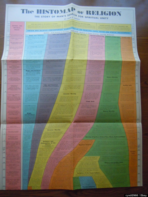
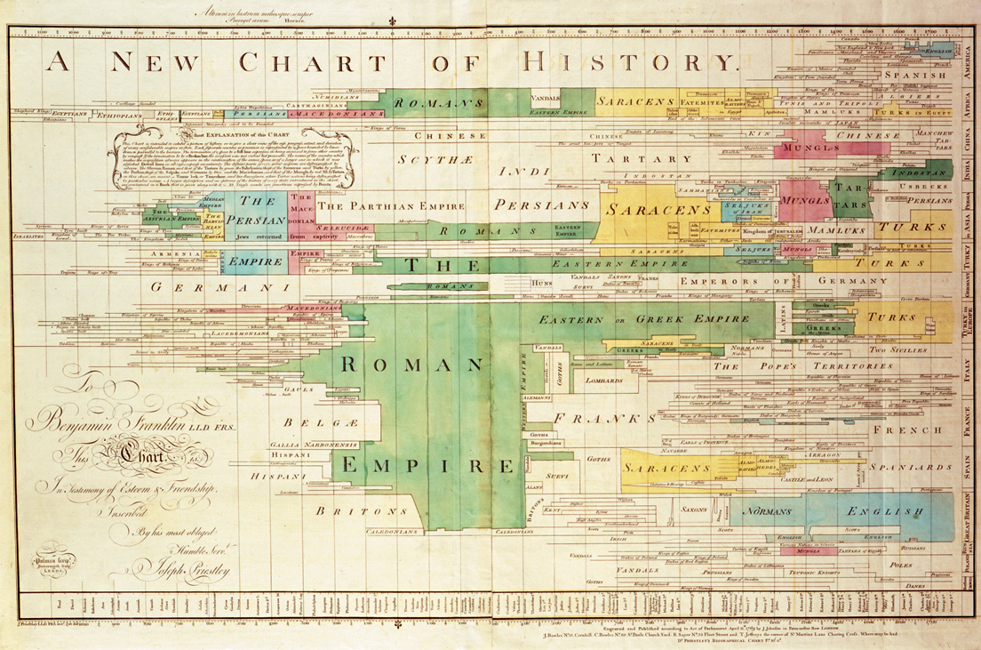
Timeline Maps
21 Aug 2013I like these vintage history maps. They are nice and information dense, and you can almost smell your old school when you look at them.


Below is the hard to find “Histomap of Religion” which recently sold online for $405.
Here’s the 1881 “Synchronological Chart of Universal History” which is one of the best chart titles of all time, and stretched 23 feet long.

![]()
Mapping Vice in San Francisco
15 Aug 2013Ok, it’s from 1885, but have things really changed much?

What Lands Did Europeans Really Discover?
14 Aug 2013Nice work by Bill Rankin over at Radial Cartography. He tries to map out lands that were really uninhabited prior to discovery. You’ll notice they were mostly small islands.

If you like maps and haven’t browsed that site before, you should. Lots of cool projects:
A table of projections:

Comparison of subways in the USA:

Make a personalized celestial calendar:

Washington DC Transit (1888-today)
13 Aug 2013I came across this interesting map of 1888 horsedrawn streetcars in Washington DC:

Not entirely difference from the location accurate version of the modern subway map:

Of course, a more accurate comparison is probably to a modern bus map. but they are so busy:

DC is scheduled to re-introduce streetcars in 2013/14, starting with a small run along H Street SE.


What is Chart Porn?
An addictive collection of beautiful charts, graphs, maps, and interactive data visualization toys -- on topics from around the world.
Categories
- Bailout (118)
- Chartporn Related (3)
- Commentary (21)
- Culture (669)
- Emerging Markets (66)
- Employment (245)
- Environment/weather (133)
- Finance (298)
- Food (92)
- Global Economy (373)
- Graphic Design (bad) (26)
- Graphic Design (general) (183)
- Graphic Tools (23)
- History (158)
- Housing (162)
- Humor (204)
- Innovative (183)
- Interactive (545)
- Internet/tech (97)
- Maps (578)
- News Media (34)
- Politics (329)
- Reference (97)
- Science (331)
- Source: Economist (101)
- Source: FT (92)
- Source: NYT (147)
- Source: Ritholtz (76)
- Source: USA Today (27)
- Source: Washington Post (90)
- Source: WSJ (135)
- Sports (58)
- Stock Market (74)
- Uncategorized (2)
- Updated regularly (76)
- US Economy (553)
- Video (22)
- Aram Korevaar: This chart is now being used as a projection in which countries such as China see themselves as in a [...]
- David: Welcome back Chart Porn! [...]
- J S: Thanks for the great story. Miss reading this blog. Hope to see you more active again. [...]
- jake: I lived in a DC row house for 6 years, and I'm writing this comment from my tiny 1 bedroom apartment [...]
- ronny pettersen: Hilarious and unfortunately accurate... ;-) [...]