Maps Archive:
Cost of Renting vs Owning
In: Housing Interactive Maps
14 Feb 2011Real estate listing service Trulia has created this interactive map of median rental costs vs purchase prices on a two bedroom home. In case you are thinking of moving, they also supply bar charts of unemployment, foreclosure, and job growth for the same cities.
The data is updated each quarter and supplemented with a series of simpler infographics:
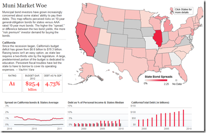
Muni Market Woes
10 Feb 2011There’s a lot of attention on the national debt, but states are in even deeper trouble. In part because investors don’t trust them to get their act together, resulting in lower ratings and higher borrowing costs. The below clickable map lets you view debt levels and interest rate spreads by state.
And while we’re talking about state fiscal policies, here’s a beautiful representation of the Massachusetts 2011 budget:
Southern Democrats (1964-2010)
8 Feb 2011The Economist produced this annotated video-graphic of mapped donut charts illustrating the dominance of southern democrats in the 1960s, and their subsequent decline.
The Organized Crime Network
7 Feb 2011Just how organized is organized crime? Think of it as the world’s largest and most illicit social network.
Ok, that may not be the best analogy ever, but this interactive map of transnational crime with popup details is a fascinating way to explore the $2 trillion global grey market of illegal activity. (via Ritholtz)
Global Debt (1880-2009)
In: Finance Global Economy History Interactive Maps Politics
7 Feb 2011The IMF has released a new database of sovereign debt-to-gdp ratios for 174 countries, going back as far as 1880 (for G7 countries).
The data shows how government debt has risen and fallen over the years as important events, such as wars and stock market crashes, affect a country’s decisions about when to save and when to spend. It turns out the relationship between debt and economic growth has changed over time; historically, fast growing countries had low debt ratios, while slow growers struggled under higher debt. In the past 30 years that relationship has altered as advanced economies’ debt levels have risen and their economies have grown.The data also debunks some old clichés, for example that African countries have the highest debt levels. In fact, low income countries in Africa today have lower debt ratios than do advanced economies in Europe and North America.
The below charts appear in a slightly slow, but interesting, IMF You-tube video:
The data can also be explored and exported using the IMF’s DataMapper (note the links at the bottom of the mapper to the related working paper and dataset):
Where the Streets Have Your Name
In: Culture Interactive Maps
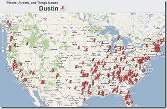
7 Feb 2011Stephen von Worley tracked down streets, places, and things all across the the world that use one of over 10,000 first names. Just enter your name and click on a pushpin to go to that location in either Google Maps or Google Earth. You can even use street view to see the signs and streets themselves. I can’t help but see this leading to a sign-theft crime spree. 😉
Flags of the World
In: Interactive Maps Reference
2 Feb 2011Roll over any nation on this map of the world to see that country’s flag, as well as an explanation of the symbolism of its design. For example, the colors in Egypt’s flag represent oppression (black), overcome through bloody struggle (red), to be replaced by a bright future (white) – a timeless design, apparently. Thanks to Jack Lucky for the link!
The FT created an interactive bar chart of the IMF’s COFER data on foreign currency holdings. Watching the growth since 2006 is particularly stunning. Design wise, the dynamic resorting of the countries is an interesting variation.
Posted at the same time was a map of China’s imports with details clickable by country. This is all part of the FT’s in depth “China Shapes the World” feature.
Note: some Financial Times features require a subscription.
Fun and Games with Airline Ticket Prices
In: Interactive Maps Reference
27 Jan 2011The Wall Street Journal has a nice article about the weekly ebbs and flows of airline ticket sales. If you want to dig deeper, farecompare.com has done some longer period analysis of this topic.
Flipping the typical fare question on it’s head, below is a very cool interactive map where you input how much you want to spend and it will show you where you can fly for that much money:
Kayak.com has also graphed a few charts of average ticket prices, and provides downloadable data:
Finally, since we’re on the topic, I want to give a Chart Porn graphic design gold star to Hipmunk’s flight reservation site. It’s what selecting a flight should look like:
From National Geographic, a wordle type cloud map based on the distribution of common last names.
Profane Twitter
In: Culture Internet/tech Maps
23 Jan 2011Daniel Huffman filtered 1.5 million tweets from March and April 2010 and mapped the rate of profanity across America. (via; note: the link below is to a 12mb pdf file)
The US Economy in Two Visualizations
In: Employment Finance Housing Interactive Maps Updated regularly US Economy
22 Jan 2011If you want to know the state of the US economy at any time, check out the below visualizations from Russell Investments and the AP. They are both updated monthly with the latest data, allow all kinds of drilling down, and both take the time to document sources and explain why you should give a shit about these particular numbers (for example, click on any of the “historical details” links on Russell’s dashboard).
What Causes Gun Deaths?
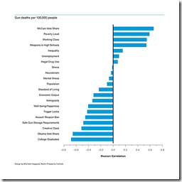
17 Jan 2011Richard Florida and Charlotta Mellander of the Atlantic took a crack at examining the statistical relationship between gun related deaths and several commonly associated causes.
Firearm-related deaths were positively associated with states that voted for McCain (.66) and negatively associated with states that voted for Obama (-.66).
[.] fatal gun violence is less likely to occur in richer states with more post-industrial knowledge economies, higher levels of college graduates, and tighter gun laws. Factors like drug use, stress levels, and mental illness are much less significant than might be assumed.
The authors correctly point out the difference between correlation and causation, and I have problems with some of the indicators used, but this analysis is one step closer to reality than most of the other crap articles floating around our news media lately on this topic. As usual with politically fiery articles like this, the comments are an entertaining read. Thanks to Tom Dawkins for the link!
Map: Factory Farms
In: Food Interactive Maps
7 Jan 2011Want to know how many cows live in your state? How about the average chickens per farm? The site obviously has a slight bias on food issues, but the data is well presented and the methodology is laid out clearly (something that is missing on too many data visualizations). Personally, I have no problem with killing animals and eating them, and agree that they shouldn’t suffer horribly crappy lives beforehand. (Related blog post).
Map: North American Accents, eh?
6 Jan 2011An interesting attempt to map out linguistic differences in the great American melting pot. It’s a bit much to absorb at first, but the more you dig, the more fascinating it is. For example, if you zoom in and click on one of the little dots, you realize that author Rick Aschmann has included links to more than 600 audio file examples of different accents. (via)
What is Chart Porn?
An addictive collection of beautiful charts, graphs, maps, and interactive data visualization toys -- on topics from around the world.
Categories
- Bailout (118)
- Chartporn Related (3)
- Commentary (21)
- Culture (669)
- Emerging Markets (66)
- Employment (245)
- Environment/weather (133)
- Finance (298)
- Food (92)
- Global Economy (373)
- Graphic Design (bad) (26)
- Graphic Design (general) (183)
- Graphic Tools (23)
- History (158)
- Housing (162)
- Humor (204)
- Innovative (183)
- Interactive (545)
- Internet/tech (97)
- Maps (578)
- News Media (34)
- Politics (329)
- Reference (97)
- Science (331)
- Source: Economist (101)
- Source: FT (92)
- Source: NYT (147)
- Source: Ritholtz (76)
- Source: USA Today (27)
- Source: Washington Post (90)
- Source: WSJ (135)
- Sports (58)
- Stock Market (74)
- Uncategorized (2)
- Updated regularly (76)
- US Economy (553)
- Video (22)
- Aram Korevaar: This chart is now being used as a projection in which countries such as China see themselves as in a [...]
- David: Welcome back Chart Porn! [...]
- J S: Thanks for the great story. Miss reading this blog. Hope to see you more active again. [...]
- jake: I lived in a DC row house for 6 years, and I'm writing this comment from my tiny 1 bedroom apartment [...]
- ronny pettersen: Hilarious and unfortunately accurate... ;-) [...]


