Housing Archive:
US Housing Prices, Nominal and Real (1890-2010)
In: History Housing US Economy
25 Mar 2011Housing prices trends don’t look the same if you adjust for inflation.
On a side note, the designer of the above, Catherine Mulbrandon over at Visualizing Economics, has a kickstarter campaign to fund production of a new publication on US Income. She does great work and I recommend you donate, if so inclined.
Update: Economic Indicators Dashboard
23 Mar 2011One of my favorite economic dashboards. It highlights major macro indicators, what direction they are trending, and what the typical ranges are. It also lets you drill down to explanations of why you should care, and historical values.
Case-Shiller as Rollercoaster (1890-2010)
In: History Housing Innovative
8 Mar 2011View the inflation adjusted Case-Shiller home price index as if you were riding the chart on a roller coaster. An update of the classic version from Speculative Bubble (that only went through 2007).
Housing Market Heat Map
In: Housing
25 Feb 2011I don’t know why it took so long for someone to graph the Case-Shiller data this way, but I like it:
Cost of Renting vs Owning
In: Housing Interactive Maps
14 Feb 2011Real estate listing service Trulia has created this interactive map of median rental costs vs purchase prices on a two bedroom home. In case you are thinking of moving, they also supply bar charts of unemployment, foreclosure, and job growth for the same cities.
The data is updated each quarter and supplemented with a series of simpler infographics:
The US Economy in Two Visualizations
In: Employment Finance Housing Interactive Maps Updated regularly US Economy
22 Jan 2011If you want to know the state of the US economy at any time, check out the below visualizations from Russell Investments and the AP. They are both updated monthly with the latest data, allow all kinds of drilling down, and both take the time to document sources and explain why you should give a shit about these particular numbers (for example, click on any of the “historical details” links on Russell’s dashboard).
Mapping America
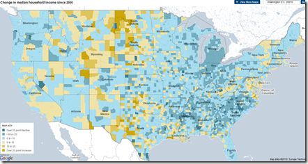
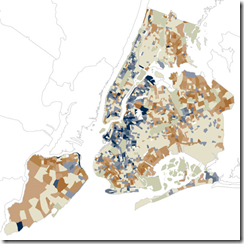
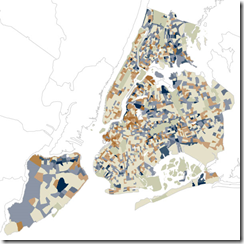
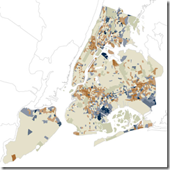
15 Dec 2010The NYT’s has created a huge variety of interactive maps based on the Census Bureau’s American Community Survey. Click on “view more maps” to see different breakdowns (income, race, housing, education). Roll-overs popup details at the county or census area level. Related article.
Here’s the percentage of foreign born population in Washington DC:
Change in income level since 2000:
This one shows how racially divided DC still is (green vs blue)”:
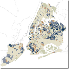
They also used the data for some more detailed analysis, such as “How NYC’s Racial Makeup has changed since 2000” (clockwise from upper left: white, hipanic, asian, black). Related article.
Foreclosure Delays (2007-2010)
13 Dec 2010This map timeline shows how the average number of days owners spend in delinquency before being foreclosed on has more than doubled since 2007.
Google Foreclosure Maps
8 Dec 2010If you select map type “More…/Real Estate”, and check “Foreclosure” as the listing type, Google will map out all the foreclosures for you. Every dot in the below map is a foreclosure in the Washington DC region (yikes!).
Floyd Norris presents some interesting data indicating that it was the least expensive homes whose prices went up the most, and are now falling the fastest. Barry Ritholtz sees this as more proof that the bubble was in credit – not housing.
American Human Development Index
In: Employment Food Housing Interactive Maps Science US Economy
21 Nov 2010Based on the idea that well-being cannot be measured by GDP alone, the Human Development Index looks at over 100 indicators, which you can explore on maps and charts at the most detailed level, or as aggregates (health, education, income). The chart display does seem to have problems separating out Washington DC, however – since we don’t actually have a congressional district — <sigh>. (via)
One Mortgage
In: Housing
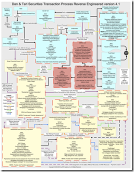
16 Nov 2010Dan Edstrom (who performs securitization audits for a living) decided to diagram what actually happened to his mortgage as it was securitized. Good luck understanding it. (via Caryn Sykes and Huffington)
Update: The State of the Economy
25 Oct 2010October’s update of the Economic Indicators Dashboard:
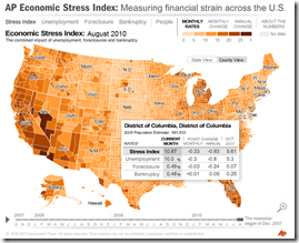
and while we’re at it, here is the AP’s Economic Stress Map, which shows unemployment, foreclosures, and bankruptcies from 2007-today, by county.
Homebuyer Tax Credits
21 Oct 2010Personally, I don’t know why we’re still subsidizing homebuying. (via Ritholtz, who points out per-capita would probably have been more useful)
Update: Economic Indicators Dashboard
In: Employment Finance Housing Interactive Updated regularly US Economy
24 Sep 2010One of my favorite summaries of economic indicators. Click on any of the “historical details” to see what each indicator means and why it’s important. Updated 9/22/10.
What is Chart Porn?
An addictive collection of beautiful charts, graphs, maps, and interactive data visualization toys -- on topics from around the world.
Categories
- Bailout (118)
- Chartporn Related (3)
- Commentary (21)
- Culture (669)
- Emerging Markets (66)
- Employment (245)
- Environment/weather (133)
- Finance (298)
- Food (92)
- Global Economy (373)
- Graphic Design (bad) (26)
- Graphic Design (general) (183)
- Graphic Tools (23)
- History (158)
- Housing (162)
- Humor (204)
- Innovative (183)
- Interactive (545)
- Internet/tech (97)
- Maps (578)
- News Media (34)
- Politics (329)
- Reference (97)
- Science (331)
- Source: Economist (101)
- Source: FT (92)
- Source: NYT (147)
- Source: Ritholtz (76)
- Source: USA Today (27)
- Source: Washington Post (90)
- Source: WSJ (135)
- Sports (58)
- Stock Market (74)
- Uncategorized (2)
- Updated regularly (76)
- US Economy (553)
- Video (22)
- Aram Korevaar: This chart is now being used as a projection in which countries such as China see themselves as in a [...]
- David: Welcome back Chart Porn! [...]
- J S: Thanks for the great story. Miss reading this blog. Hope to see you more active again. [...]
- jake: I lived in a DC row house for 6 years, and I'm writing this comment from my tiny 1 bedroom apartment [...]
- ronny pettersen: Hilarious and unfortunately accurate... ;-) [...]


