History Archive:
Drought (1896-2012)
In: Food History Maps US Economy
24 Jul 2012A look at drought through the years. There’s also a nice article about the design decisions and process that went into it.
Poverty and Policy
In: Culture Employment History
18 Jul 2012Some slick programming in this annotated exploration of 50 years of poverty statistics. Tough I’m not a fan of the pie charts, per se, the rollover drill down is a nice idea. Be sure to click on the small “change year” to bring up a timeline slider that updates in real time. Like I said – slick!
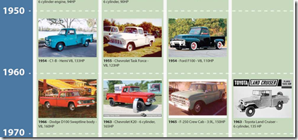
Truck Timeline
17 Jul 2012Ok, confession time. I’m not posting this because it’s a great infographic or timeline. I’m posting it because I love vintage trucks. Particularly those in the 50s and 60s.
Native America Maps
18 Jun 2012The below map of Linguistic Groups has been making the social media rounds. When I saw it on Facebook it had the title “1491” – which I suppose means this is what North America looked like before Columbus showed up. Yet, the map has no date, and very specifically refers to linguistic groups, not tribes. The link below goes to a Tumblr version with an entertaining review:
this map is awful. it’s so fucking inaccurate and offensive.
when will cartographers (and map-readers) learn to be fucking accountable tho. like it’s just irresponsible and essentially automatically shoddy work to try to map all tribal territories in N. America on the same map, because at that scale, it’s physically impossible to represent everyone. a few months ago I was hired to make maps of historical changes in indigenous territories in eastern Guatemala (a relatively small area), and ended up having to draw maps that were 1” to 20km, and even then, it was still a logistical challenge. lol this map doesn’t even have a date on it, much less sources…again: as someone who makes a living mapping stuff like this, I can tell you: it took over 6 months to dig through archives and indigenous records just to find adequate and reliable information for less than half of Guatemala, a tiny tiny fraction of N. America.
there’s a lot at stake in mapping indigenous territories and cultural/linguistic areas, and unfortunately, usually those with the power and authority to map things like that are (a) not indigenous (b) not invested in indigenous communities (c) not knowledgeable enough on indigenous cultures and complexity therein to draw an adequate representation.
FELLOW CARTOGRAPHERS AND ACADEMICS: STOP FUCKING EVERYTHING UP AND HOLD YOURSELF ACCOUNTABLE FOR THE POWER AND RESPONSIBILITY IN DRAWING MAPS
I thought it might be interesting to check out other variations on this topic. Here are two from Wikipedia which are much more detailed:
This one seems to combine tribe locations with language families, which makes sense, but is very simplified.
the National Geographic wins for overall aesthetics, while also including Latin American cultures (click to see zoomable version).
The Atlas of Extinct Nations has a small discussion of the uncertainties of creating these maps, and also included this cool animated gif timemap of the loss of Native American Lands:
Science Fiction to Reality Timeline
25 Apr 2012When scientific advances were first theorized vs when they became reality. After a close viewing I would say whoever wrote this wasn’t particularly well-read, or even a very good geek – a lot of things on both sides are just plain wrong. Great idea. Crappy execution. Anybody want to try their hand at a version that includes da Vinci, Verne, and Heinlein (just for starters).
Apollo Astronaut Assignments
12 Apr 2012Not the most aesthetically pleasing figure I’ve ever seen – but there’s a ton of information crammed in.
What America Buys
9 Apr 2012World GDP (1-2050)
19 Mar 2012I’ve posted charts based on Maddison’s GDP dataset before, but here’s a new one that tacks on IMF projections. Obviously, the timeline scale isn’t linear and thus distorts things a bit, but the broad point is the same.
All of History
19 Mar 2012Chronozoom provides an interactive timeline of the known history of the universe. Maybe think of it as a historical Prezi, where you can zoom in on information, images, and videos explaining what we know. The html5 animation was pretty shaky on my Firefox, but it ran nicely on Safari. The behind the scenes story about the team that created this is a good read.
2012 Economic Freedom Map
In: Finance Global Economy History Interactive Maps Politics Updated regularly
6 Mar 2012I’m not a fan of the Heritage Foundation, and the one time I dug into the data of their Economic Freedom Index I found that they occasionally compare apples and oranges to get around data scarcity – BUT: they do put a large research effort into the report each year. The below interactive map is well executed – but you should drill down to country level data to get a feel for what is really being measured (click on a country, then the “learn more about this country” link that pops up in the lower left. Why this requires two steps I have no idea).
Improving on Minard?!?
2 Mar 2012How dare they! Well, actually, it’s a fun exercise. Declared by Tufte to be one of the best statistical graphics ever drawn, Joseph Minard’s graph of Napoleon’s march on Russia is definitely a classic (a copy hangs in my bathroom).
John Boykin recently took a crack at redesigning the classic, and goes into quite a bit of detail on his website about the choices he made:
John links to a series of other re-creations and re-interpretations of Minard’s dataset, as collected by Michael Friendly:
3D:
I particularly like this googlemap version:
And then there’s the executive summary version. Bwahahahahaha!
(via JunkCharts)
Old Maps Online
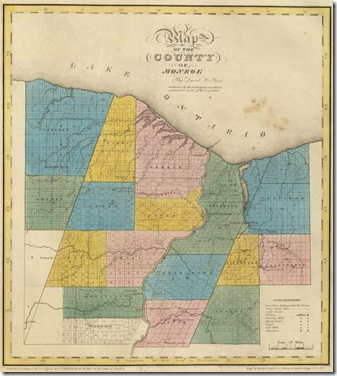
29 Feb 2012What’s cool about this repository of old maps is that you can just type in a city or zip code, select the period your are interested in, and it will you show you what maps cover that area. Below is my hometown in 1829. I think it’s great that they are preserving these online – I see the old surveyor books torn up for sale at flea markets all the time.(via Sean R and Flowing Data)
Genealogy of Car Companies
29 Feb 2012Another cool piece from HistoryShots – this one looking at the growth, consolidation, and death of automobile companies.
San Francisco Rain (1960-2012)
23 Feb 2012Stephen Von Worley created this beautiful visualization of 50 years of San Francisco rainfall. I’d love to see an interactive version of this for any city – as an addition to Weatherspark perhaps?
Amazing Old (and Free) Visualization Books
22 Feb 2012There are lots of great new books out there about graphics and data visualization. But have you ever taken a look at some that were written back before computer software? It turns out that most of these chart and visualization methods have been around for decades – it’s just that they used to draw them by hand.
I highly recommend these books to anyone. Besides the impressive graphics and nostalgia values, the writing quality and content advice are excellent – regardless of what century you are in.
Graphic Methods for Presenting Facts, Willard Cope Brinton (1914). Brinton not only presents a variety of graph types, he goes into quite a bit of detail on the decisions that go into making a well designed chart. Note the author’s sarcastic review of the first chart below – Ha!
In 1939, Brinton released a greatly expanded version of his book, entitled Graphic Presentation, which covers an amazing breadth of graphic methods (520 pages with separate chapters for 59 different graph types!) — including these beauties:
Sections on chart elements and color choice:
Who knew they were drawing 3d curve charts in 1939?:
Next up, Calvin Schmid’s 1954 Handbook of Graphic Presentation. Schmid focused a lot on the proper use of design elements, including some draftsmanship tips. It’s amusing how many of the examples resemble charts from recent policy debates:
Others are a bit more dated:
Note: if you want to read these on your iPad (like I did), you should follow the directions at this link (the PDF files available directly from the Archive do not always display properly).
What is Chart Porn?
An addictive collection of beautiful charts, graphs, maps, and interactive data visualization toys -- on topics from around the world.
Categories
- Bailout (118)
- Chartporn Related (3)
- Commentary (21)
- Culture (669)
- Emerging Markets (66)
- Employment (245)
- Environment/weather (133)
- Finance (298)
- Food (92)
- Global Economy (373)
- Graphic Design (bad) (26)
- Graphic Design (general) (183)
- Graphic Tools (23)
- History (158)
- Housing (162)
- Humor (204)
- Innovative (183)
- Interactive (545)
- Internet/tech (97)
- Maps (578)
- News Media (34)
- Politics (329)
- Reference (97)
- Science (331)
- Source: Economist (101)
- Source: FT (92)
- Source: NYT (147)
- Source: Ritholtz (76)
- Source: USA Today (27)
- Source: Washington Post (90)
- Source: WSJ (135)
- Sports (58)
- Stock Market (74)
- Uncategorized (2)
- Updated regularly (76)
- US Economy (553)
- Video (22)
- Aram Korevaar: This chart is now being used as a projection in which countries such as China see themselves as in a [...]
- David: Welcome back Chart Porn! [...]
- J S: Thanks for the great story. Miss reading this blog. Hope to see you more active again. [...]
- jake: I lived in a DC row house for 6 years, and I'm writing this comment from my tiny 1 bedroom apartment [...]
- ronny pettersen: Hilarious and unfortunately accurate... ;-) [...]


