History Archive:
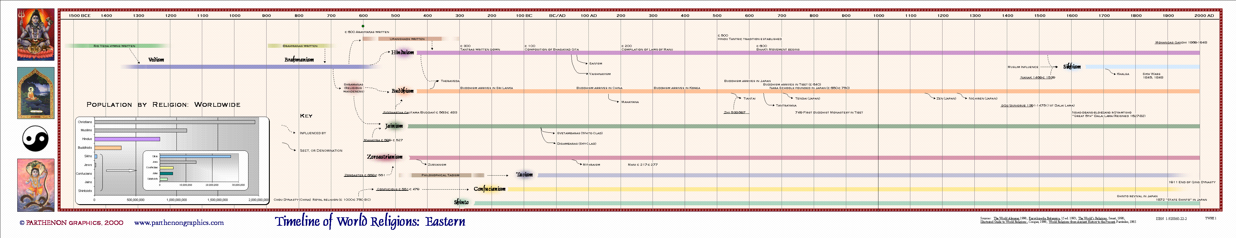
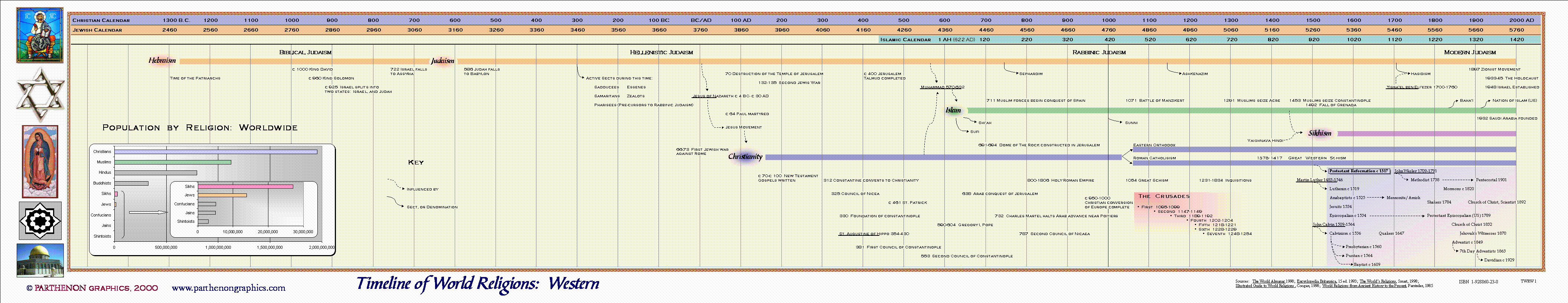
Timeline of World Religions
29 Jan 2013I’m not expert enough on any of these to say whether this is accurate or not. A clear explanation of what the different colors and line widths would have been helpful.

Some other versions:

Travel Speed (1800-1930)
11 Jan 2013Sure, the internet and the information revolution has been fun. But before that there was the communication revolution. And before that, it was transportation:


(original source: 1932 Atlas of the Historical Geography of the United States, which has a number of other cool historical maps)
2012 Hottest Year on Record
9 Jan 2013It didn’t just FEEL hot. It WAS hot.


Video Games (1975-2011)
21 Dec 2012Games by genre, and games by platform. Labeling the axis might have been useful – I assume it’s supposed to be percent of total, with the space at top “other”? I tried to find the original source for this, but had no luck.

Timeline Wizardry
20 Dec 2012Timelines are underutilized visualization tools – partially because they are a huge pain in the ass to create. Nate Kogan describes his experience using Timeline.Verite.Co’s nifty javascript timeline creation tool to convert stories stored in a google spreadsheet into a beautiful way to view history.

What’s Killing People
18 Dec 2012The Institute for Health Metrics and Evaluation collects detailed information on global health issues, and produces a number of interesting visualizations.
How people died in 2010 – by cause, age, and filterable by sex and region:

Life expectancy in the US (1989-2009). Who knew it varied so much?

Drill-downable US Causes of Death (1970-2006)

and many many more.
Oskar Fischinger
18 Dec 2012I dabble in VJ’ing, and it’s amazing what you can do with todays tools, like Resolume. But take a look at what Oskar Fischinger did back in 1938 with pieces of paper hanging from wires in his synesthetic interpretation of Liszt’s Hungarian Rhapsody. Amazing. Actually, it’s kind of embarrassing. We are so spoiled.
US Weather Disasters (1980-2011)
19 Nov 2012Cool graphic from National Geographic:


Hurricanes, Earthquakes, and Fires
1 Nov 2012Hurricanes since 1851:

Earthquakes since 1898:

Fires 2001-2012:

US Congress: Left and Right
29 Oct 2012Another beauty from xkcd. I’m a little dubious of the methodology behind the liberal/conservative distinctions, but they’re upfront and clear about what is being displayed.

You’re Too Old to be King?
In: History
25 Sep 2012Ages and reigns of famous leaders throughout history. The coverage is a little odd. Mao but not Castro? No Khans?


Here’s a similar chart of the empires themselves. I’m told this is an awesome graphic, but I can’t read Italian.

Great Tree of Life
24 Sep 2012The angle threw me for a minute, and I wonder if the ending arc widths are proportionally representative or not – but overall, I like it!

Summer Olympics (1896-2012)
In: History Interactive Maps Sports
30 Jul 2012I guess today is the day of map posts! Here is one from the Economist that shows which countries participated in each summer Olympics since 1896. You can see the stupid 1980/84 boycotts by east and west, for example.


Origins of America
30 Jul 2012Awesome animated gif of the growth of the US territories and states. The only improvement I can think of is if there was a timeline control – watching the dates change while keeping track of map changes is almost impossible.

I couldn’t find the original creator to link to. If you know where credit should be given, let me know.


What is Chart Porn?
An addictive collection of beautiful charts, graphs, maps, and interactive data visualization toys -- on topics from around the world.
Categories
- Bailout (118)
- Chartporn Related (3)
- Commentary (21)
- Culture (669)
- Emerging Markets (66)
- Employment (245)
- Environment/weather (133)
- Finance (298)
- Food (92)
- Global Economy (373)
- Graphic Design (bad) (26)
- Graphic Design (general) (183)
- Graphic Tools (23)
- History (158)
- Housing (162)
- Humor (204)
- Innovative (183)
- Interactive (545)
- Internet/tech (97)
- Maps (578)
- News Media (34)
- Politics (329)
- Reference (97)
- Science (331)
- Source: Economist (101)
- Source: FT (92)
- Source: NYT (147)
- Source: Ritholtz (76)
- Source: USA Today (27)
- Source: Washington Post (90)
- Source: WSJ (135)
- Sports (58)
- Stock Market (74)
- Uncategorized (2)
- Updated regularly (76)
- US Economy (553)
- Video (22)
- Aram Korevaar: This chart is now being used as a projection in which countries such as China see themselves as in a [...]
- David: Welcome back Chart Porn! [...]
- J S: Thanks for the great story. Miss reading this blog. Hope to see you more active again. [...]
- jake: I lived in a DC row house for 6 years, and I'm writing this comment from my tiny 1 bedroom apartment [...]
- ronny pettersen: Hilarious and unfortunately accurate... ;-) [...]