Graphic Design (general) Archive:
Sovereign Debt Ratings
1 Aug 2011I’m posting this more because it’s an example of a well designed cartogram map, more than because of the content. (via)
Data Journalism
29 Jul 2011As excellent article over at the Guardian about the rise of data journalism and what it takes to do it right.
Flying Carpet of Middle East Protests
In: Graphic Design (general) Interactive News Media Politics
4 May 2011There were so many of these last month I stopped looking at them – but this one is cute. Yes, I said cute. It’s an interactive flying timeline of protest milestones for 17 countries. Click on any of them to bring up a full Guardian article. They are also keeping it up to date (as of today, anyway).
Going Clubbing in Canada
12 Apr 2011The images were obviously chosen to be inflammatory – but the infographic is carefully constructed to do so in a serious way.
ezViz Desktop BI Tool
29 Mar 2011I receive a lot of emails asking what tools can be used to move past excel and create cool charts. Well, here’s one: ezViz is a very affordable ($79) desktop data visualization analysis tool that has many of the same cool features as much more expensive products such as Tableau and Spotfire. Starting with an excel spreadsheet you can easily assign variables to chart attributes, filter, and drill down through your data. Chart types include heatmaps, scatter bubbles, maps, and surface plots, among others. Watch the video and read the manual to see some of the nifty features included. Tableau and Spotfire are awesome and more powerful products, obviously, but they have priced themselves so far out of the reach of researchers and analysts that it’s nice to see a product like this fill in the gap a little.
Teen Drug Use
24 Mar 2011I usually don’t post these column-style infographics anymore, because most of them are shitty link-bait. But this one on teen drug use cites a quality recent source, doesn’t over-use symbols or clip art, properly highlights key observations, and uses a consistent color scheme. Nice work! Oh, and high school kids – don’t do drugs.
The Wonderful Work of Karl Hartig
In: Culture Employment Finance Graphic Design (general) History Innovative Politics Science US Economy
22 Mar 2011Karl Hartig was creating beautiful complex data visualizations back when most of us “graphics experts” were still trying to figure out how to change colors in excel. Here is a selection of his work on population, electronics, energy, stocks, immigration, politics, and music. Soak it up!
Elements of Design
19 Mar 2011Look. Study. Learn. It will be on the test. (via)
Dow Jones 2010, in Music
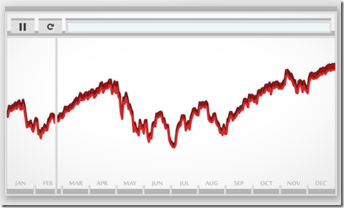
7 Mar 2011No it’s not a musical. Artist Bard Edlund’s “Dow Piano” translates the performance of the Dow each day onto a three octave scale, and adjusts the volume of each note according to trading volume. I guess instead of data visualization we could call this data audioization – or we could just call it cool.
Revolution
1 Mar 2011I will occasionally veer slightly away from the chart world into graphic design and image theory. If you don’t like it: suffer.
Exo-Planets
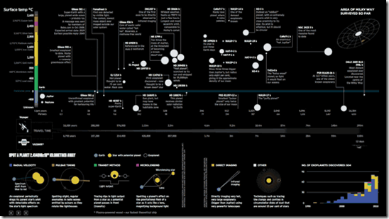
24 Feb 2011This infographic lays out what is known about all of the planets that have been identified outside of our solar system. Also, Information is Beautiful has put together a lovely post about the steps that went into creating it.
What is Data Visualization?
19 Feb 2011Worth staring at for a few minutes. There’s a discussion about it with author Audree Lapierre over at ReadWriteCloud.
1 Line + 500 Monkeys = Chaos
10 Feb 2011Clement Valla drew a line. Then he asked 500 people to trace it, one after the other. The below video is the result. This lovely video art illustrates how individual differences can compound changes in perception over time, even when starting with the simplest of designs.
He also did it with a circle:
I can’t help but wonder if the results were affected by how the 500 people were chosen: They were paid 2 cents each using Amazon’s Mechanical Turk marketplace. At first I thought the quality would be worse from paid workers, but then I realized that if this was in a museum or art show some idiot would sign his name or draw a smiley face and screw the whole thing up. (via)
Walt Disney’s Production Diagram
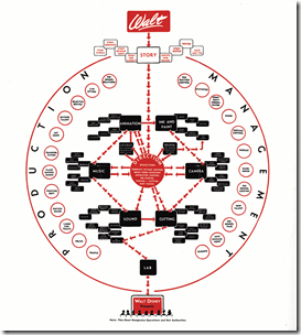
9 Feb 2011A testament to what a genius Walt Disney was, his 1943 production process diagram is a Harvard MBA’s wet dream that beautifully lays out the flow and departments. (via)
What is Chart Porn?
An addictive collection of beautiful charts, graphs, maps, and interactive data visualization toys -- on topics from around the world.
Categories
- Bailout (118)
- Chartporn Related (3)
- Commentary (21)
- Culture (669)
- Emerging Markets (66)
- Employment (245)
- Environment/weather (133)
- Finance (298)
- Food (92)
- Global Economy (373)
- Graphic Design (bad) (26)
- Graphic Design (general) (183)
- Graphic Tools (23)
- History (158)
- Housing (162)
- Humor (204)
- Innovative (183)
- Interactive (545)
- Internet/tech (97)
- Maps (578)
- News Media (34)
- Politics (329)
- Reference (97)
- Science (331)
- Source: Economist (101)
- Source: FT (92)
- Source: NYT (147)
- Source: Ritholtz (76)
- Source: USA Today (27)
- Source: Washington Post (90)
- Source: WSJ (135)
- Sports (58)
- Stock Market (74)
- Uncategorized (2)
- Updated regularly (76)
- US Economy (553)
- Video (22)
- Aram Korevaar: This chart is now being used as a projection in which countries such as China see themselves as in a [...]
- David: Welcome back Chart Porn! [...]
- J S: Thanks for the great story. Miss reading this blog. Hope to see you more active again. [...]
- jake: I lived in a DC row house for 6 years, and I'm writing this comment from my tiny 1 bedroom apartment [...]
- ronny pettersen: Hilarious and unfortunately accurate... ;-) [...]


