Graphic Design (general) Archive:
How Google Builds its Maps
11 Sep 2012Awesome article in The Atlantic about the science and process that goes into Google’s maps and directions.
The maps you see represent the combination of many different sources of information. For example, the map below includes street signs captured by Street View cars driving around.
If you didn’t know, you can add your own local knowledge to Google maps with their Map Maker:
Philographics
21 Aug 2012I can’t say I agree with a lot of these deconstructed icons, but it is a fun collection to look through.
NASA Logo
6 Aug 2012Infographics Explained with Legos
17 Jul 2012Nice work by Karyn Rossen. Though I think I would have taken this further. Maybe adding labels and saying “explained”, then an animated lego plane saying “too far”.
11 Reasons Your Infographic Isn’t an Infographic
28 Jun 2012How Colorblind are You?
27 Jun 2012An interactive online Hue test. It’s a little tedious to sort all the squares – but kind of challenging too. I got a 20, which apparently puts me in the top 25% or so.
The Illusion of Choice
26 Apr 2012This has been making the rounds lately. I find it as interesting to look at the minimalist design inherent in modern logos as the ownership concentrations.
Chart Art
7 Mar 2012Artist Gary Simpson created a series of frescos in 2006 based on global indicators from the CIA’s factbook. A bit stylized, to say the least, but I applaud the effort. Below are my favorites:
Stephen Wildish
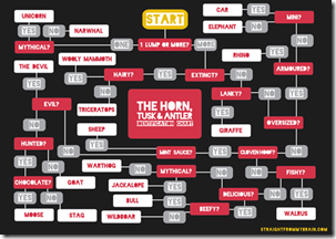
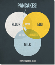
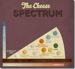
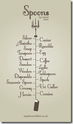
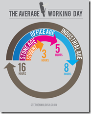
5 Mar 2012A number of cool diagram designs from this UK designer. File them in your inspiration rolodex under “properly balanced color combinations”. Thanks to Lisa Lisa for sending in the link!
Improving on Minard?!?
2 Mar 2012How dare they! Well, actually, it’s a fun exercise. Declared by Tufte to be one of the best statistical graphics ever drawn, Joseph Minard’s graph of Napoleon’s march on Russia is definitely a classic (a copy hangs in my bathroom).
John Boykin recently took a crack at redesigning the classic, and goes into quite a bit of detail on his website about the choices he made:
John links to a series of other re-creations and re-interpretations of Minard’s dataset, as collected by Michael Friendly:
3D:
I particularly like this googlemap version:
And then there’s the executive summary version. Bwahahahahaha!
(via JunkCharts)
Graphic Decision Making
29 Feb 2012I thought this was a good example of how to use graphics to clearly differentiate a list of similar items – in this case making a choice between 25 different software apps.
Amazing Old (and Free) Visualization Books
22 Feb 2012There are lots of great new books out there about graphics and data visualization. But have you ever taken a look at some that were written back before computer software? It turns out that most of these chart and visualization methods have been around for decades – it’s just that they used to draw them by hand.
I highly recommend these books to anyone. Besides the impressive graphics and nostalgia values, the writing quality and content advice are excellent – regardless of what century you are in.
Graphic Methods for Presenting Facts, Willard Cope Brinton (1914). Brinton not only presents a variety of graph types, he goes into quite a bit of detail on the decisions that go into making a well designed chart. Note the author’s sarcastic review of the first chart below – Ha!
In 1939, Brinton released a greatly expanded version of his book, entitled Graphic Presentation, which covers an amazing breadth of graphic methods (520 pages with separate chapters for 59 different graph types!) — including these beauties:
Sections on chart elements and color choice:
Who knew they were drawing 3d curve charts in 1939?:
Next up, Calvin Schmid’s 1954 Handbook of Graphic Presentation. Schmid focused a lot on the proper use of design elements, including some draftsmanship tips. It’s amusing how many of the examples resemble charts from recent policy debates:
Others are a bit more dated:
Note: if you want to read these on your iPad (like I did), you should follow the directions at this link (the PDF files available directly from the Archive do not always display properly).
Beyond the Hairball
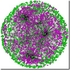
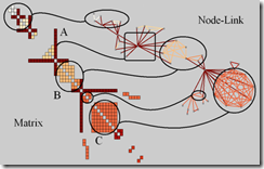
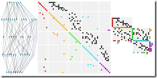
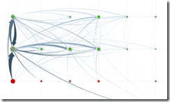
6 Feb 2012Robert Kosara examines alternatives to the classic (useless) node-link hairball network diagram.
Bad!
Better?
We Need a New Pie Chart
3 Feb 2012While poking around the World Economic Forum’s website I came across this talk by Adam Bly from 2011 about the important uses of data visualization to policy makers:
What is Chart Porn?
An addictive collection of beautiful charts, graphs, maps, and interactive data visualization toys -- on topics from around the world.
Categories
- Bailout (118)
- Chartporn Related (3)
- Commentary (21)
- Culture (669)
- Emerging Markets (66)
- Employment (245)
- Environment/weather (133)
- Finance (298)
- Food (92)
- Global Economy (373)
- Graphic Design (bad) (26)
- Graphic Design (general) (183)
- Graphic Tools (23)
- History (158)
- Housing (162)
- Humor (204)
- Innovative (183)
- Interactive (545)
- Internet/tech (97)
- Maps (578)
- News Media (34)
- Politics (329)
- Reference (97)
- Science (331)
- Source: Economist (101)
- Source: FT (92)
- Source: NYT (147)
- Source: Ritholtz (76)
- Source: USA Today (27)
- Source: Washington Post (90)
- Source: WSJ (135)
- Sports (58)
- Stock Market (74)
- Uncategorized (2)
- Updated regularly (76)
- US Economy (553)
- Video (22)
- Aram Korevaar: This chart is now being used as a projection in which countries such as China see themselves as in a [...]
- David: Welcome back Chart Porn! [...]
- J S: Thanks for the great story. Miss reading this blog. Hope to see you more active again. [...]
- jake: I lived in a DC row house for 6 years, and I'm writing this comment from my tiny 1 bedroom apartment [...]
- ronny pettersen: Hilarious and unfortunately accurate... ;-) [...]


