Global Economy Archive:
Sugar Water Companies
In: Food Global Economy
22 Aug 2010A wonderful (and quite detailed) visualization of the wide world business of sugar water. (via)
China Leads World in Beer Consumption
In: Food Global Economy Maps
18 Aug 2010Forget GDP, China now drinks more beer than either the US or Europe, and is growing by 10 percent a year.
History of GDP (1-2008)
17 Aug 2010Data compiled by Angus Maddison, an economist who died earlier this year, suggest that China and India were the biggest economies in the world for almost all of the past 2000 years. Why they fell so far behind may be more of a mystery than why they are currently flourishing.
(ps – the comments at the Economist are worth the read)
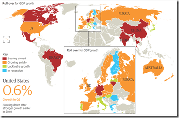
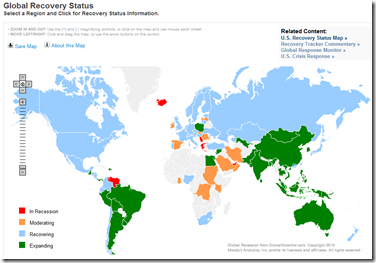
Recession Recovery Map
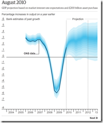
16 Aug 2010England’s Poor GDP Projections
11 Aug 2010Animated timeline of BOE’s fan projections. I think they should have included some “shadow” of the earlier projections to illustrate just how far off they were. A longer time frame would have been nice to show whether they were as inaccurate during non-recession periods.
The Breakfast Index
5 Aug 2010Commodity prices are on the rise again. The Economist picked a pretty recent base year for this graph of wheat, orange juice, and coffee prices – a longer trend would have shown the big ups and downs of the past few years.
Reforming the Global Financial System
In: Finance Global Economy Interactive Maps Politics Source: FT
28 Jul 2010From Dodd-Frank to Basel III, this graphic explains the current plans for global financial regulatory reform in advanced economies, from the US to the eurozone.
(note: some FT items require a subscription – you can view up to 10 articles a month for free)
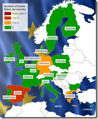
Map: European Bank Stress Tests
26 Jul 2010This is kind of a silly map considering only 7 of 91 banks failed. Related article.
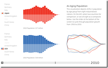
Demographics (1950-2050)
25 Jul 2010A very smooth interactive that allows you to compare the population composition of 8 countries over time. You can see some interesting trends by playing with the timeline control at the bottom — like watching the baby boom bulge move through the USA population then disappear, or the holes left in european age groups by WWII.
The Big Mac Index
25 Jul 2010Asia remains the cheapest place to enjoy a burger. China’s recent decision to increase the “flexibility” of the yuan has not made much difference yet. A Big Mac costs $1.95 in China at current exchange rates, against $3.73 in America. […] In other words the yuan is undervalued by 48%.
Global Tidal Wave of Debt
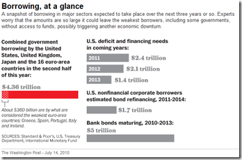
14 Jul 2010Update: Moody’s Global Recovery Map
In: Global Economy Maps
12 Jul 2010I gave this map a bit of grief when I first posted about it, so it’s only fair that I point out that they now appear to be keeping it up to date, and annotating the analysis better.
Sovereign Debt Levels 1980-2009
1 Jul 2010What is Chart Porn?
An addictive collection of beautiful charts, graphs, maps, and interactive data visualization toys -- on topics from around the world.
Categories
- Bailout (118)
- Chartporn Related (3)
- Commentary (21)
- Culture (669)
- Emerging Markets (66)
- Employment (245)
- Environment/weather (133)
- Finance (298)
- Food (92)
- Global Economy (373)
- Graphic Design (bad) (26)
- Graphic Design (general) (183)
- Graphic Tools (23)
- History (158)
- Housing (162)
- Humor (204)
- Innovative (183)
- Interactive (545)
- Internet/tech (97)
- Maps (578)
- News Media (34)
- Politics (329)
- Reference (97)
- Science (331)
- Source: Economist (101)
- Source: FT (92)
- Source: NYT (147)
- Source: Ritholtz (76)
- Source: USA Today (27)
- Source: Washington Post (90)
- Source: WSJ (135)
- Sports (58)
- Stock Market (74)
- Uncategorized (2)
- Updated regularly (76)
- US Economy (553)
- Video (22)
- Aram Korevaar: This chart is now being used as a projection in which countries such as China see themselves as in a [...]
- David: Welcome back Chart Porn! [...]
- J S: Thanks for the great story. Miss reading this blog. Hope to see you more active again. [...]
- jake: I lived in a DC row house for 6 years, and I'm writing this comment from my tiny 1 bedroom apartment [...]
- ronny pettersen: Hilarious and unfortunately accurate... ;-) [...]


