Global Economy Archive:
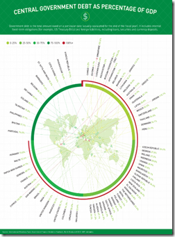
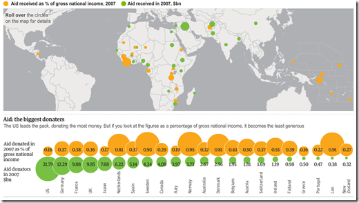
Ok, the content of this chart is nothing new – and the intent is basically linkbait. But the design is fairly intriguing: it’s an exploding map to a badly overlapped radial chart, with categories. It both works and doesn’t work. I love it and hate it at the same time. Bravo!
World Bank Data Visualizer
In: Emerging Markets Global Economy History Interactive Reference
30 Nov 2010Graph a wide range of World Development Indicators, gapminder-style, using the World Bank’s Data Visualizer. There is also a trade-related version.
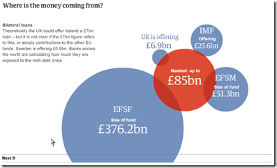
The Ireland Problem
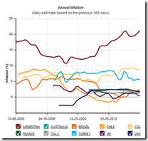
24 Nov 2010Inflation After the Bubble: US vs Japan
21 Nov 2010I always like these crisis-rebased comparison charts. (via)
European Banks’ Sovereign Debt Exposure
15 Nov 2010Pick a country and view the bilateral exposures on the map. You can also drill-down at the bank level.
note: access to some Financial Times features requires a subscription.
The Billion Price Index
In: Global Economy
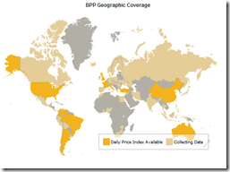
13 Nov 2010A global price index based on the monitoring of prices at online stores in more than 70 countries. You can drill-down by clicking on the map. (via Ritholtz)
Hip-Hop Explanation of Currency Wars
12 Nov 2010The amount of time someone put into this video is staggering. Oh, and it’s fairly accurate, and absolutely hilarious. “In the future all macroeconomic issues will be explained through hip-hop.” (via)
The Burden of Public Debt
2 Nov 2010A pretty slick interactive look at the numbers from the FT (though I’m not sure what some of the subtle animations really accomplish).
(note: Some Financial Times features require a subscription to view)
Chinese Imports
In: Global Economy Maps
29 Oct 2010CHINA is now the biggest export market for countries as far afield as Brazil (accounting for 12.5% of Brazilian exports in 2009), South Africa (10.3%) Japan (18.9%) and Australia (21.8%). Each surge or wobble in China’s economy has a material impact in these places.
Currency Wars Explained
21 Oct 2010The FT has an interactive feature explaining the latest financial mainstream media buzz-word, and tracking individual country actions. Related articles.
note: some FT articles require a subscription.
Update: European Economic Weather Map
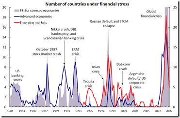
19 Sep 2010Financial Stress (1981-2009)
13 Sep 2010Interesting graph of global financial crises. I can’t tell why it has two different axis, though. I suppose the data is from the IMF’s Financial Stress Index.
Global Competitiveness Report 2010-11
In: Employment Finance Global Economy Interactive Maps Politics Updated regularly
10 Sep 2010The World Economic Forum has a number of interactive tools for examining the results of it’s Global Competitiveness Report. You can view the aggregate index or any of the many (very interesting) sub-components as maps, bar charts, scatter plots, rankings, or individual profiles. FYI – The United States has slipped from 2nd to 4th overall.
What is Chart Porn?
An addictive collection of beautiful charts, graphs, maps, and interactive data visualization toys -- on topics from around the world.
Categories
- Bailout (118)
- Chartporn Related (3)
- Commentary (21)
- Culture (669)
- Emerging Markets (66)
- Employment (245)
- Environment/weather (133)
- Finance (298)
- Food (92)
- Global Economy (373)
- Graphic Design (bad) (26)
- Graphic Design (general) (183)
- Graphic Tools (23)
- History (158)
- Housing (162)
- Humor (204)
- Innovative (183)
- Interactive (545)
- Internet/tech (97)
- Maps (578)
- News Media (34)
- Politics (329)
- Reference (97)
- Science (331)
- Source: Economist (101)
- Source: FT (92)
- Source: NYT (147)
- Source: Ritholtz (76)
- Source: USA Today (27)
- Source: Washington Post (90)
- Source: WSJ (135)
- Sports (58)
- Stock Market (74)
- Uncategorized (2)
- Updated regularly (76)
- US Economy (553)
- Video (22)
- Aram Korevaar: This chart is now being used as a projection in which countries such as China see themselves as in a [...]
- David: Welcome back Chart Porn! [...]
- J S: Thanks for the great story. Miss reading this blog. Hope to see you more active again. [...]
- jake: I lived in a DC row house for 6 years, and I'm writing this comment from my tiny 1 bedroom apartment [...]
- ronny pettersen: Hilarious and unfortunately accurate... ;-) [...]









Beware of Greeks Bearing Bonds
In: Commentary Global Economy
13 Sep 2010I rarely post articles that are not graphics related, but Michael Lewis qualifies for the occasional exception by offering remarkable insights into financial and economic issues. Read this article if you want to understand the Greek crisis in a very accessible and hilarious way.