Finance Archive:
Budget Forecasts vs Reality
2 Mar 2011This is from 2010, but I wanted to post it because it’s an excellent way to visualize the quality of economic projections. The New York Times refers to it as a “porcupine” chart.
Google and Eyebeam have created a $10,000 dataviz challenge for designers to visualize how individual federal income taxes are spent. The site includes details, data, and a few cool examples, like the one below that lets you input your income and see how the government shelled out your shekels. Submissions are due by March 27, 2011. (Thanks to Melissa Mac for the link!)
An inspirational British version:
and a excellent interactive chart one that let’s you examine the changing income inequality in the united states (and probably the only good use I’ve seen of a pie chart in a long time):
It’s the Inequality Stupid
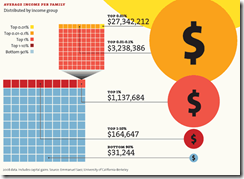
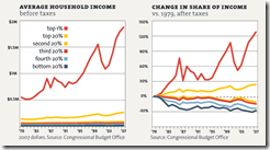
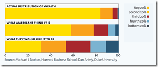
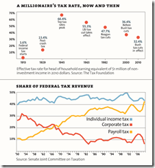
22 Feb 2011“Eight charts that explain everything that’s wrong with America”, from Mother Jones. (Thanks to Matt Brown for the link!)
Consumer debt is down, though nobody knows whether that’s a sign of changing consumer habits or changing banker habits. (related article)
Muni Market Woes
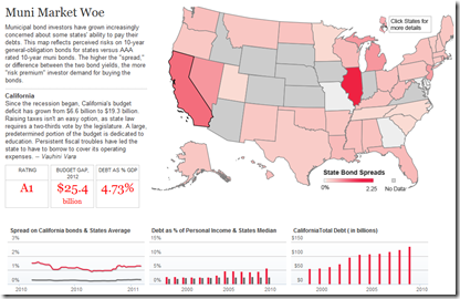
10 Feb 2011There’s a lot of attention on the national debt, but states are in even deeper trouble. In part because investors don’t trust them to get their act together, resulting in lower ratings and higher borrowing costs. The below clickable map lets you view debt levels and interest rate spreads by state.
And while we’re talking about state fiscal policies, here’s a beautiful representation of the Massachusetts 2011 budget:
Global Debt (1880-2009)
In: Finance Global Economy History Interactive Maps Politics
7 Feb 2011The IMF has released a new database of sovereign debt-to-gdp ratios for 174 countries, going back as far as 1880 (for G7 countries).
The data shows how government debt has risen and fallen over the years as important events, such as wars and stock market crashes, affect a country’s decisions about when to save and when to spend. It turns out the relationship between debt and economic growth has changed over time; historically, fast growing countries had low debt ratios, while slow growers struggled under higher debt. In the past 30 years that relationship has altered as advanced economies’ debt levels have risen and their economies have grown.The data also debunks some old clichés, for example that African countries have the highest debt levels. In fact, low income countries in Africa today have lower debt ratios than do advanced economies in Europe and North America.
The below charts appear in a slightly slow, but interesting, IMF You-tube video:
The data can also be explored and exported using the IMF’s DataMapper (note the links at the bottom of the mapper to the related working paper and dataset):
Wall Street Compensation: 2010
2 Feb 2011In 2010, total compensation and benefits at publicly traded Wall Street banks and securities firms hit a record of $135 billion […] The total is up 5.7% from $128 billion in combined compensation and benefits by the same companies in 2009.
The interactive tree-map has a nice introduction of how it works, but it would have been nice to be able to drill down further to firm level data. On the two bottom graphs, they could have combined them using the same scale so it was easier to view the revenue/profit/compensation ratios. (related article)
The US Economy in Two Visualizations
In: Employment Finance Housing Interactive Maps Updated regularly US Economy
22 Jan 2011If you want to know the state of the US economy at any time, check out the below visualizations from Russell Investments and the AP. They are both updated monthly with the latest data, allow all kinds of drilling down, and both take the time to document sources and explain why you should give a shit about these particular numbers (for example, click on any of the “historical details” links on Russell’s dashboard).
Cross-Country Risks: Financial and Trade
In: Finance Global Economy Interactive Source: Washington Post
13 Jan 2011Cross-country financial and trade exposures are hard to visualize, but this interactive network diagram from the Washington Post is a good attempt. And the sovereign spread sparklines at the bottom are a nice addition.
I somehow missed catching this when it came out in December.
Retail Sales by Business
In: Finance Interactive Source: WSJ Updated regularly US Economy
20 Dec 2010A beautiful data visualization of retail sales by type of business. I usually hate stacked bar charts because you really can’t compare what’s happening to any stack except the bottom and the total. The WSJ solves that problem by letting you click on any individual sector, which smoothly animates into a chart of just those bars. Well done! It would be interesting to see this done for the components of GDP.
Update: Philip Izzo pointed out to me that the WSJ’s interactive area chart of the Fed’s balance sheet (below) also allows the same kind of drill-down. In addition, both of these are updated regularly as new data is released.
Floyd Norris presents some interesting data indicating that it was the least expensive homes whose prices went up the most, and are now falling the fastest. Barry Ritholtz sees this as more proof that the bubble was in credit – not housing.
Quantitative Easing Explained by Cartoons
In: Finance US Economy
15 Nov 2010What does quantitative easing mean? (via Zero Edge and Matt Taibbi)
European Banks’ Sovereign Debt Exposure
15 Nov 2010Pick a country and view the bilateral exposures on the map. You can also drill-down at the bank level.
note: access to some Financial Times features requires a subscription.
As of today you can tack on another half trillion.
Prescription for a Sickly Economy
In: Finance Interactive Source: Washington Post Stock Market US Economy
2 Nov 2010Five-part interactive explanation of quantitative easing. My favorite part: “The Fed will likely buy $100s of billions of Treasury bonds using money that it creates out of thin air”
What is Chart Porn?
An addictive collection of beautiful charts, graphs, maps, and interactive data visualization toys -- on topics from around the world.
Categories
- Bailout (118)
- Chartporn Related (3)
- Commentary (21)
- Culture (669)
- Emerging Markets (66)
- Employment (245)
- Environment/weather (133)
- Finance (298)
- Food (92)
- Global Economy (373)
- Graphic Design (bad) (26)
- Graphic Design (general) (183)
- Graphic Tools (23)
- History (158)
- Housing (162)
- Humor (204)
- Innovative (183)
- Interactive (545)
- Internet/tech (97)
- Maps (578)
- News Media (34)
- Politics (329)
- Reference (97)
- Science (331)
- Source: Economist (101)
- Source: FT (92)
- Source: NYT (147)
- Source: Ritholtz (76)
- Source: USA Today (27)
- Source: Washington Post (90)
- Source: WSJ (135)
- Sports (58)
- Stock Market (74)
- Uncategorized (2)
- Updated regularly (76)
- US Economy (553)
- Video (22)
- Aram Korevaar: This chart is now being used as a projection in which countries such as China see themselves as in a [...]
- David: Welcome back Chart Porn! [...]
- J S: Thanks for the great story. Miss reading this blog. Hope to see you more active again. [...]
- jake: I lived in a DC row house for 6 years, and I'm writing this comment from my tiny 1 bedroom apartment [...]
- ronny pettersen: Hilarious and unfortunately accurate... ;-) [...]


