Finance Archive:
Paying Off Credit Card Debt
15 Aug 2011Catherine Mulbrandon visualizes how long it takes to pay off a new computer making the minimum payment versus $100/month.
Sovereign Debt Ratings
1 Aug 2011I’m posting this more because it’s an example of a well designed cartogram map, more than because of the content. (via)
Deficit has a Numerator and Denominator
1 Aug 2011Ok, I’m pretty bored with the debt graphics, but Barry Ritholtz today had a few that illustrate the problem quite well.
This one makes clear our deficit is as much a result of falling revenue as it is of rising spending:
The same numbers in percent of GDP make sense when you take the recession shading into account:
I highly recommend you read the article and discussion over there.
Debt Debt Debt Goose!
29 Jul 2011Four perfect graphs from the NYT (as usual) putting the debt crisis into perspective.
Thanks to Kanal Eliezer for sending in the link!
How Much is That Again?
28 Jul 2011Dodd-Frank Implementation
22 Jul 2011An interesting chart on different benchmarks that are required by the Bill. At closer inspection though, you realize all it does is describe the sections and count the requirements. It would have been nice if you could drill down and see the details of each of the colored lines, for example. The main impression remains, however: the Bill’s implementation is very complicated – which I suppose is in contrast to the wide agreement that it doesn’t actually solve any of our financial systems’ problems.
European Bank Stress Tests
21 Jul 2011An interactive map and table of the test results, showing debt levels by bank.
note: access to some FT features require a subscription.
Too Big to Fail
30 Jun 2011A pretty comprehensive explanation of the financial crisis. (via The Big Picture)
Update: Economic Indicators Dashboard
23 Jun 2011My favorite economic status tool. Point and/or click on anything and everything to learn something new about the economy, and why you should care.
Update: Economic Indicators Dashboard
25 Apr 2011An 85 foot long annotated timeline of early American financial and industrial history. Similar to the 1775-1943 Booms and Busts timeline I posted last year, this one isn’t quite as technical, but the historical notes are fascinating: 1877: “Guaranteed Mtges coming into use”, 1899: “100 taxis in New York”, 1910: “Movie censorship being demanded”. (via)
Update: Economic Indicators Dashboard
23 Mar 2011One of my favorite economic dashboards. It highlights major macro indicators, what direction they are trending, and what the typical ranges are. It also lets you drill down to explanations of why you should care, and historical values.
The Wonderful Work of Karl Hartig
In: Culture Employment Finance Graphic Design (general) History Innovative Politics Science US Economy
22 Mar 2011Karl Hartig was creating beautiful complex data visualizations back when most of us “graphics experts” were still trying to figure out how to change colors in excel. Here is a selection of his work on population, electronics, energy, stocks, immigration, politics, and music. Soak it up!
Bailout Scorecard
18 Mar 2011Despite media spin, the United States is a long way from getting all of the bailout money back. (via Ritholtz)
Dow Jones 2010, in Music
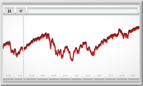
7 Mar 2011No it’s not a musical. Artist Bard Edlund’s “Dow Piano” translates the performance of the Dow each day onto a three octave scale, and adjusts the volume of each note according to trading volume. I guess instead of data visualization we could call this data audioization – or we could just call it cool.
What is Chart Porn?
An addictive collection of beautiful charts, graphs, maps, and interactive data visualization toys -- on topics from around the world.
Categories
- Bailout (118)
- Chartporn Related (3)
- Commentary (21)
- Culture (669)
- Emerging Markets (66)
- Employment (245)
- Environment/weather (133)
- Finance (298)
- Food (92)
- Global Economy (373)
- Graphic Design (bad) (26)
- Graphic Design (general) (183)
- Graphic Tools (23)
- History (158)
- Housing (162)
- Humor (204)
- Innovative (183)
- Interactive (545)
- Internet/tech (97)
- Maps (578)
- News Media (34)
- Politics (329)
- Reference (97)
- Science (331)
- Source: Economist (101)
- Source: FT (92)
- Source: NYT (147)
- Source: Ritholtz (76)
- Source: USA Today (27)
- Source: Washington Post (90)
- Source: WSJ (135)
- Sports (58)
- Stock Market (74)
- Uncategorized (2)
- Updated regularly (76)
- US Economy (553)
- Video (22)
- Aram Korevaar: This chart is now being used as a projection in which countries such as China see themselves as in a [...]
- David: Welcome back Chart Porn! [...]
- J S: Thanks for the great story. Miss reading this blog. Hope to see you more active again. [...]
- jake: I lived in a DC row house for 6 years, and I'm writing this comment from my tiny 1 bedroom apartment [...]
- ronny pettersen: Hilarious and unfortunately accurate... ;-) [...]


