Environment/weather Archive:
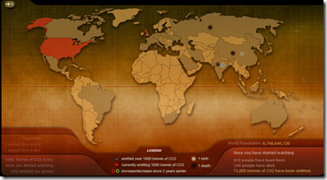
CO2 Emissions Simulator
30 Sep 2009Breathing Earth’s “real-time simulation displays the CO2 emissions of every country in the world, as well as their birth and death rates.” Also has good links on climate change info. (via)
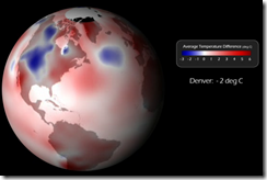
Warm August
25 Sep 2009NOAA has a cool animated visualization of the temperature in August compared to the historical average. It would be nice to see this in an interactive toy over time. (via)
Extinction
23 Sep 200926 well designed cards (though some more interesting information on each would have been nice) produced to draw attention to threatened species. Below is the Amur Tiger. From ArtistAsCitizen.
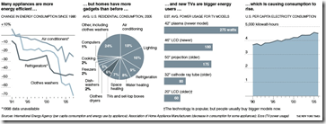
Gadget Impact
22 Sep 2009While toys and appliances are getting more efficient – we are using more of them. Related NYT article. Again, hat tip to the keen eye of Paul Kedrosky.
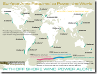
Solar, Wind, and Bodies
11 Sep 2009These have been making the rounds. (I like the revised version at the bottom which does the same comparison with matrix-style human batteries)
Wildfires
10 Sep 2009Along the lines of the interactive hurricane trackers, but if you click around you also find information on historical trends, how wildfires grow, and even some basic fire ecology info and an explanation of why prescribed fires are a good idea.
Live Storm Tracker
10 Sep 2009Kind of fun, with good roll-overs and animation; only shows current storms and projections. Click on the little hurricane icons around the sides of the map to shift to other storms.
Hurricane Season 2009
In: Environment/weather Interactive Maps Science Source: WSJ Updated regularly
21 Aug 2009A map of the paths of several hurricanes. Looks like they plan to update it throughout the hurricane season. This is very similar to the AP tool I mentioned in June.
Greenhouse Gases
14 Aug 2009The Guardian’s DataBlog brings us some environmental infographics on greenhouse gases.
Sources: (from the World Resources Institute)
CO2 emission map, with interactive country drill-downs:
10 Things you should know about water.
3 Aug 2009Global Boiling
25 Jun 2009Have you taken the time to follow the detailed science behind the global warming debate? Me neither. But I’m starting to read the “Global Climate Change Impacts in the United States” report, which has a number of very effective data visualizations, in addition to laying out all the different climate change arguments. (Thanks to my friend Brad Johnson for pointing out the report.)
Hurricanes
22 Jun 2009Two part interactive toy from AP. The first one takes you on a cool animated walk through the 5 point Saffir-Simpson Hurricane scale, simulating the amount of damage along the way. The second maps out the path and category of every hurricane from 1851-2009.
ooops: Missed one, though it’s separate from the others… It includes a map of the empty homes in Florida (from foreclosures, amongst other causes) and animates the types of different types of damage a hurricane can cause (click along the top):
What is Chart Porn?
An addictive collection of beautiful charts, graphs, maps, and interactive data visualization toys -- on topics from around the world.
Categories
- Bailout (118)
- Chartporn Related (3)
- Commentary (21)
- Culture (669)
- Emerging Markets (66)
- Employment (245)
- Environment/weather (133)
- Finance (298)
- Food (92)
- Global Economy (373)
- Graphic Design (bad) (26)
- Graphic Design (general) (183)
- Graphic Tools (23)
- History (158)
- Housing (162)
- Humor (204)
- Innovative (183)
- Interactive (545)
- Internet/tech (97)
- Maps (578)
- News Media (34)
- Politics (329)
- Reference (97)
- Science (331)
- Source: Economist (101)
- Source: FT (92)
- Source: NYT (147)
- Source: Ritholtz (76)
- Source: USA Today (27)
- Source: Washington Post (90)
- Source: WSJ (135)
- Sports (58)
- Stock Market (74)
- Uncategorized (2)
- Updated regularly (76)
- US Economy (553)
- Video (22)
- Aram Korevaar: This chart is now being used as a projection in which countries such as China see themselves as in a [...]
- David: Welcome back Chart Porn! [...]
- J S: Thanks for the great story. Miss reading this blog. Hope to see you more active again. [...]
- jake: I lived in a DC row house for 6 years, and I'm writing this comment from my tiny 1 bedroom apartment [...]
- ronny pettersen: Hilarious and unfortunately accurate... ;-) [...]

