Culture Archive:
Emotional Guidance Scale
In: Culture
14 Aug 2012Emotions are the result of how well reality meets up with your expectations. I go back and forth between liking this graphic and thinking the it’s a little too vague and disconnected.
Design wise, I suppose the colors don’t really add anything – so sure, make it black.
How Old is Your Government?
23 Jul 2012Poverty and Policy
In: Culture Employment History
18 Jul 2012Some slick programming in this annotated exploration of 50 years of poverty statistics. Tough I’m not a fan of the pie charts, per se, the rollover drill down is a nice idea. Be sure to click on the small “change year” to bring up a timeline slider that updates in real time. Like I said – slick!
Truck Timeline
17 Jul 2012Ok, confession time. I’m not posting this because it’s a great infographic or timeline. I’m posting it because I love vintage trucks. Particularly those in the 50s and 60s.
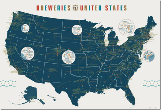
Map of 1000 US Breweries
4 Jun 2012A detailed map from Pop Chart Lab. Has all my favorites on it!
Nerd, Dork, Geek
In: Culture
30 May 2012Why do we almost always use “three” circles for venns? Could this diagram have benefited from another circle?
Avengers Visualize!
In: Culture Innovative
22 May 2012Every once in a while you stumble upon an obsessive hobby niche with some really stunning visualizations. Today’s obsession: Avengers comic books and the work of Jer Thorp. It turns out that there is a massive database of comic book metadata to work with.
The covers of every Avengers issue:

Who appears in each issue, by date:
Jer goes on to look at Avengers by first appearance, sex, robot, gods, and in part II who appeared more, who created the characters, and so on. I only wish he had shared more about how he built the visualization tools.
Women in Parliament
15 May 2012We’ve looked at female world leaders before. Here are some stats on representation (well, what is supposed to be representation).
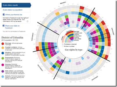
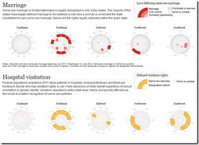
Gay Rights
In: Culture Interactive
9 May 2012A nice interactive visualization of gay rights in the United States, by State. This was created by the Guardian in the UK – where, interestingly, the conservatives support gay rights.
Fashion Color Forecaster
In: Culture Innovative
7 May 2012The Pimkie clothing company has come up with an interesting real-time fashion indicator: They video what people are wearing as they walk down the street in Paris, Milan, and Antwerp (supposed fashion capitals), and analyze what color pixels are moving. You can then look at the findings in real time, for yesterday, last week, or last month. Apparently, peach-ish red is huge right now in Paris. (via StoryTellingWithData)
Science Fiction to Reality Timeline
25 Apr 2012When scientific advances were first theorized vs when they became reality. After a close viewing I would say whoever wrote this wasn’t particularly well-read, or even a very good geek – a lot of things on both sides are just plain wrong. Great idea. Crappy execution. Anybody want to try their hand at a version that includes da Vinci, Verne, and Heinlein (just for starters).
Zombie Apocalypse Map
In: Culture Humor Interactive Maps
11 Apr 2012Use this interactive google-mashup-map to locate emergency supplies in the event of a zombie outbreak. This should help you not walk past guns and supplies like in that stupid Walking Dead show.
What America Buys
9 Apr 2012MEGA MILLIONS!
30 Mar 2012Seemed timely considering tonight’s $640million drawing: how many times numbers have been picked?
A heatmap of variations from the standard deviation:
What is Chart Porn?
An addictive collection of beautiful charts, graphs, maps, and interactive data visualization toys -- on topics from around the world.
Categories
- Bailout (118)
- Chartporn Related (3)
- Commentary (21)
- Culture (669)
- Emerging Markets (66)
- Employment (245)
- Environment/weather (133)
- Finance (298)
- Food (92)
- Global Economy (373)
- Graphic Design (bad) (26)
- Graphic Design (general) (183)
- Graphic Tools (23)
- History (158)
- Housing (162)
- Humor (204)
- Innovative (183)
- Interactive (545)
- Internet/tech (97)
- Maps (578)
- News Media (34)
- Politics (329)
- Reference (97)
- Science (331)
- Source: Economist (101)
- Source: FT (92)
- Source: NYT (147)
- Source: Ritholtz (76)
- Source: USA Today (27)
- Source: Washington Post (90)
- Source: WSJ (135)
- Sports (58)
- Stock Market (74)
- Uncategorized (2)
- Updated regularly (76)
- US Economy (553)
- Video (22)
- Aram Korevaar: This chart is now being used as a projection in which countries such as China see themselves as in a [...]
- David: Welcome back Chart Porn! [...]
- J S: Thanks for the great story. Miss reading this blog. Hope to see you more active again. [...]
- jake: I lived in a DC row house for 6 years, and I'm writing this comment from my tiny 1 bedroom apartment [...]
- ronny pettersen: Hilarious and unfortunately accurate... ;-) [...]


