Culture Archive:
Music Sales on the Rise
In: Culture
5 Mar 2013Music sales rose last year for the first time in over a decade. Click below for a video explanation over at the Economist. Huffington has some more of the numbers.
I look at this chart and wonder who is still buying all that physical music? Must be the same people who are responsible for this list of top ten selling albums I have never heard.

You are unlikely to die… oh wait
15 Feb 2013Which of these do you worry about?

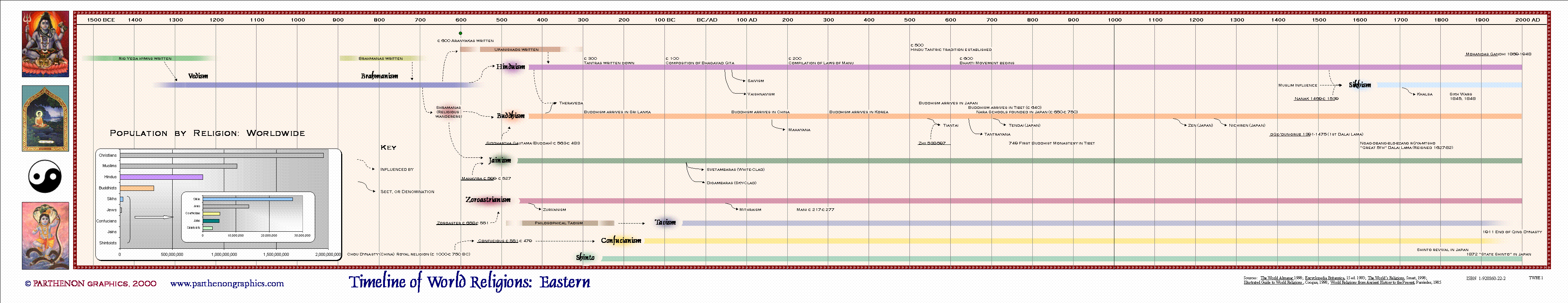
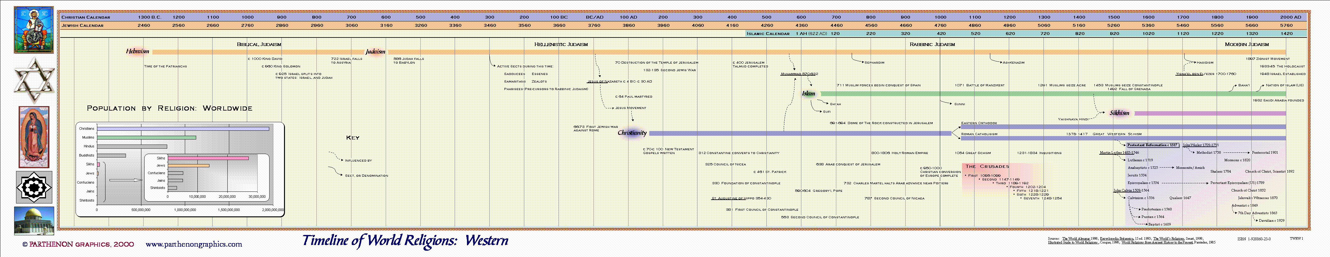
Timeline of World Religions
29 Jan 2013I’m not expert enough on any of these to say whether this is accurate or not. A clear explanation of what the different colors and line widths would have been helpful.

Some other versions:

Billionaires
25 Jan 2013Bloomberg has several interactive tools for filtering and ranking the the world’s billionaires.

If you click on any of them, individual profiles come up, like for Carlos Slim":

You can plot them by industry, gender, number of children and all kinds of other variables.

California Shooting Location Map
2 Jan 2013An amusing map from 1927, showing which areas of California could be used to film movies that you wanted to look like other parts of the world.

Video Games (1975-2011)
21 Dec 2012Games by genre, and games by platform. Labeling the axis might have been useful – I assume it’s supposed to be percent of total, with the space at top “other”? I tried to find the original source for this, but had no luck.

Oskar Fischinger
18 Dec 2012I dabble in VJ’ing, and it’s amazing what you can do with todays tools, like Resolume. But take a look at what Oskar Fischinger did back in 1938 with pieces of paper hanging from wires in his synesthetic interpretation of Liszt’s Hungarian Rhapsody. Amazing. Actually, it’s kind of embarrassing. We are so spoiled.
A cool real time synced visualization of guitar riffs and their matching tabs notations. Apparently the Soundslice site let’s you annotate any youtube video in such a way. I love internet functionality mashups like this.

17 Ways to Tie Shoes
12 Dec 2012A practical combination of diagram and example. Simple is usually best.

How Frequent is Your Birthday?
28 Nov 2012Very nice heat chart. I wonder what would happen if you filtered by geography? An awful lot of people I knew in northern NY were born 9 months after the cold dark winter.

More colorful Tableau version:

History of Film
In: Culture
5 Nov 2012I don’t know. These amorphous charts with somewhat arbitrary categorization and selection bias just don’t do it for me. They are nice for reminding you of films – and maybe that’s useful now that you can’t wander the isles of blockbuster anymore – but that’s about it.


The American Dream
In: Culture US Economy
24 Sep 2012So how are most of us doing in terms of achieving the “American Dream”?


Murder! (2000-2010)
In: Culture Source: WSJ
20 Aug 2012Explore the 165,068 murders in the US by where, when, how, and the circumstances. The subtotals next to the filter menu saves a lot of time.

(Except for Florida – who doesn’t use the FBI’s guidelines for reporting homicide details)
Income Distribution by Religion
In: Culture
20 Aug 2012No point to the arc or the dotted lines, but the content is kind of interesting. Who knew the Hindus were rich?


What is Chart Porn?
An addictive collection of beautiful charts, graphs, maps, and interactive data visualization toys -- on topics from around the world.
Categories
- Bailout (118)
- Chartporn Related (3)
- Commentary (21)
- Culture (669)
- Emerging Markets (66)
- Employment (245)
- Environment/weather (133)
- Finance (298)
- Food (92)
- Global Economy (373)
- Graphic Design (bad) (26)
- Graphic Design (general) (183)
- Graphic Tools (23)
- History (158)
- Housing (162)
- Humor (204)
- Innovative (183)
- Interactive (545)
- Internet/tech (97)
- Maps (578)
- News Media (34)
- Politics (329)
- Reference (97)
- Science (331)
- Source: Economist (101)
- Source: FT (92)
- Source: NYT (147)
- Source: Ritholtz (76)
- Source: USA Today (27)
- Source: Washington Post (90)
- Source: WSJ (135)
- Sports (58)
- Stock Market (74)
- Uncategorized (2)
- Updated regularly (76)
- US Economy (553)
- Video (22)
- Aram Korevaar: This chart is now being used as a projection in which countries such as China see themselves as in a [...]
- David: Welcome back Chart Porn! [...]
- J S: Thanks for the great story. Miss reading this blog. Hope to see you more active again. [...]
- jake: I lived in a DC row house for 6 years, and I'm writing this comment from my tiny 1 bedroom apartment [...]
- ronny pettersen: Hilarious and unfortunately accurate... ;-) [...]