Culture Archive:
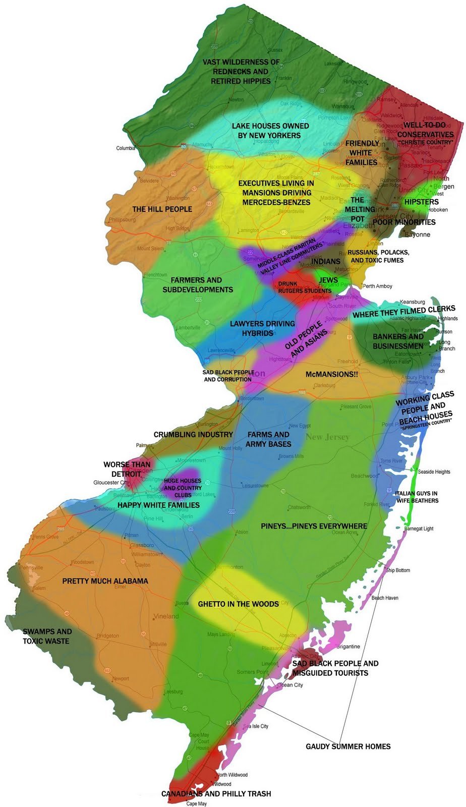
Red Heads and Blondes
5 Aug 2013

NYC Bike Share Usage
In: Culture Interactive Maps
30 Jul 2013A clever animation of how the bikes move around throughout the day. You have to watch it on slow to really get a feeling of what’s going on.

Bootstrap America
22 Jul 2013Is the American dream still alive? Can you work hard and raise your income level? Well, it kinda depends on where you live. The NYT has a couple of nice interactive tools who exploring the results of a study of the issue. (via FlowingData)


Gmail Network Map
In: Culture Internet/tech
9 Jul 2013MIT has a fun toy which let’s you conduct network analysis of your gmail emails. There’s a thread over at Slashdot that discusses how this analysis of meta data is similar to the Snowden revealed PRISM project.

22 Maps of Linguistic Differences
11 Jun 2013This has been making the rounds. I like that they used alpha shading to show variations. And it’s pop, not soda.

Things have changed quite a bit, but is anyone (including the children) happier or better off?

31 Charts to Restore Your Faith in Humanity
31 May 2013A lot of these are misleading – but hey, so are most charts. For more entertaining interpretations of the same figures, check out The Washington Post’s “31 Charts to Destroy Your Faith in Humanity.”


 and so on.
United States Immigration
30 May 2013Immigration has always been a tough issue to deal with.

The chart reminds me of this John Stewart bit on immigration and “Traditional America”:
Geography of Hate
In: Culture Internet/tech Maps
15 May 2013This has been making the rounds. Based on 150,000 geocoded tweets from June 2012 to April 2013, filtered 1st by use of word, and then manually whether it was used in a negative or derogatory fashion.
Obviously this suffers from selection bias as it only includes people who bother to tweet, and those who aren’t ashamed to do it publicly. There’s also the usual population density distortion (last map below), which would be compounded by cell phone coverage out west. So, basically, this is another pretty visualization of social media meta data that doesn’t really mean much of anything. To be honest I’m surprised they only found 150,000 hateful tweets in 11 months. (The author’s FAQ is an interest read)
Homophobia:

Racist:

Disability:


Geek Productivity
29 Apr 2013Pretty accurate. Some people just don’t understand that performing at a high level requires some rest periods in between the productivity. Or maybe we really are just lazy – I can’t say for sure.

The Average Porn Star (SFW)
27 Mar 2013Note: Safe for work (no dirty pictures or obscenity).
John Millward analyzed meta data from the Internet Adult Film Database and came up with some interesting findings. Apparently. the average female porn star is 5’5″ tall, weighs 117lbs, has B-cup breasts, starts when they are 22 and has a 3 year career.
Hair color, against stereotype, is not dominated by blondes:

Race matches closely with the general population:

Birthplaces:

Most common names:

There are other findings, but even a blog named ChartPorn has some limits – so if you want to see them, head over to the original article.
Chord Progressions of 1,300 Songs
In: Culture
24 Mar 2013Pick a chord, then another, then another – and it will display a list of songs written with that key, and a visualization of the notes and chords of that song. Below is GCGF.

The same site has other cool musical tools. You can test your ear and musical transcription:

and a basic multimedia music theory book for the iPad.
Venn Diagram of Irrational Nonsense
24 Mar 2013I don’t know that this works that great as a venn, but I like having list of nonsense all in one place to remind me how much of it there is.

Drug War Effectiveness
12 Mar 2013I suppose you could argue about what metric to use to measure the effectiveness of the drug war – but I’ve never seen one that justifies the costs (probably true for most “wars”). Anyways, the author of the below chart does a great job detailing his sources and methodology on his website.


What is Chart Porn?
An addictive collection of beautiful charts, graphs, maps, and interactive data visualization toys -- on topics from around the world.
Categories
- Bailout (118)
- Chartporn Related (3)
- Commentary (21)
- Culture (669)
- Emerging Markets (66)
- Employment (245)
- Environment/weather (133)
- Finance (298)
- Food (92)
- Global Economy (373)
- Graphic Design (bad) (26)
- Graphic Design (general) (183)
- Graphic Tools (23)
- History (158)
- Housing (162)
- Humor (204)
- Innovative (183)
- Interactive (545)
- Internet/tech (97)
- Maps (578)
- News Media (34)
- Politics (329)
- Reference (97)
- Science (331)
- Source: Economist (101)
- Source: FT (92)
- Source: NYT (147)
- Source: Ritholtz (76)
- Source: USA Today (27)
- Source: Washington Post (90)
- Source: WSJ (135)
- Sports (58)
- Stock Market (74)
- Uncategorized (2)
- Updated regularly (76)
- US Economy (553)
- Video (22)
- Aram Korevaar: This chart is now being used as a projection in which countries such as China see themselves as in a [...]
- David: Welcome back Chart Porn! [...]
- J S: Thanks for the great story. Miss reading this blog. Hope to see you more active again. [...]
- jake: I lived in a DC row house for 6 years, and I'm writing this comment from my tiny 1 bedroom apartment [...]
- ronny pettersen: Hilarious and unfortunately accurate... ;-) [...]