Bailout Archive:
Investment Banking (updated)
In: Bailout Finance Source: FT
5 Oct 2009No Loans for You
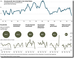
28 Sep 2009A chart from the NYT illustrating lending has not begun to recover much at all. Related article.
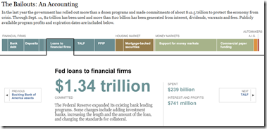
Bailout Update
22 Sep 2009Bailout Matrices
21 Sep 2009I question the value of “Bold/Weak” as an axis. but it’s still interesting to look at. Related CNNMoney article.
More interesting: Change in stock price one year later, versus level of federal assistance:
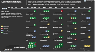
Lehman Diaspora
16 Sep 2009Move the timeline slider and watch former Lehman employees scatter to their new jobs. Click on blocks to see individual stories.
WSJ Economist Survey (July 09 edition)
In: Bailout Employment Finance Housing Interactive Source: WSJ Updated regularly US Economy
12 Jul 2009Interactive results of a survey of 54 economists, on a number of indicators and issues. Updated Monthly. Related article.
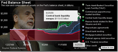
Fed Balance Sheet
12 Jul 2009To be fair, 2009 values are analyst “estimates”. Related article.
Detailed Timelines of the Financial Crisis
In: Bailout Finance Global Economy Interactive Reference Updated regularly US Economy
29 Jun 2009Ok, obviously it’s NY Fed day at ChartPorn. Interactive PDF files (click on events to jump to more details) provide a detailed list of policy actions and events. It is supposedly updated the 1st of every month.
There is both a domestic version, organized by Fed Policy Actions/Market Events/Other Policy Actions:
And an international (G7) version, organized by Bank Liability Guarantees/Liquidity and Rescue Interventions/Other Market Interventions:
Yet Another Recovery Index
In: Bailout Employment Finance Housing Updated regularly US Economy
22 Jun 2009This one from Kiplinger. Pretty standard stuff – a color-coded summary and charts for each of six components. Uses a pretty weak (but easy to understand) recovery threshold: “When at least three of the six indicators go fully positive — with a check mark from us — it’s more than likely that the recession has ended.” The "watch for" section of each indicator are interesting.
Unemployment Reform
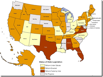
22 Jun 2009Many states are modifying their unemployment benefit laws, some in connection to the recession and some to take advantage of federal stimulus money. Related NYT blog post.
Bubbles 1994-2009
In: Bailout Finance Housing Reference Source: WSJ Stock Market US Economy
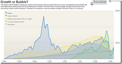
18 Jun 2009A good chart of US bubbles. The print version (p.A8, 6/18/09) had much better aesthetics. but the data are the same. Related article.
US Financial Oversight Proposals
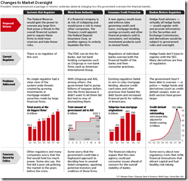
18 Jun 2009A table summarizing the oversight reforms proposed on Wednesday. Related Washpost article.
More Auto Data
In: Bailout Maps US Economy
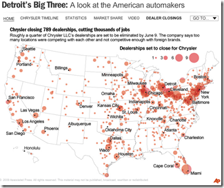
16 Jun 2009Ok, I know we’ve all about had it with visualizations of the history, market share, sales, brands, blah blah blah, concerning the US automotive industry — but here’s one last one from NPR. In addition to the map of Chrysler dealership closings shown below, there are several others of moderate interest if you click on the drop down menu in the upper right.
Automotive Family Tree
In: Bailout US Economy
16 Jun 2009Trying to keep track of who owns what auto brands? Check out this interactive chart. (read the legend in the upper right to avoid confusion). Last updated 3/1/09, so it’s missing some recent changes, but you can read the site’s blog if you want the latest news.
What is Chart Porn?
An addictive collection of beautiful charts, graphs, maps, and interactive data visualization toys -- on topics from around the world.
Categories
- Bailout (118)
- Chartporn Related (3)
- Commentary (21)
- Culture (669)
- Emerging Markets (66)
- Employment (245)
- Environment/weather (133)
- Finance (298)
- Food (92)
- Global Economy (373)
- Graphic Design (bad) (26)
- Graphic Design (general) (183)
- Graphic Tools (23)
- History (158)
- Housing (162)
- Humor (204)
- Innovative (183)
- Interactive (545)
- Internet/tech (97)
- Maps (578)
- News Media (34)
- Politics (329)
- Reference (97)
- Science (331)
- Source: Economist (101)
- Source: FT (92)
- Source: NYT (147)
- Source: Ritholtz (76)
- Source: USA Today (27)
- Source: Washington Post (90)
- Source: WSJ (135)
- Sports (58)
- Stock Market (74)
- Uncategorized (2)
- Updated regularly (76)
- US Economy (553)
- Video (22)
- Aram Korevaar: This chart is now being used as a projection in which countries such as China see themselves as in a [...]
- David: Welcome back Chart Porn! [...]
- J S: Thanks for the great story. Miss reading this blog. Hope to see you more active again. [...]
- jake: I lived in a DC row house for 6 years, and I'm writing this comment from my tiny 1 bedroom apartment [...]
- ronny pettersen: Hilarious and unfortunately accurate... ;-) [...]


